First Responder Network
Context
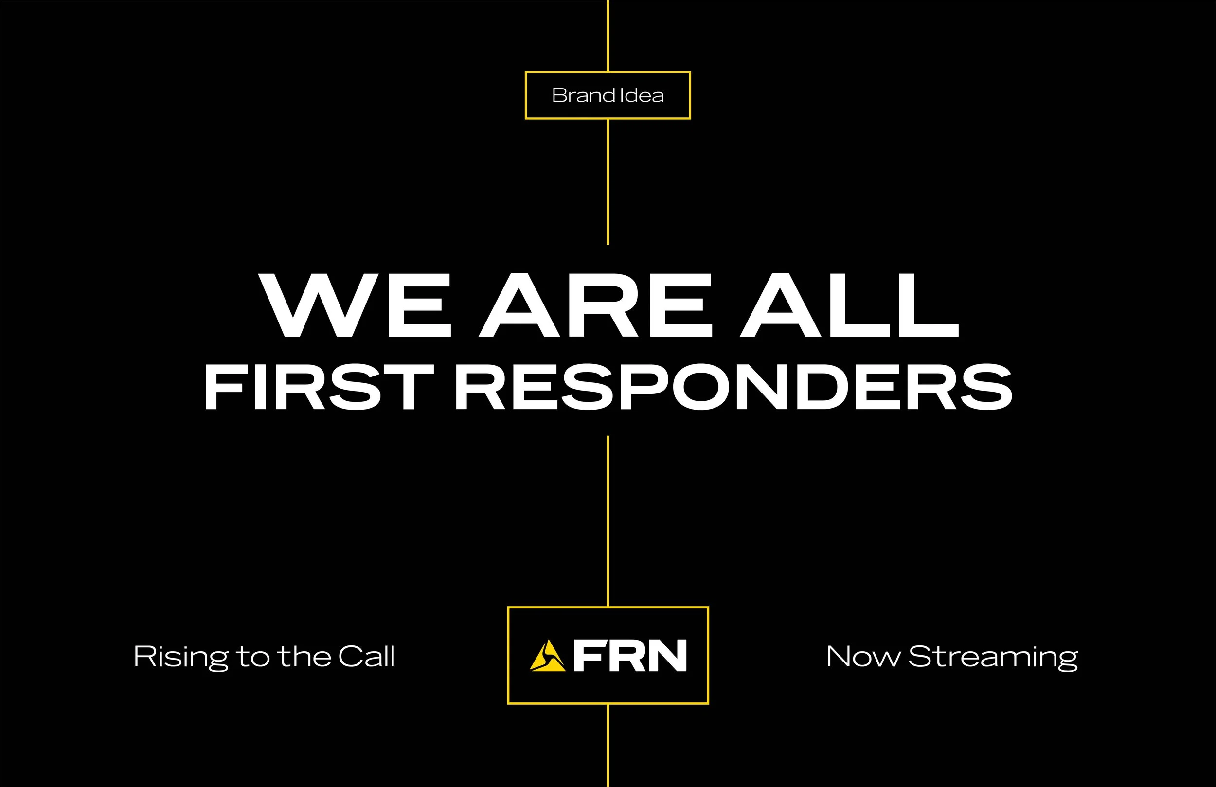
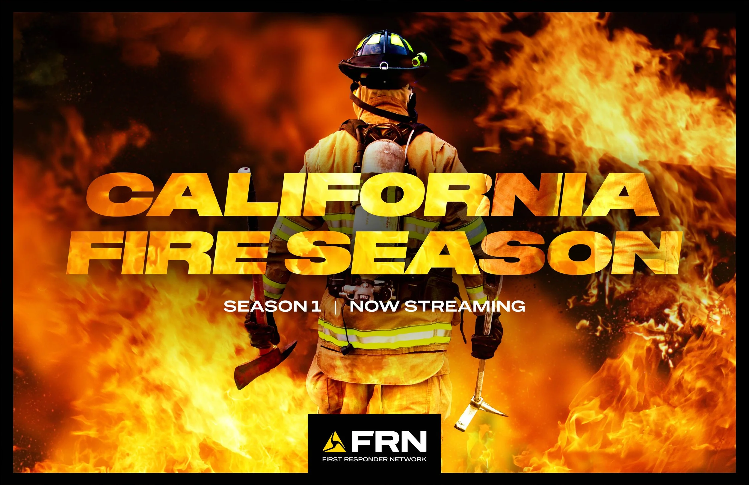
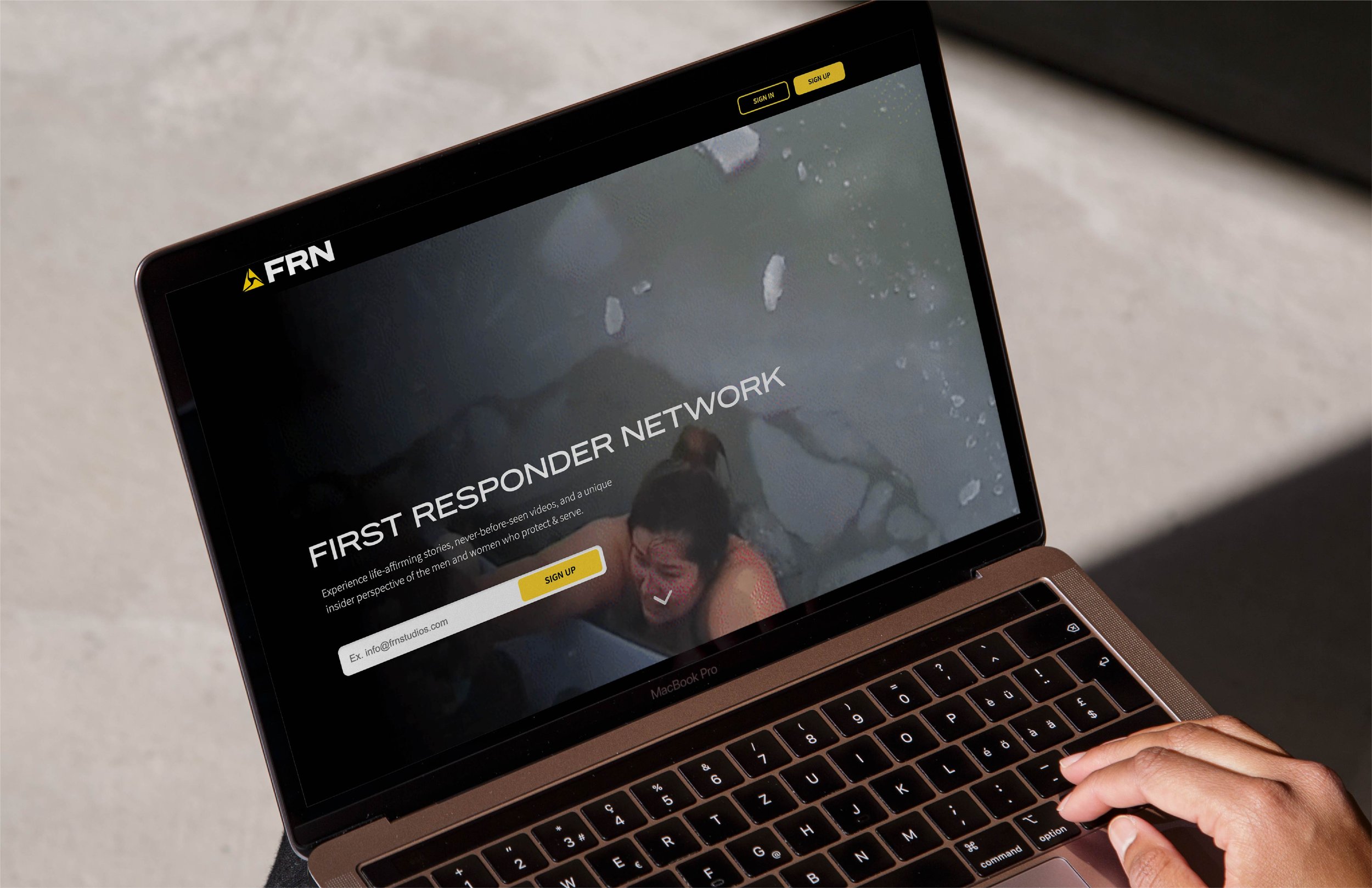
Every day, first responders run toward the moments everyone else runs from, and almost no one sees what that actually looks like. First Responder Network was built to change that: a brand-new streaming platform dedicated to real-life stories, never-before-seen footage and an insider’s view of the people who protect and serve. Much of that footage came from Axon cameras, so the brand had to sit naturally alongside Axon while standing on its own as a media destination. It needed an identity strong enough to hold up on a phone screen, a TV guide and a billboard, and a message that brought the audience into the story: We are all First Responders.
Approach
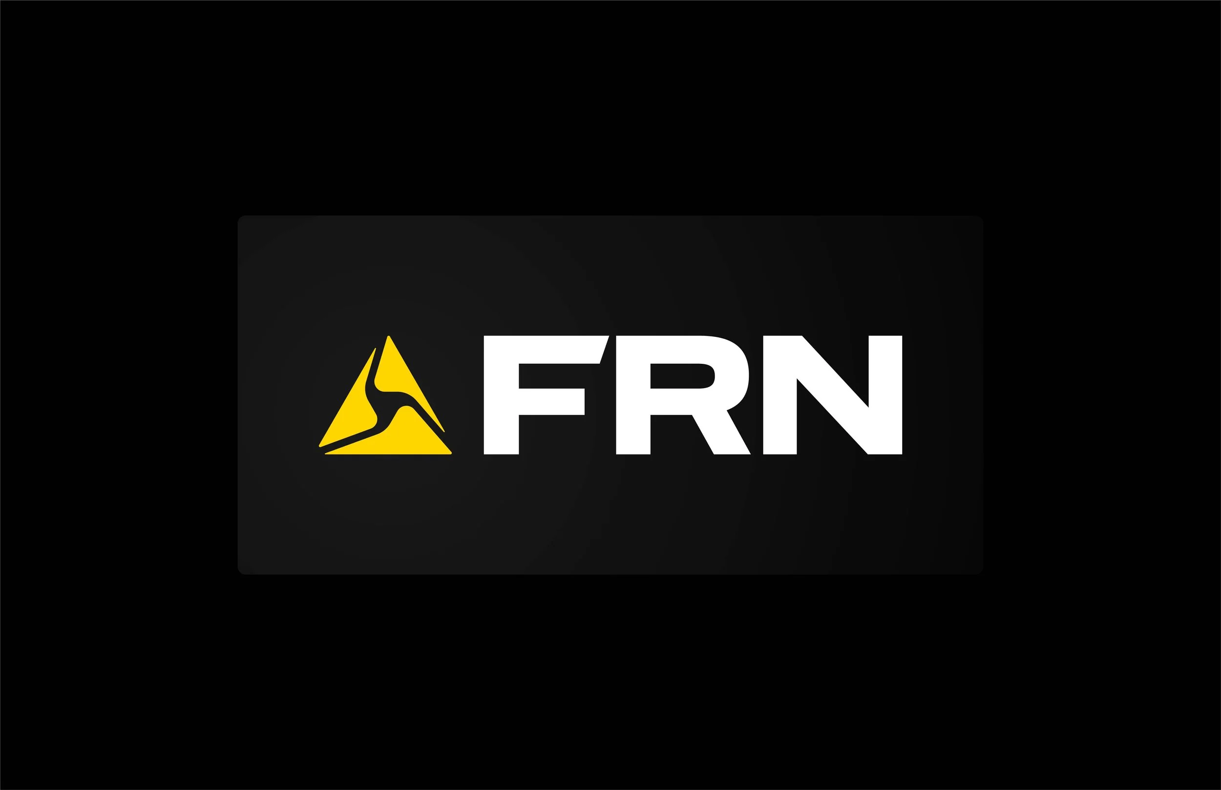
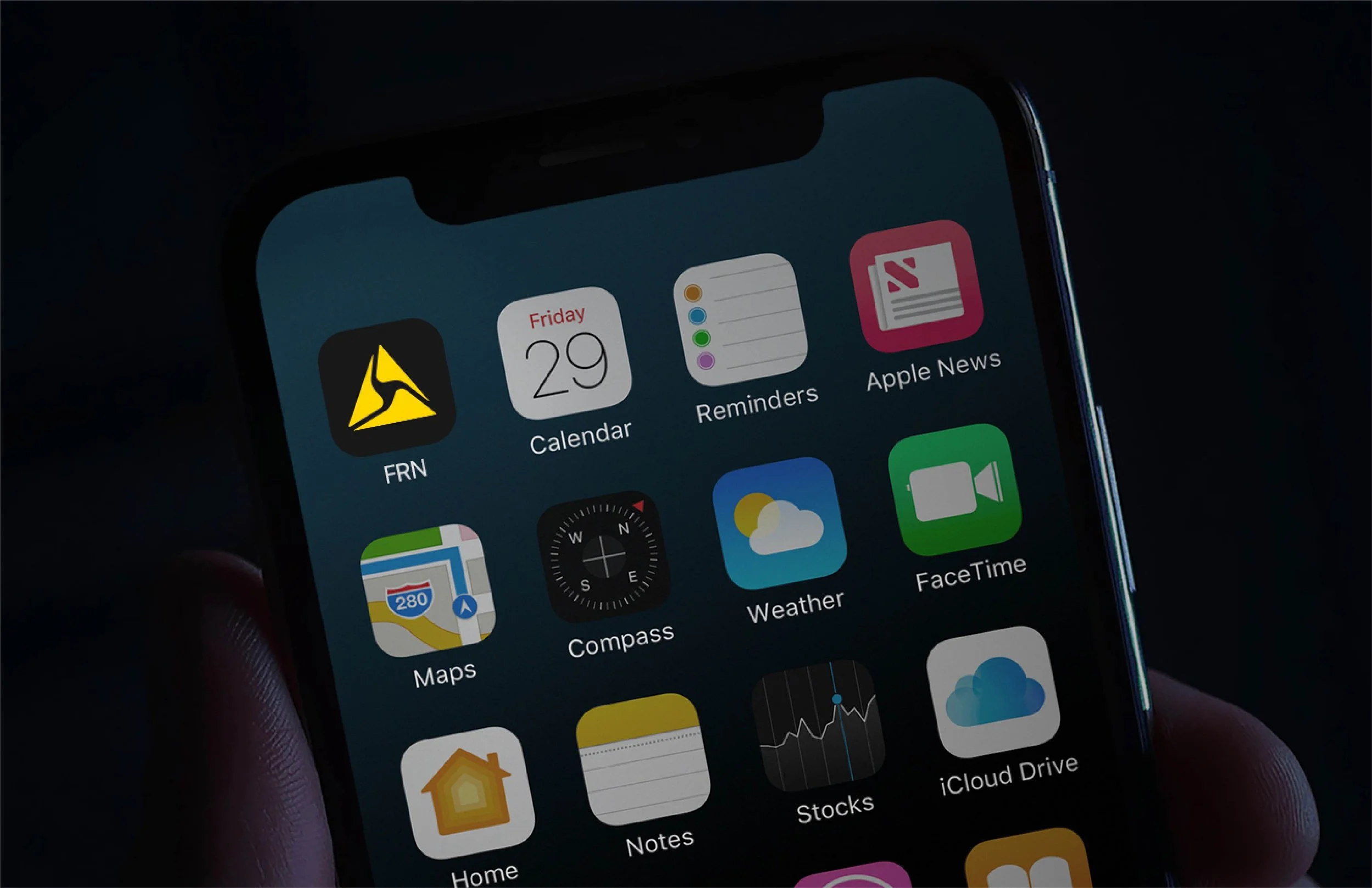
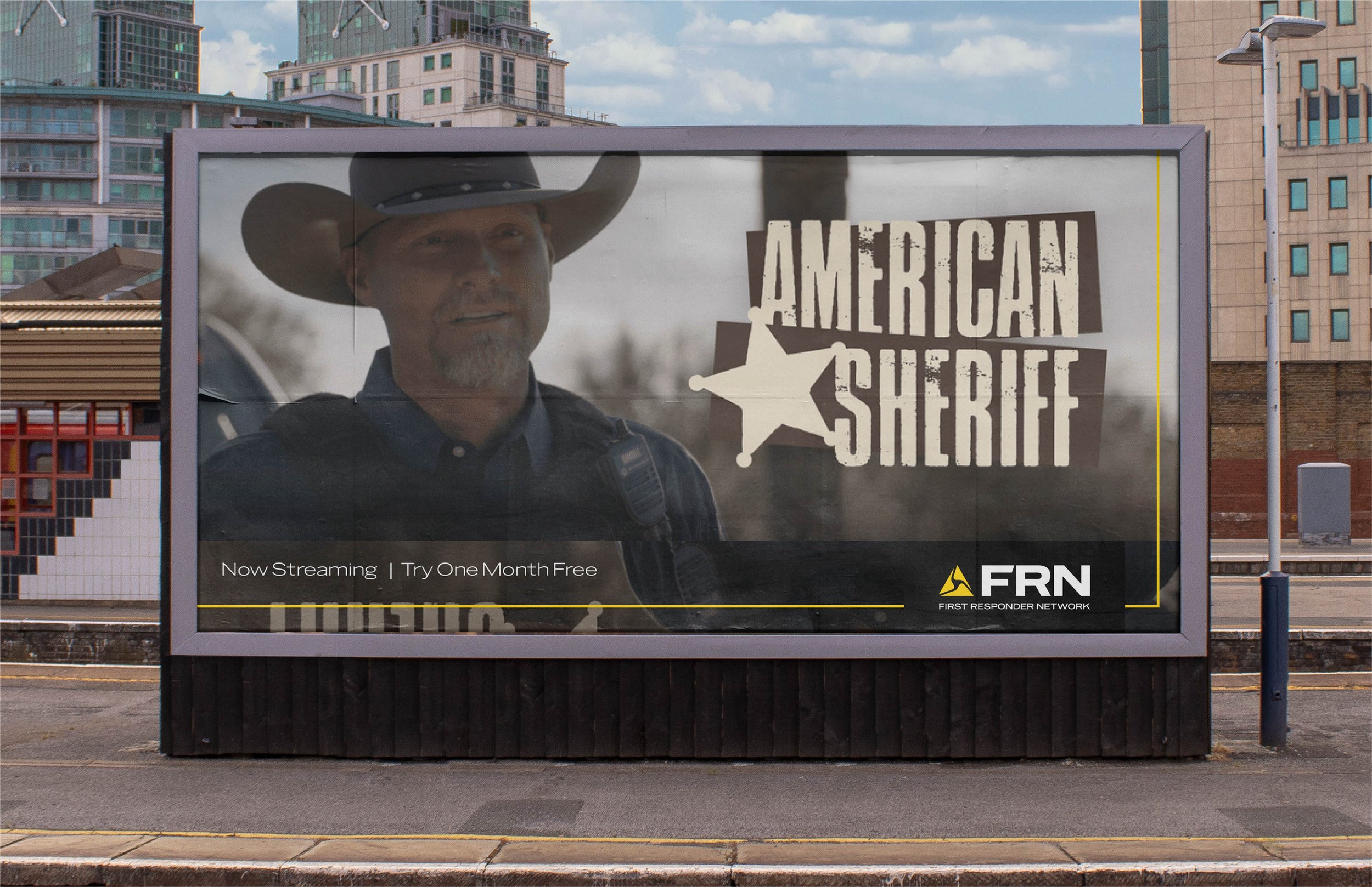
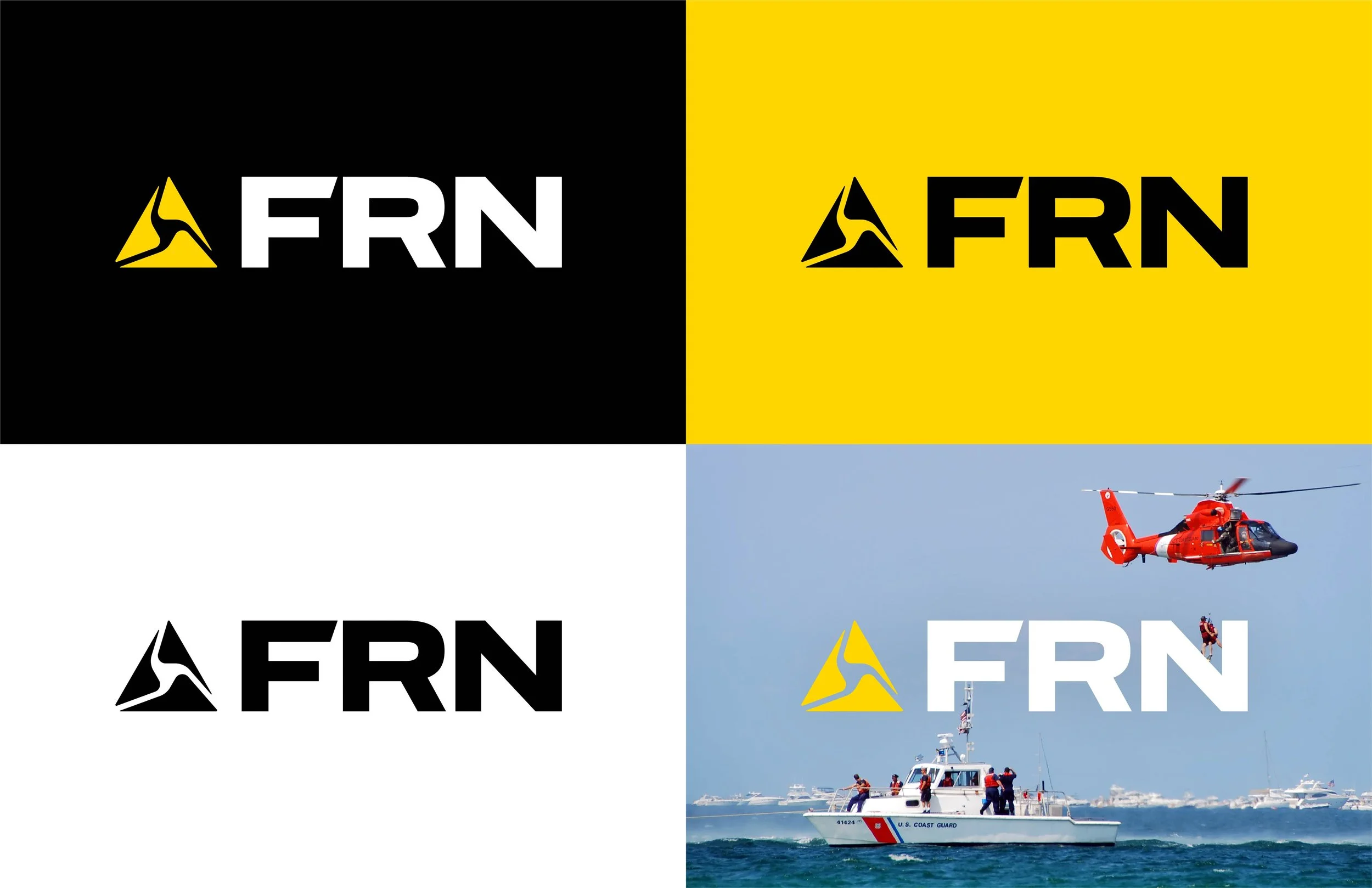
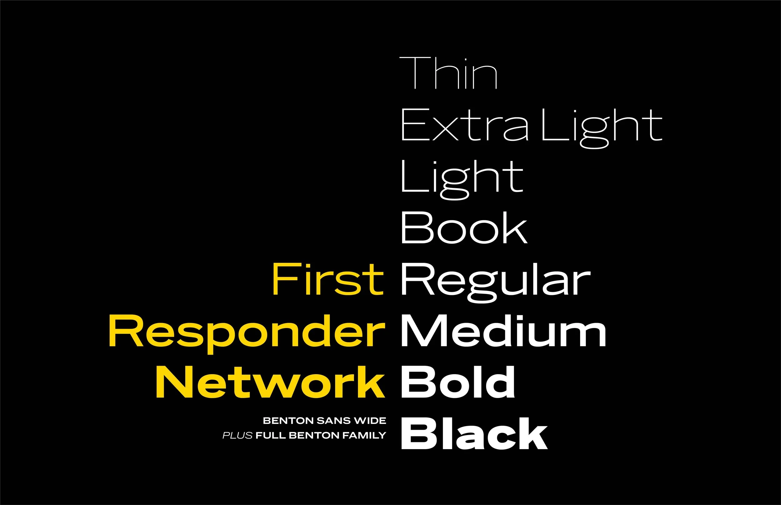
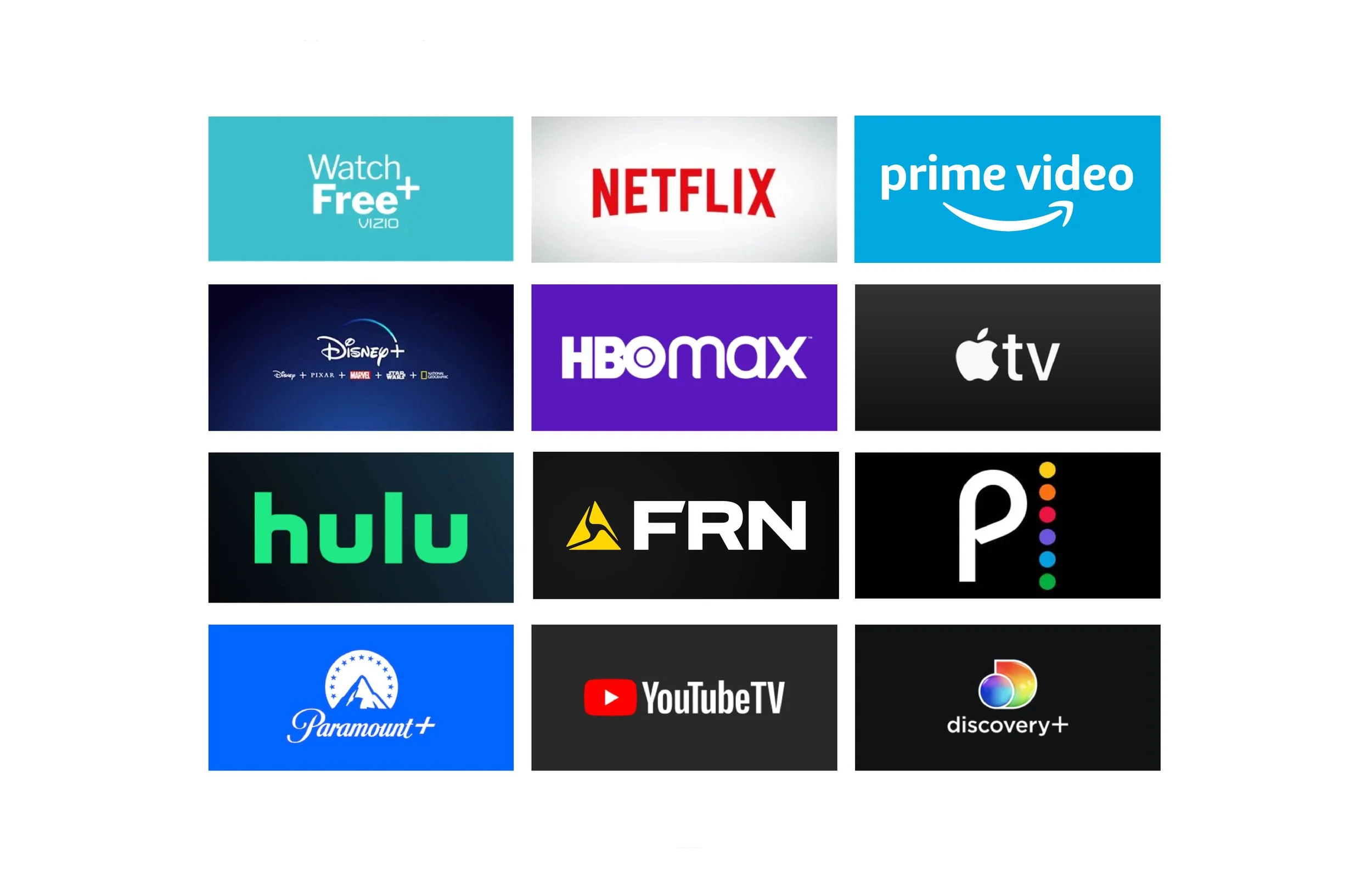
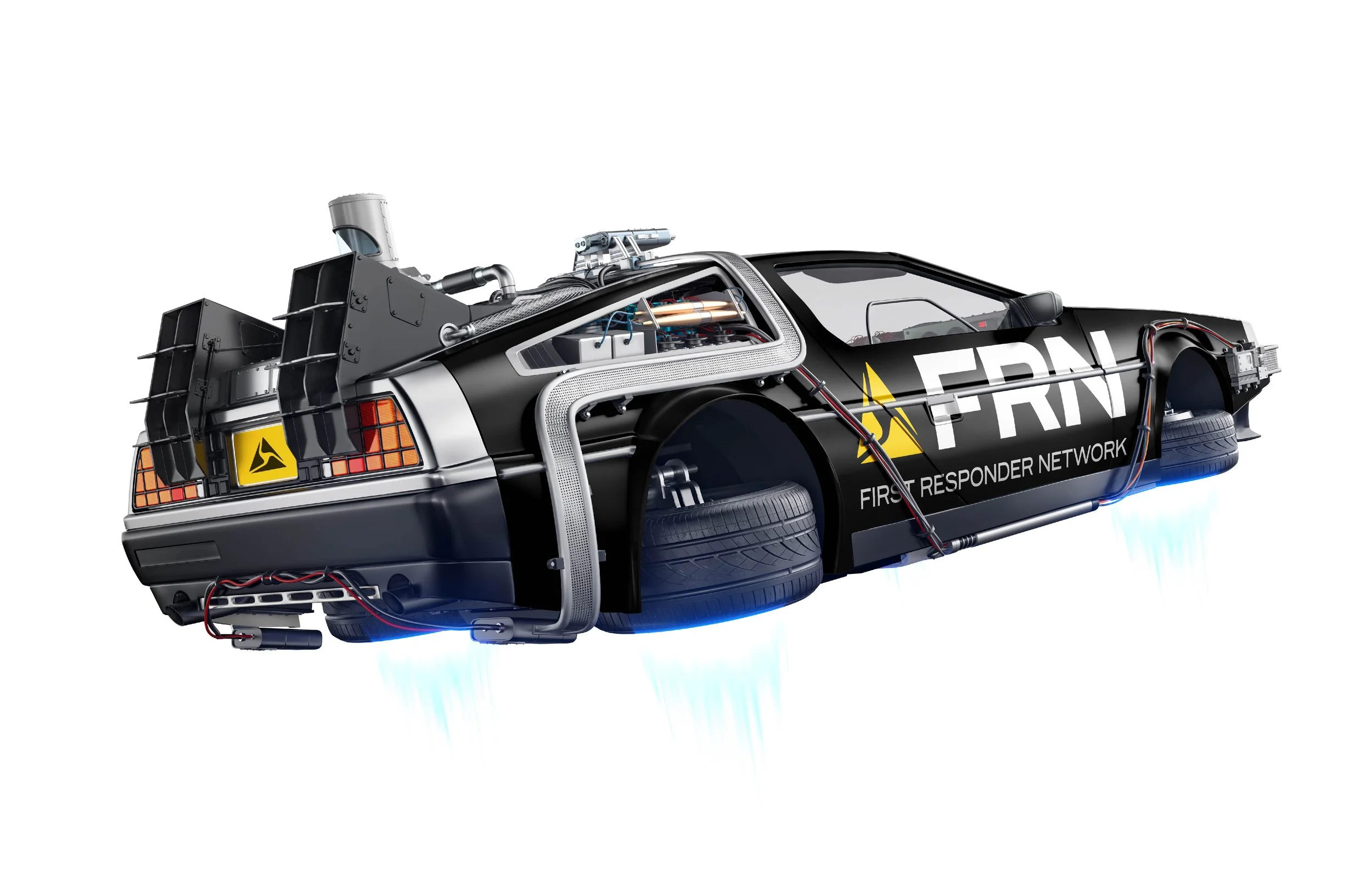
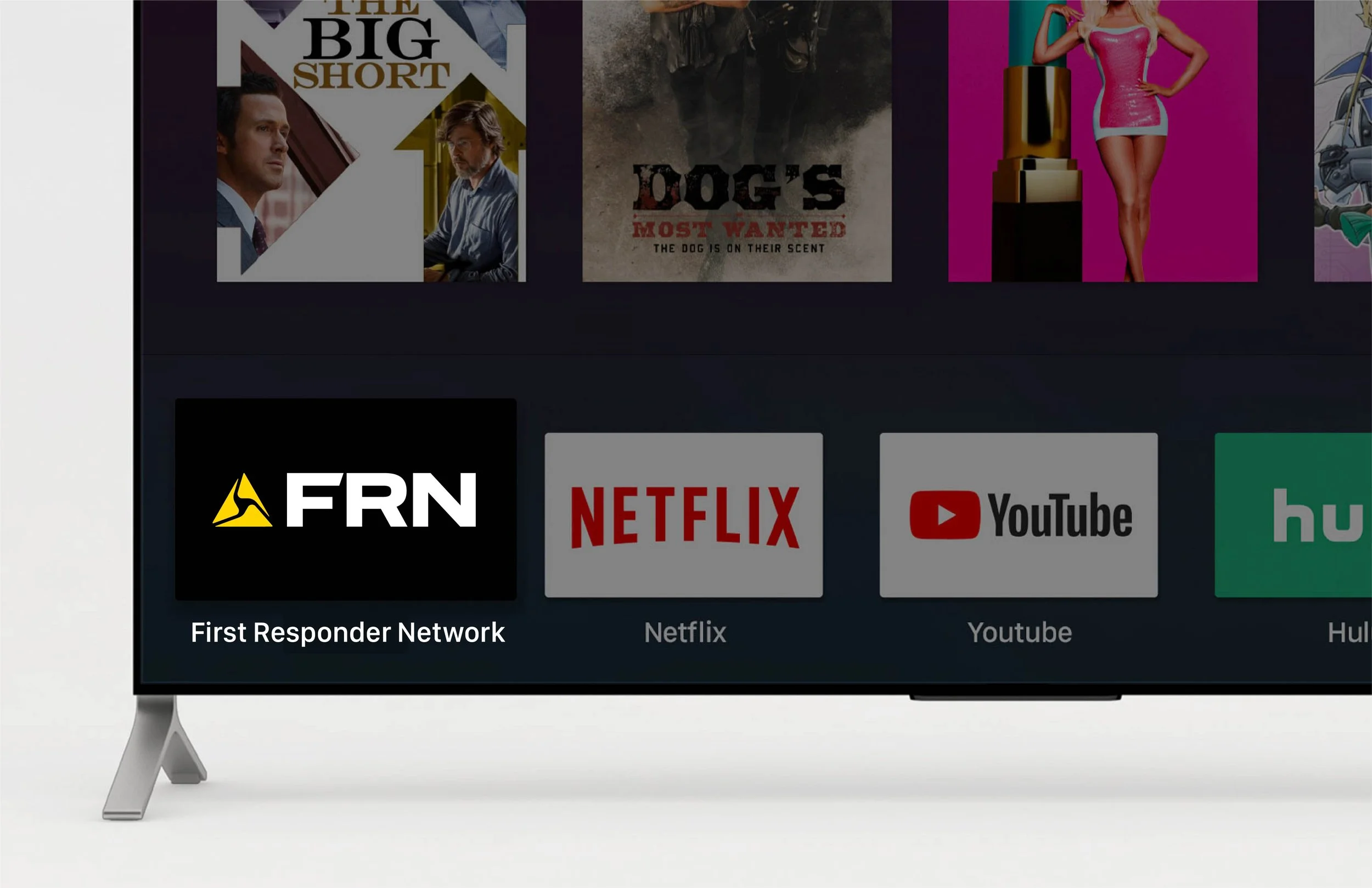
The identity started with what viewers would already see on screen. We built on the Axon delta, which appears throughout the footage, and brought in Axon Yellow and Axon’s typeface, Benton Sans, so FRN felt connected to the source of its stories. From there we made it its own. A custom F adds a sense of motion, giving the FRN logotype something unique and ownable, and Benton Sans Wide Bold carries the wordmark with the weight to read clearly across every platform, digital and traditional. The system was built to flex from small to large, from app icons and on-screen bugs to print and out-of-home. Brand guidelines kept it consistent as the network grew. The result is a bold, unmistakable identity for a network built on courage.
-
Public Safety · Media & Streaming
-
We are all First Responders.
-
Brand identity, logo design, positioning, brand guidelines, marketing materials, production and OOH
-
Streaming network launch · Digital, print & OOH
-
Creative Director: Travis Bartlett
Art Director: Travis Bartlett
Lead Designer: Travis Bartlett