Bollinger Motors
Context
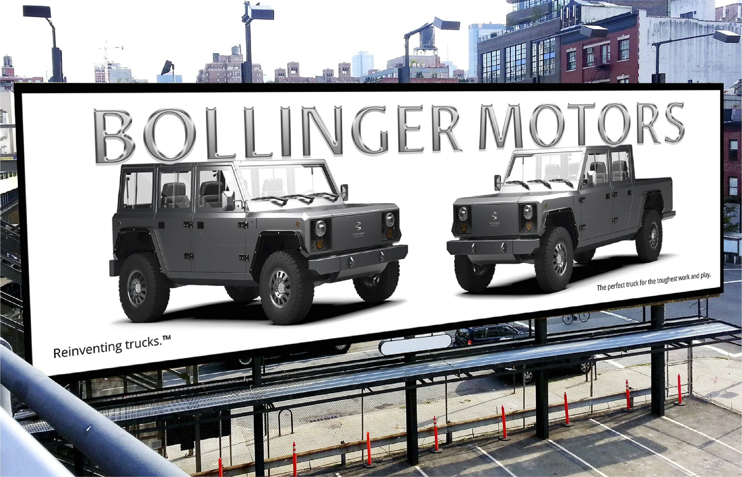
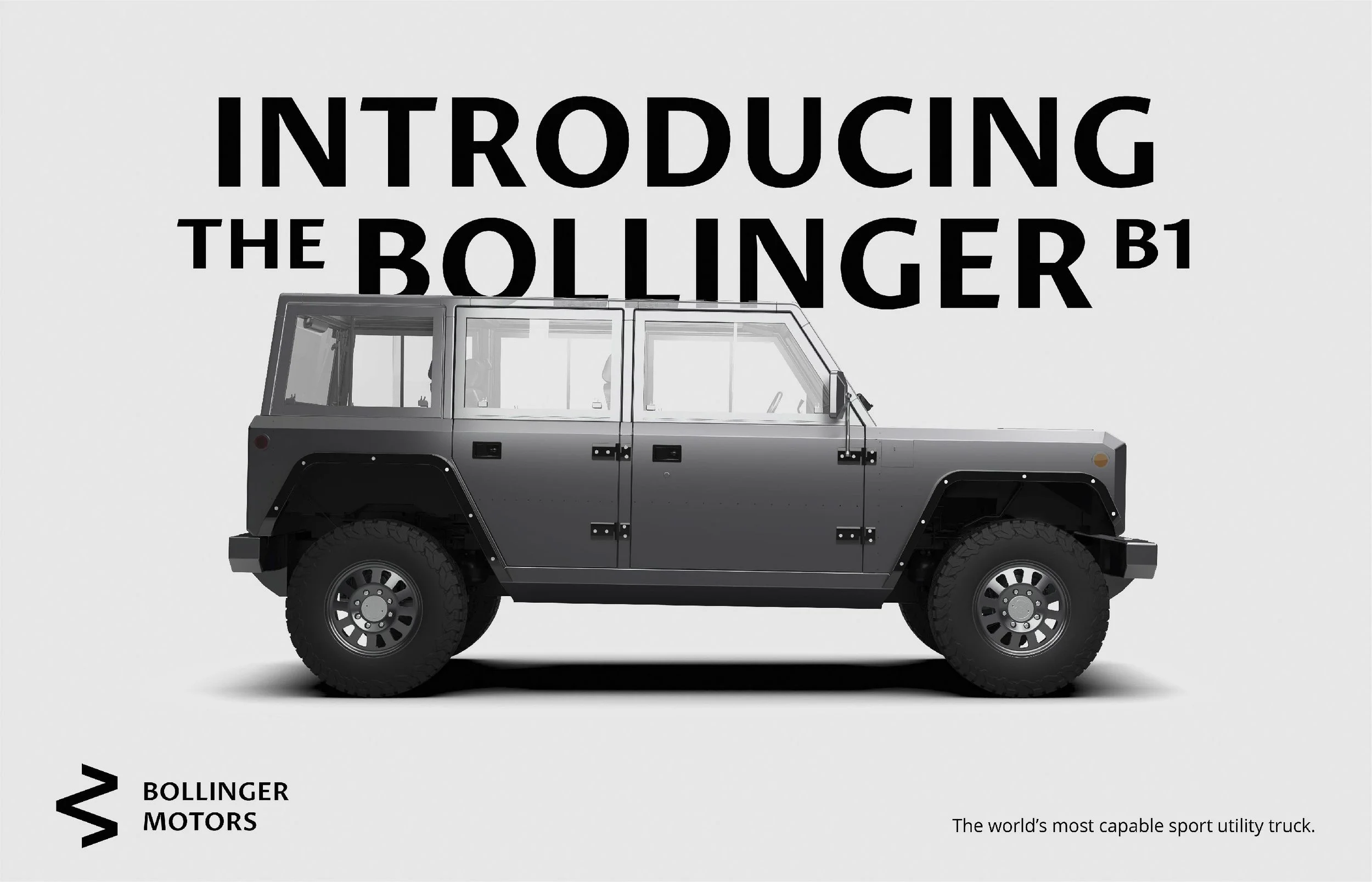
Bollinger Motors set out to do something few automakers attempt: build an electric 4-wheel-drive truck from the ground up, engineered as the toughest truck for work and play anywhere on earth. A brand that ambitious needed an identity just as tough. It had to live on a chassis, a rim and a steering wheel, not just a business card.
Approach
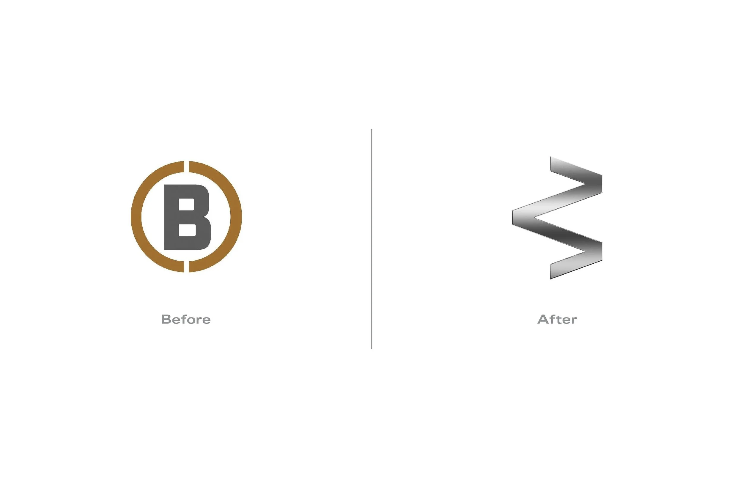
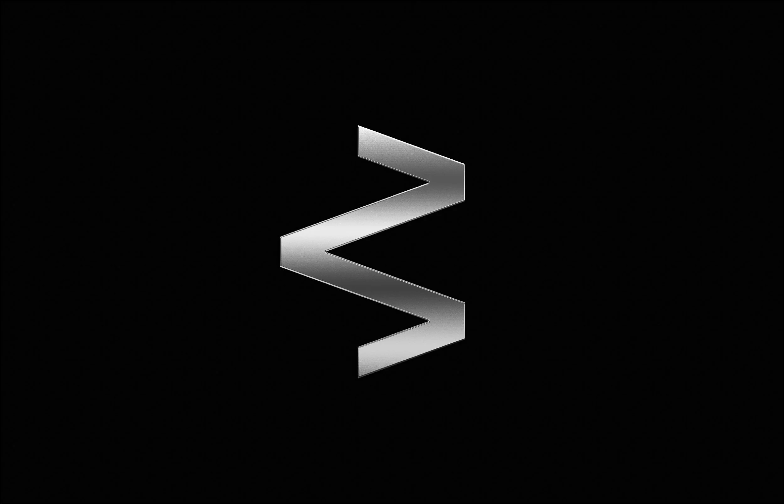
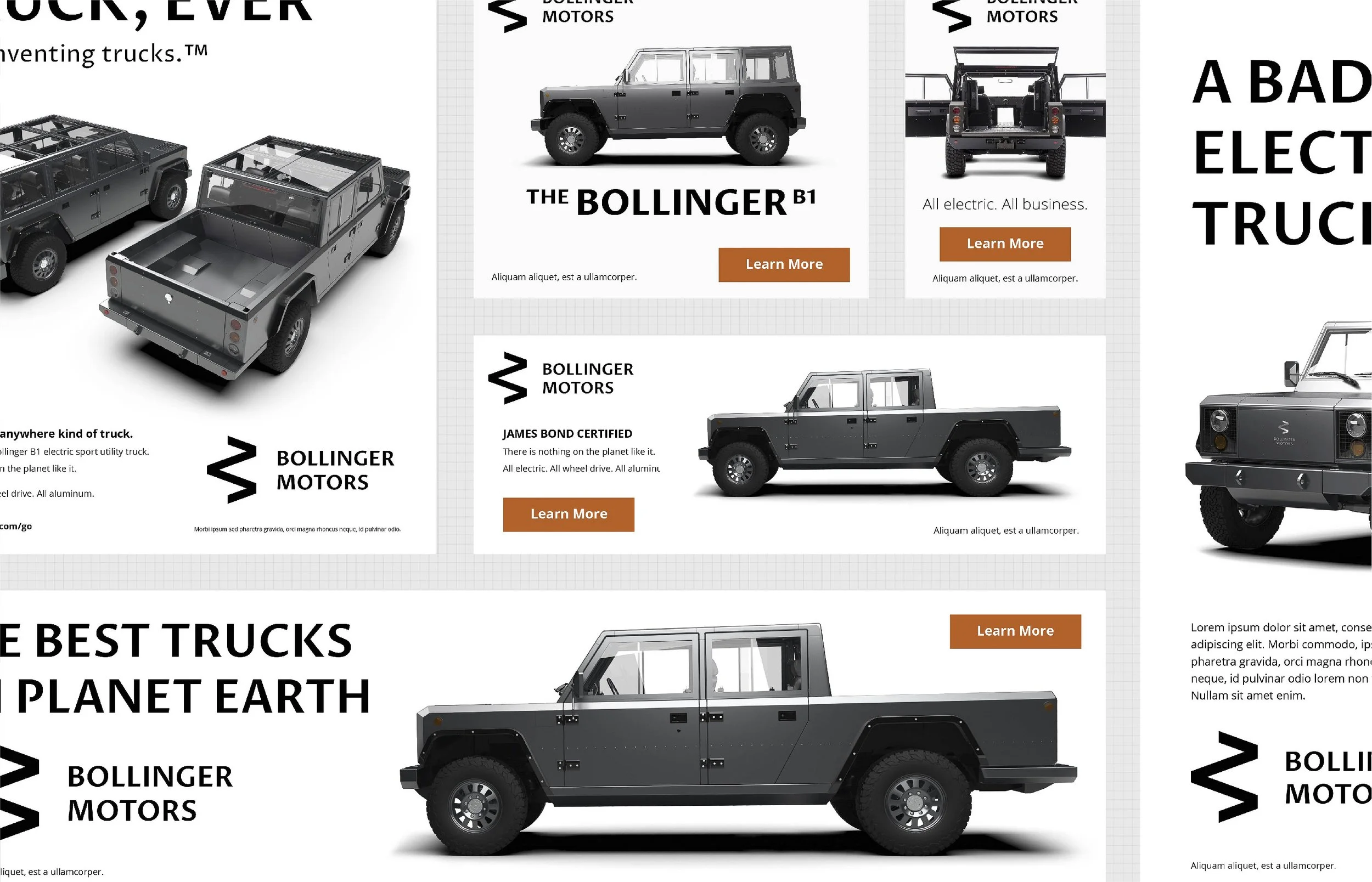
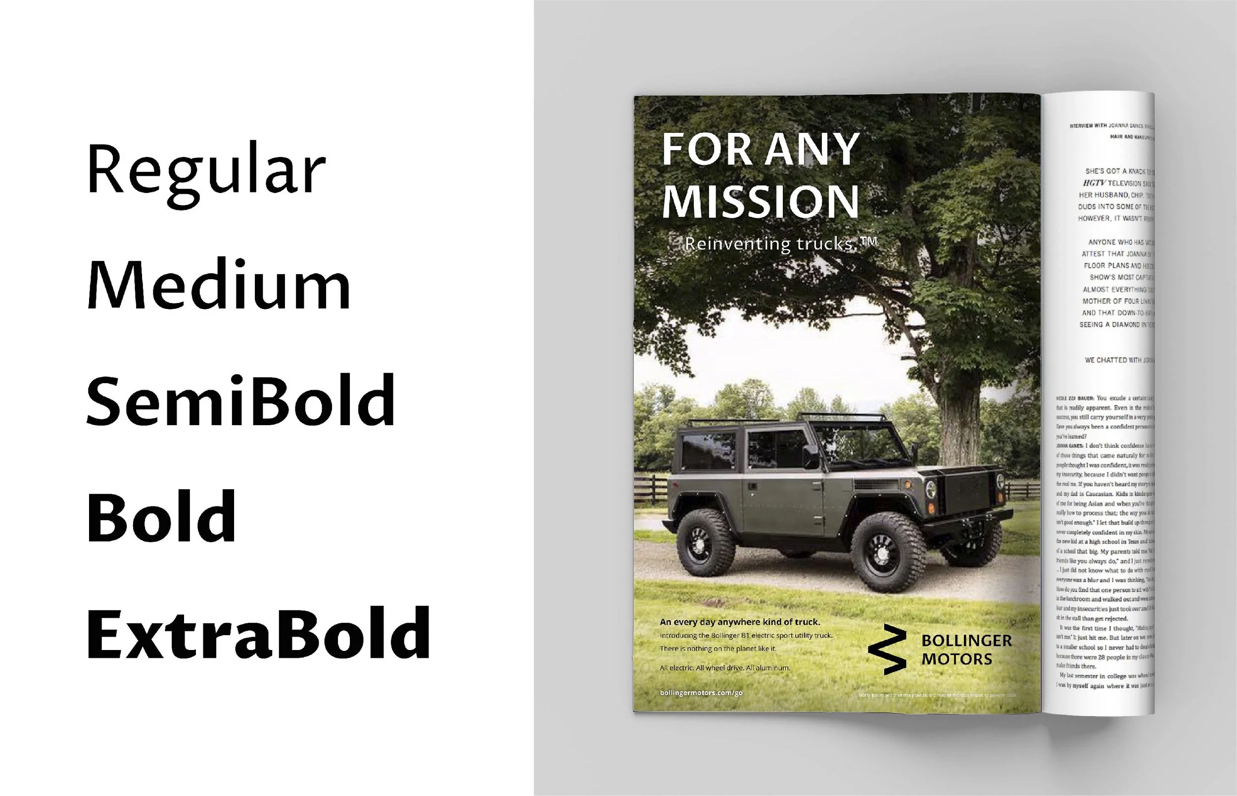
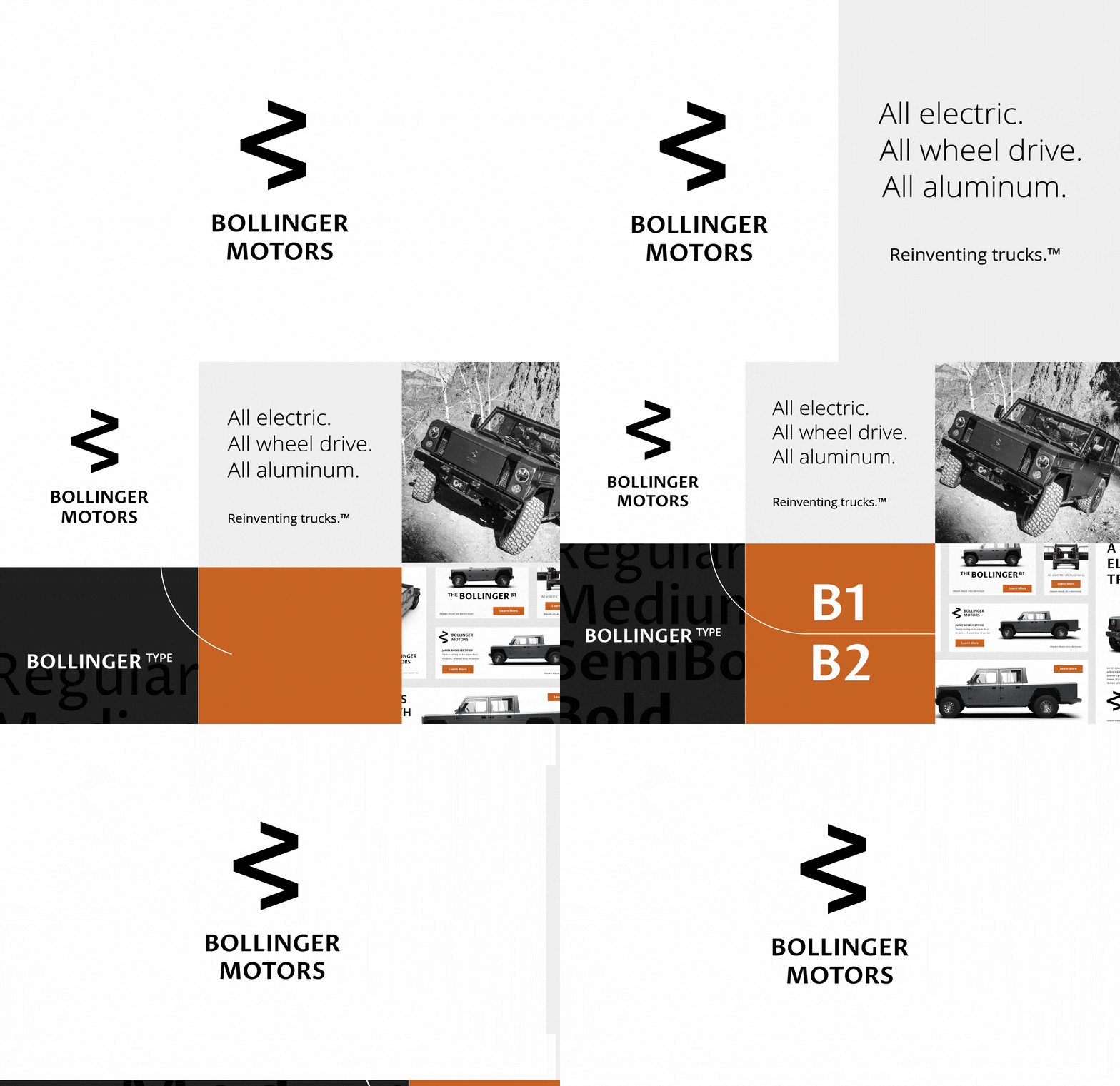
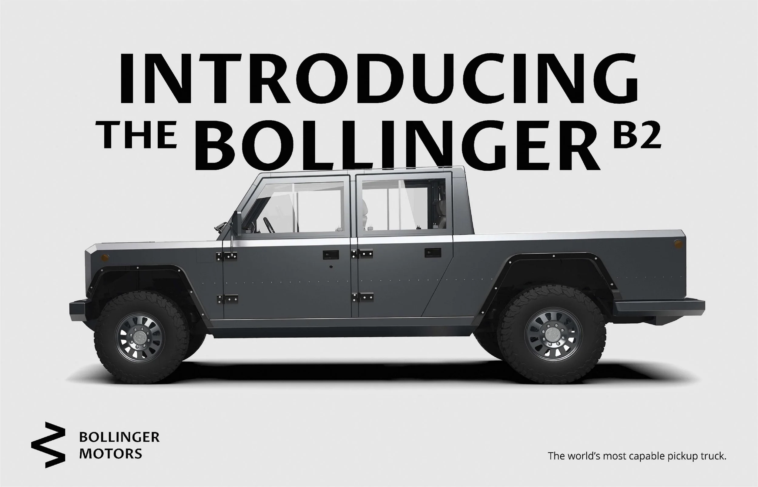
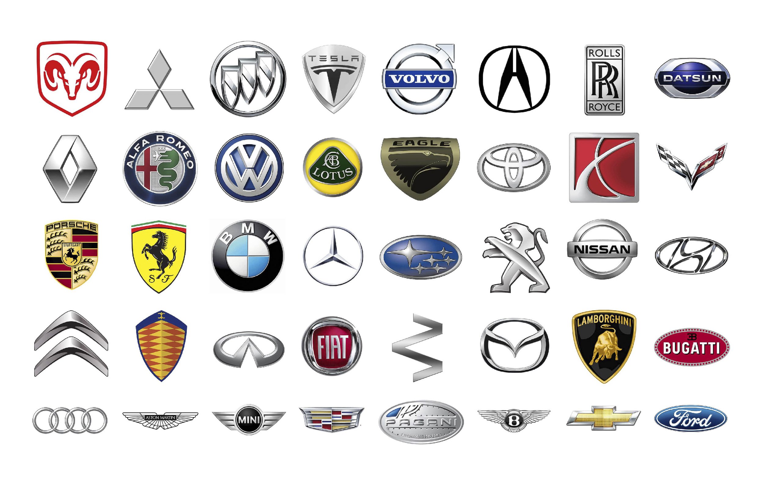
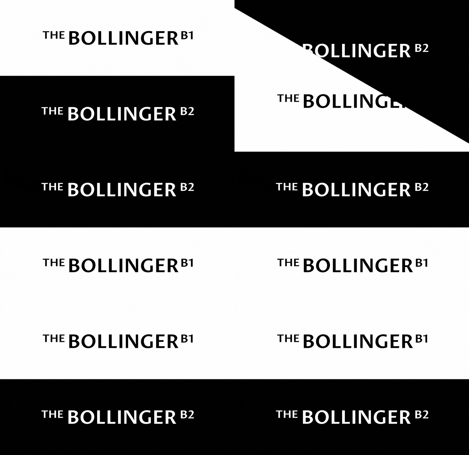
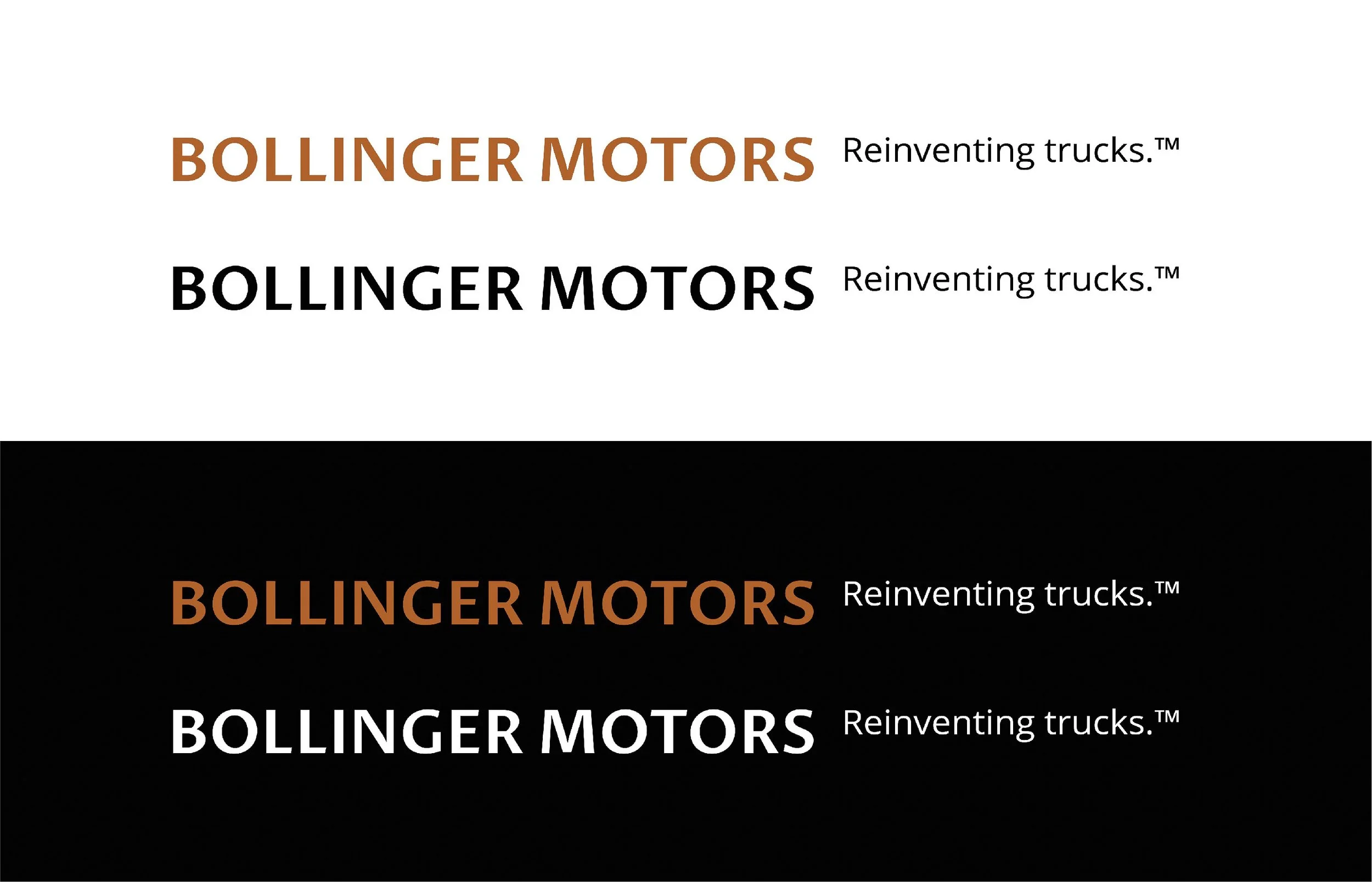
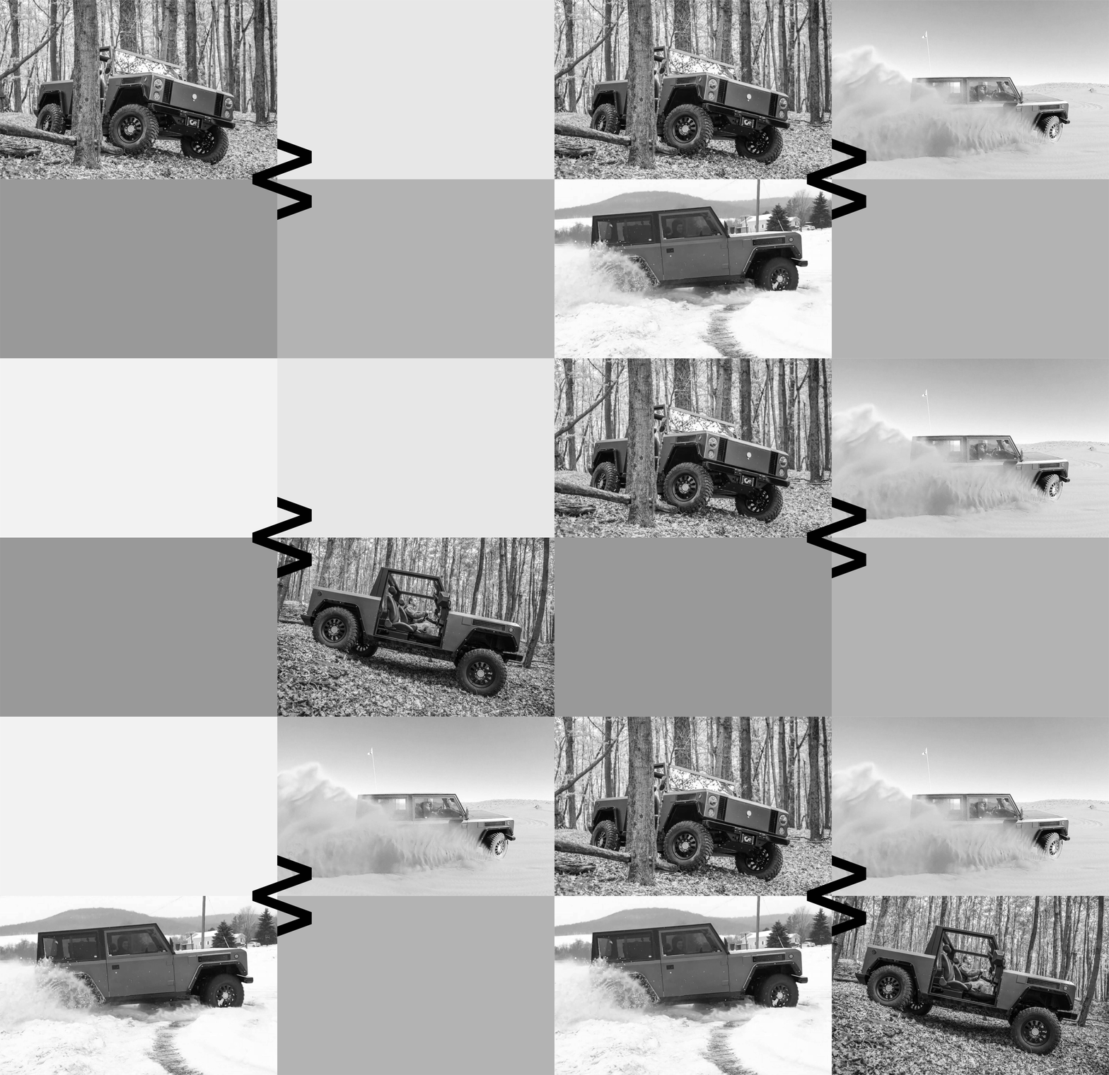
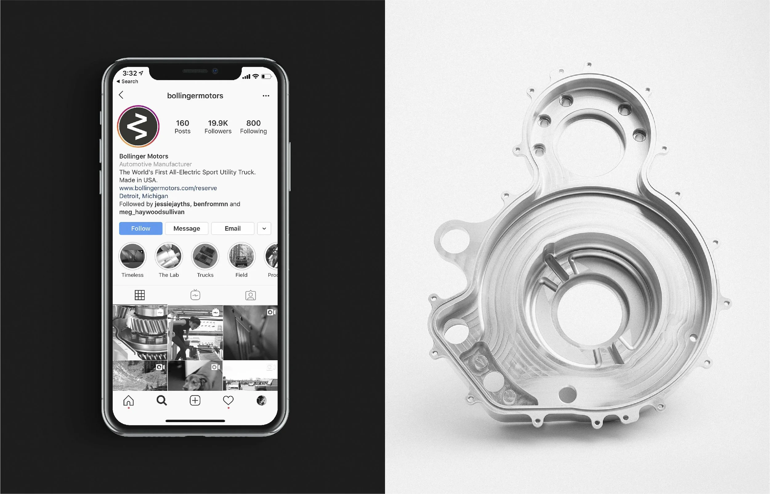
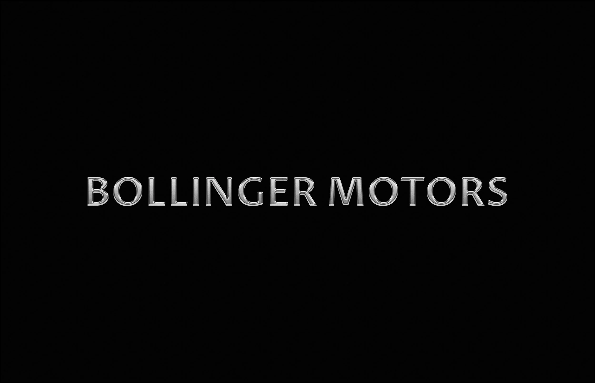
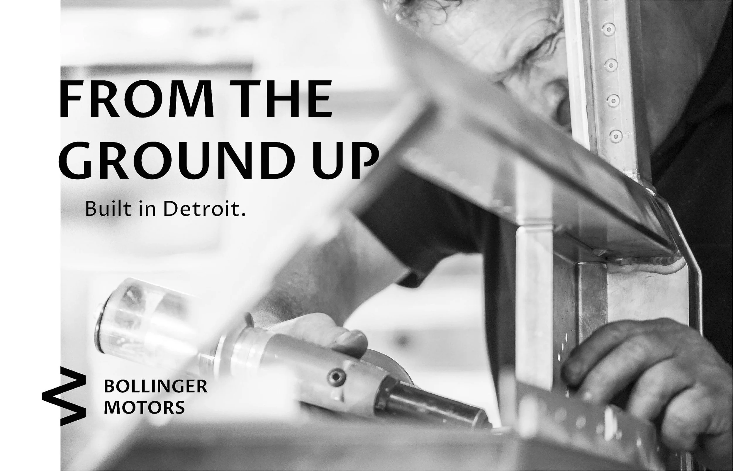
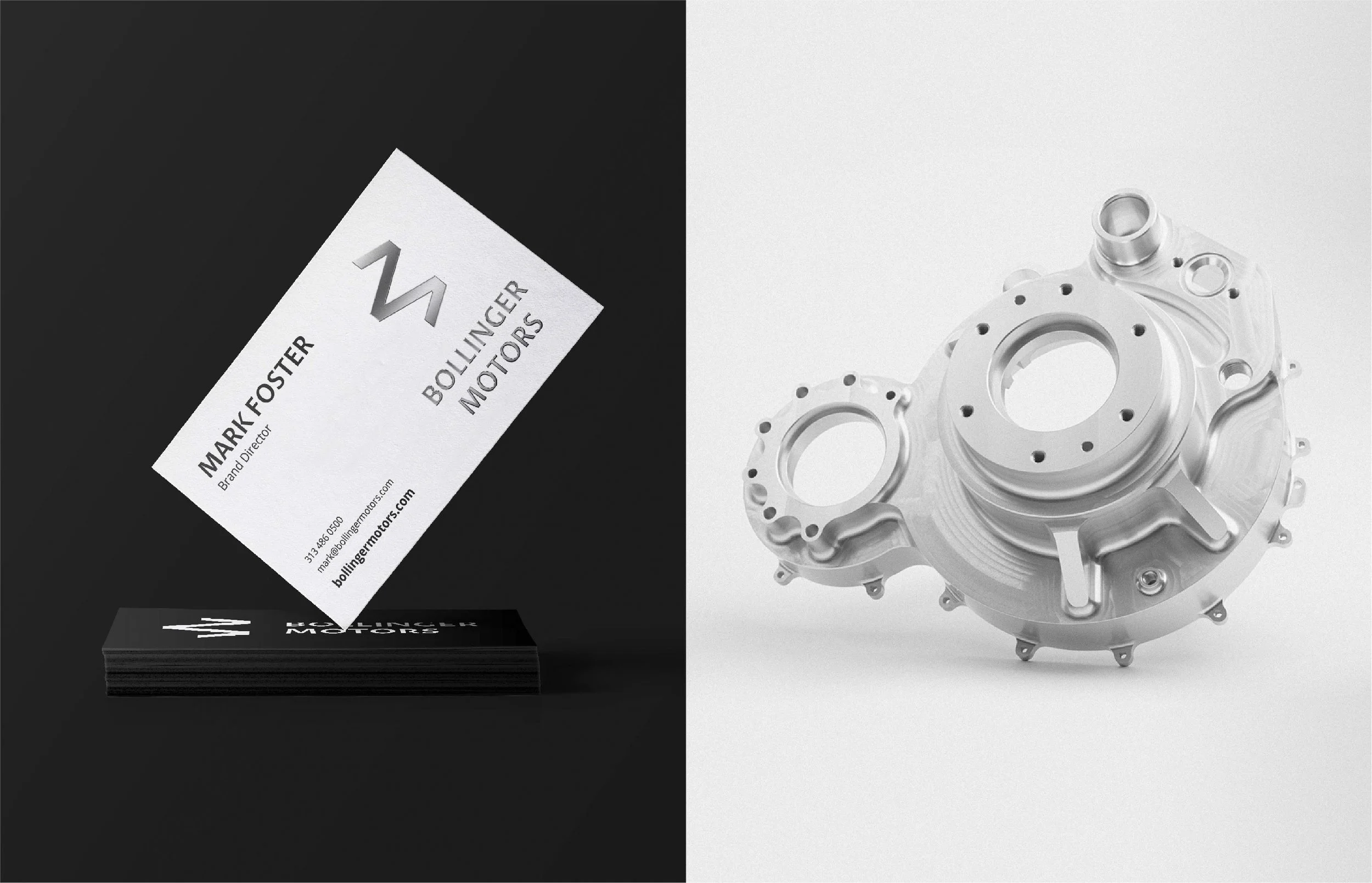
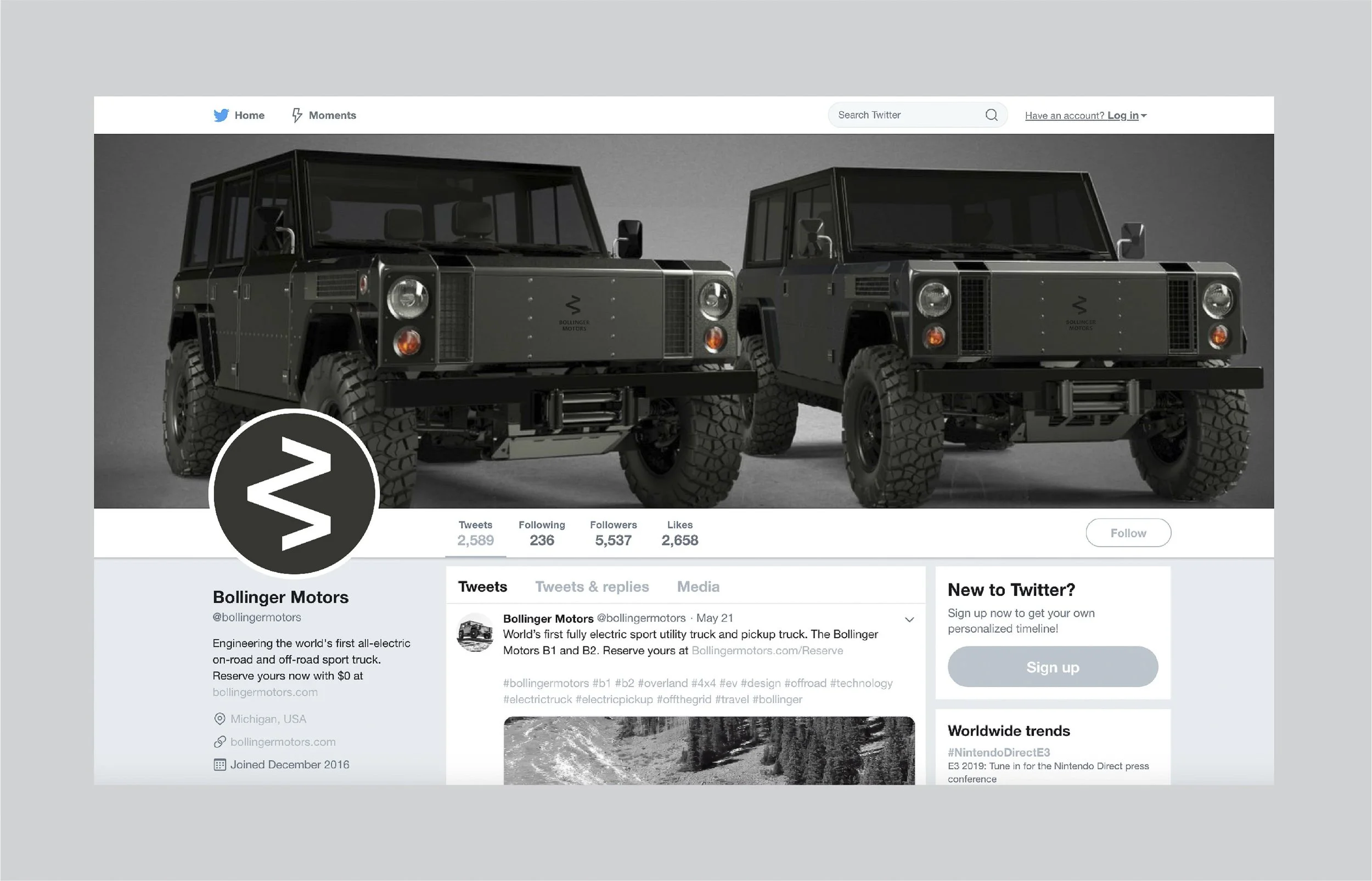
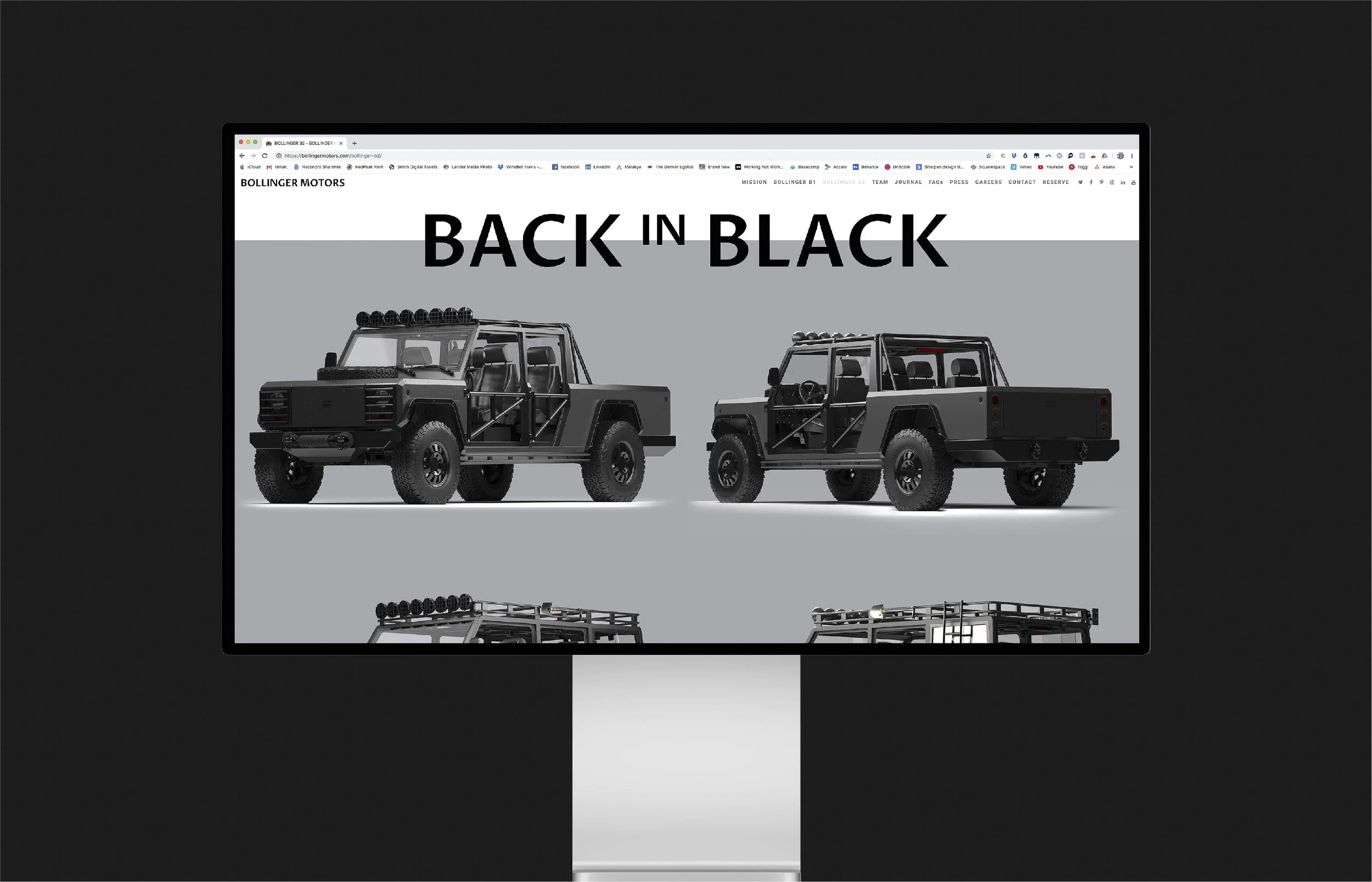
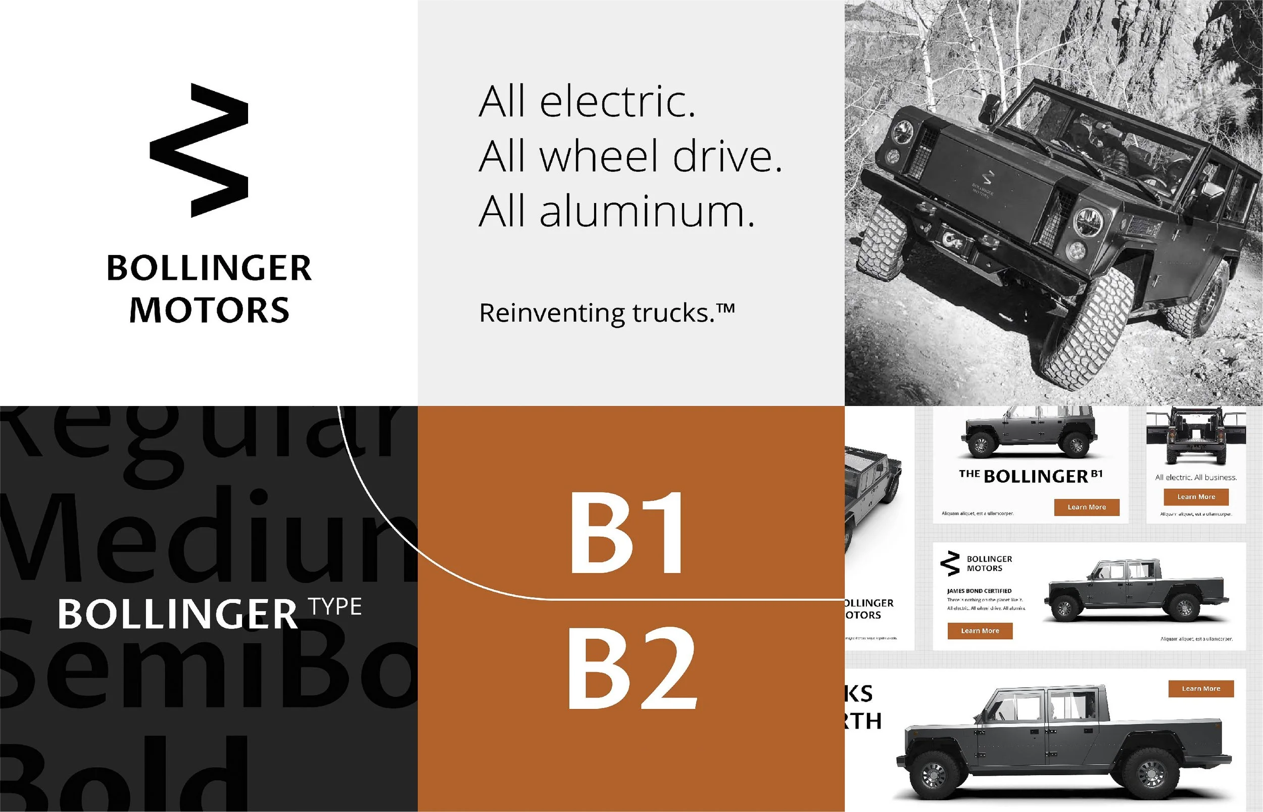
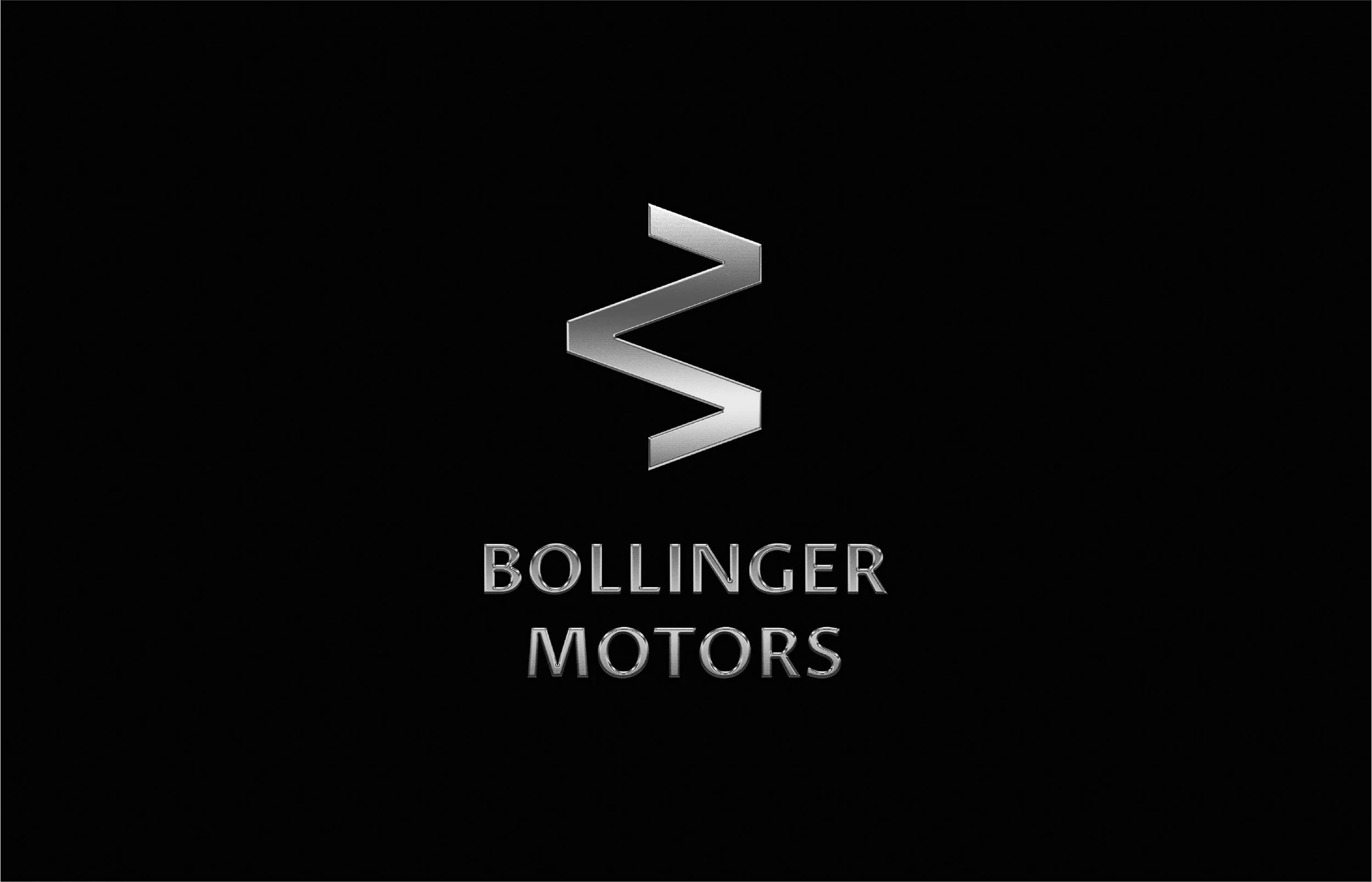
This concept imagines what that identity could be. It started with a deep dive into the auto industry, dissecting the design directions already crowding the electric truck space, then landed on a strong, timeless sans serif built to stay legible on every surface the brand would reach. From there came a mark built to move: a double-read letter B that resolves into an M when rotated, designed to hold its identity on the smallest surfaces a truck offers, like a rim, a steering wheel or a badge. A heavy black palette leads throughout, with a pop of orange saved for calls to action and key brand moments. The result is an identity with the same toughness Bollinger was engineering into the truck itself.
-
Automotive · Electric Vehicles
-
A mark meant to move.
-
Logo, monogram, typography, color, brand applications
-
Concept · Identity
-
Creative Director: Travis Bartlett
Art Director: Travis Bartlett
Lead Designer: Travis Bartlett