Colo Yoga
Context
The yoga space is crowded. National studios and apps all compete for the same mat, and many of them look and sound alike. Colo Yoga came from something more personal: its founder’s own journey of overcoming mental and physical challenges through movement, breath and mindset. Even the name carries the mission. Colo stands for Conscious Love, the daily choice between love and fear. It’s a small company with a big mission, built on the belief that we live in limitation but have limitless potential. What it needed was a timeless brand strong enough to stand out nationally without losing the heart it was built on.
Approach
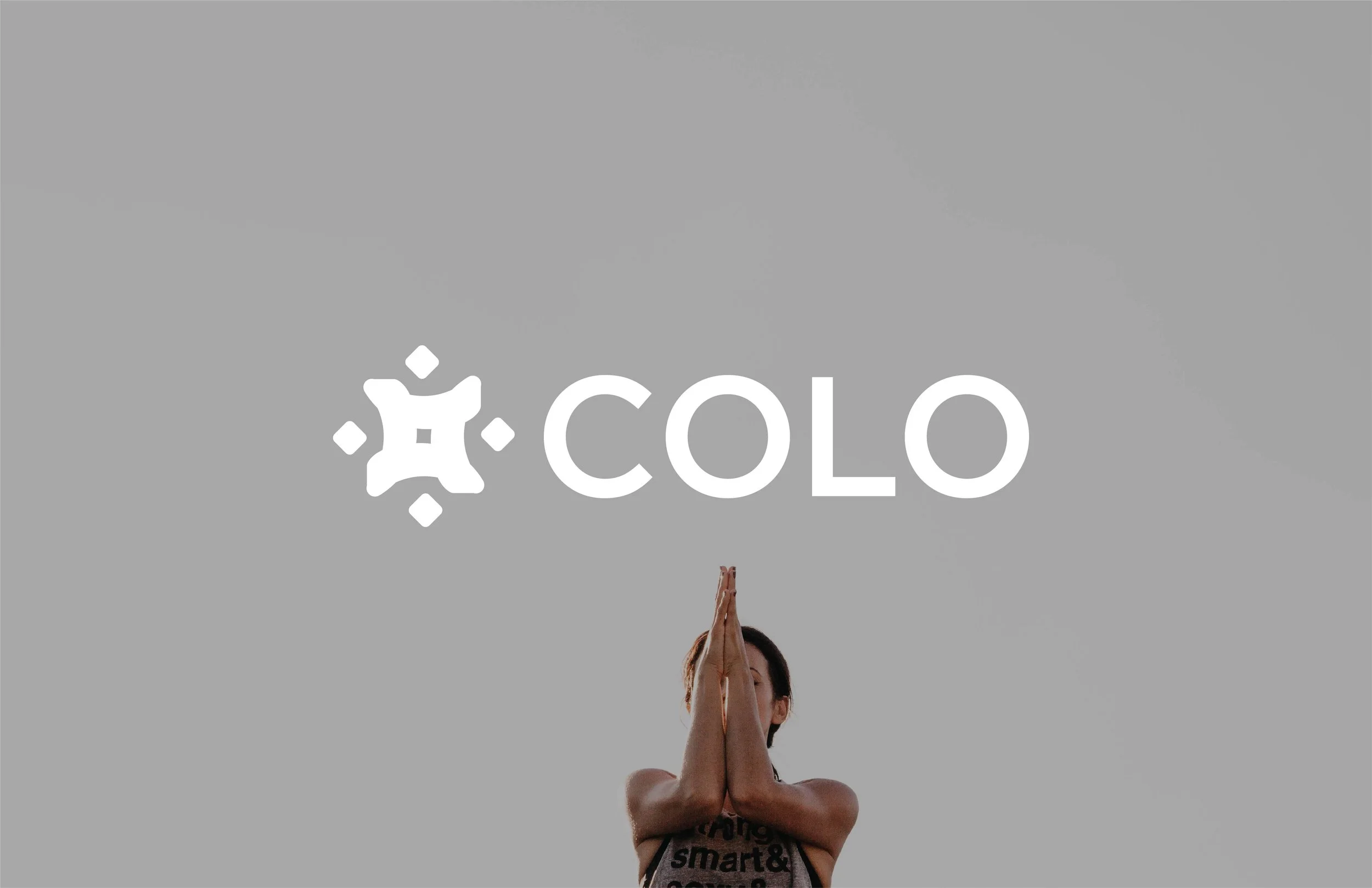
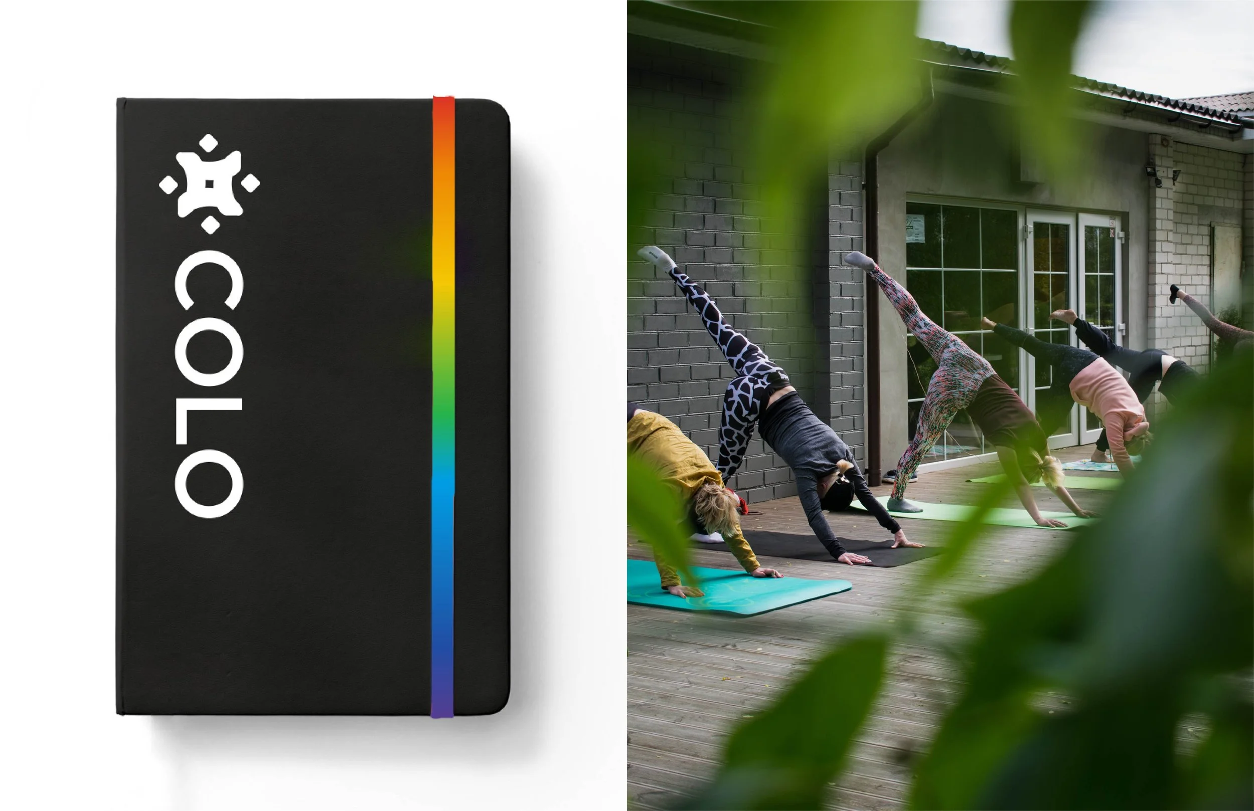
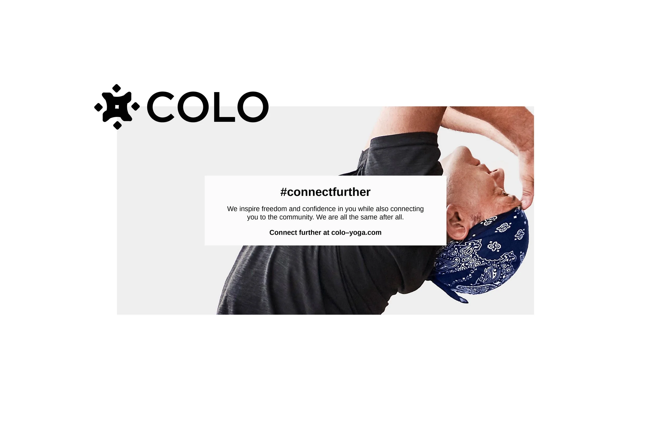
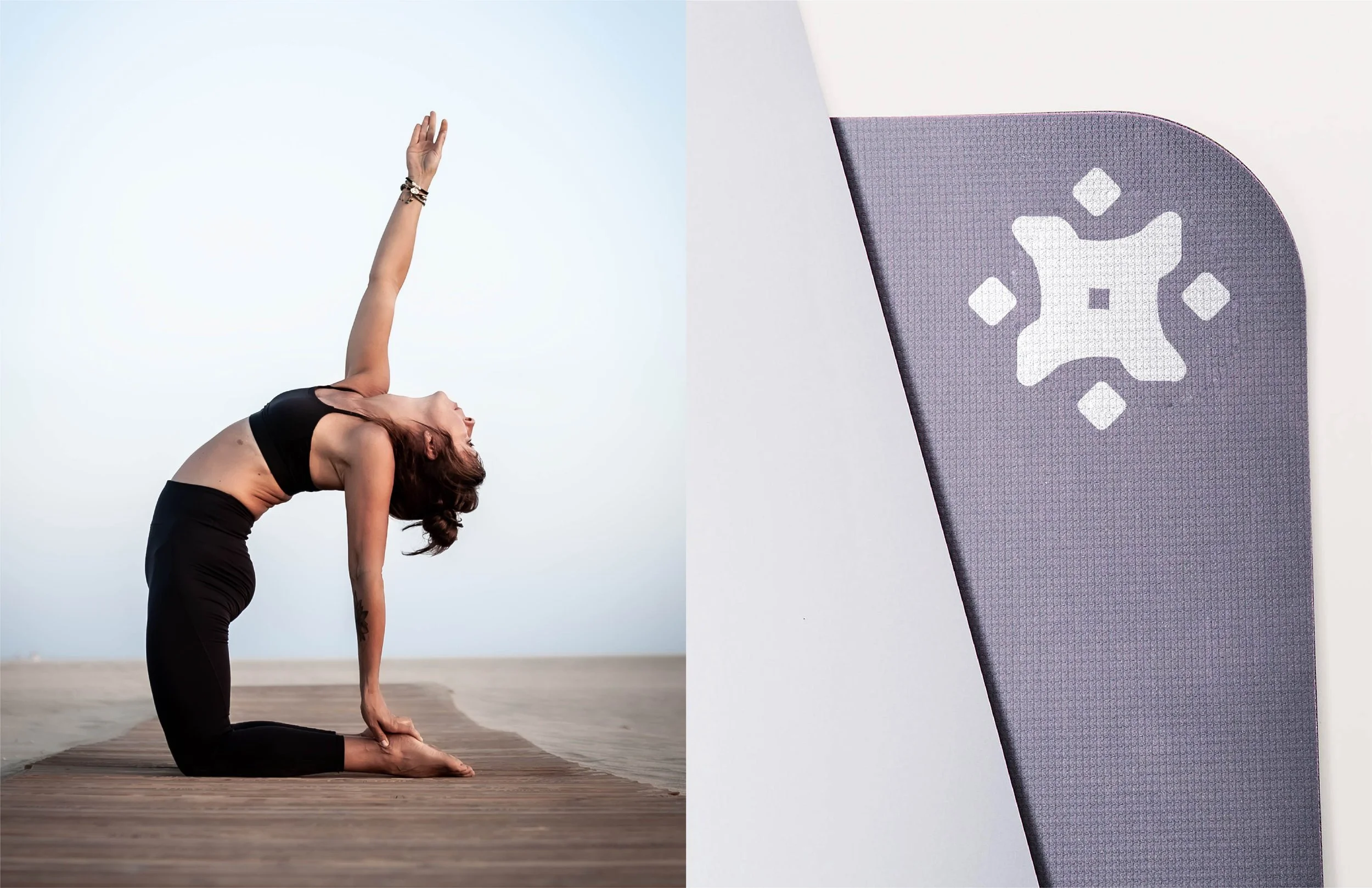
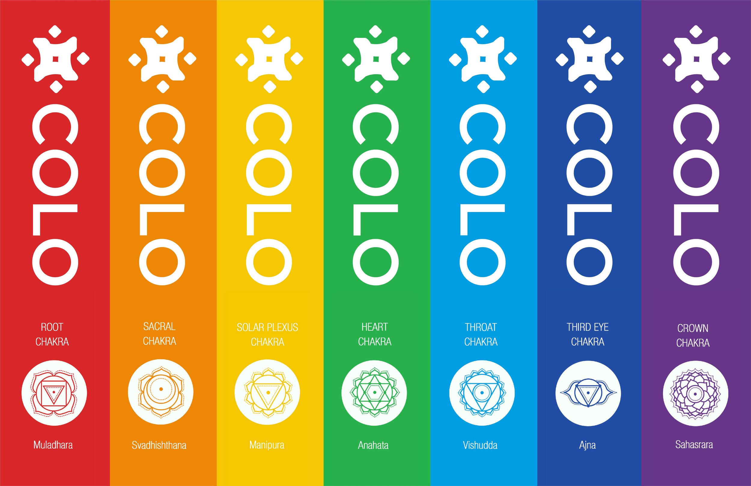
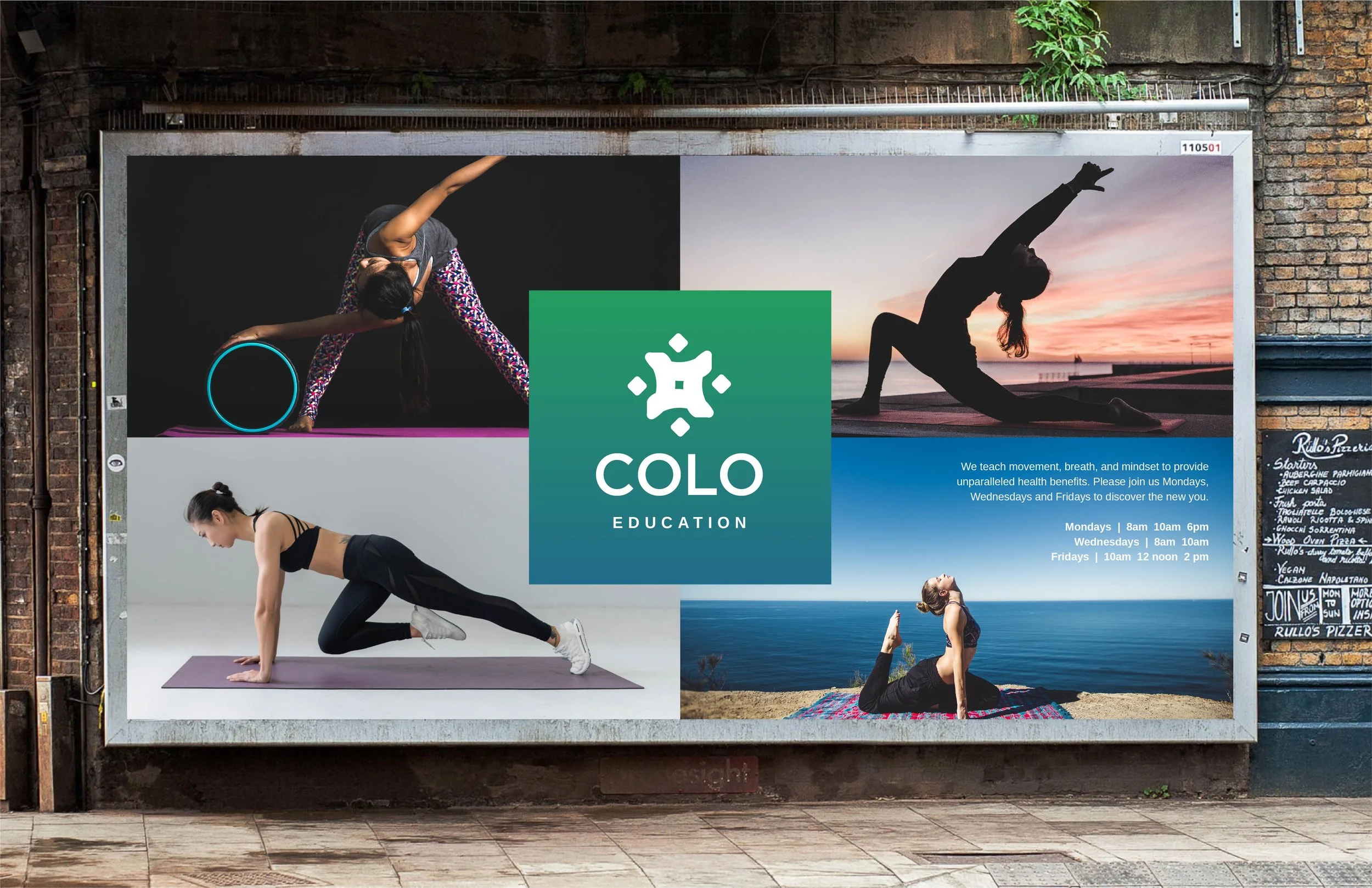
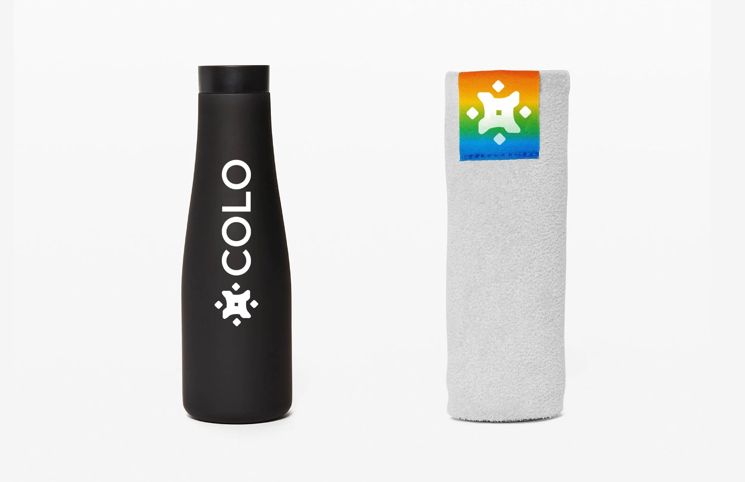
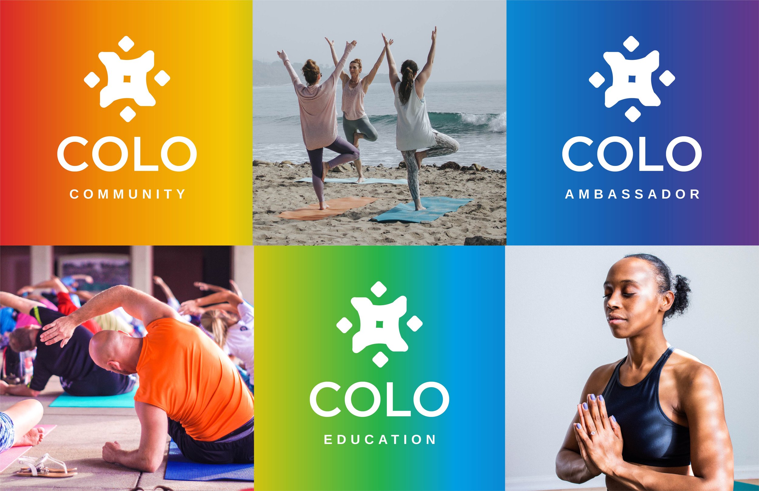
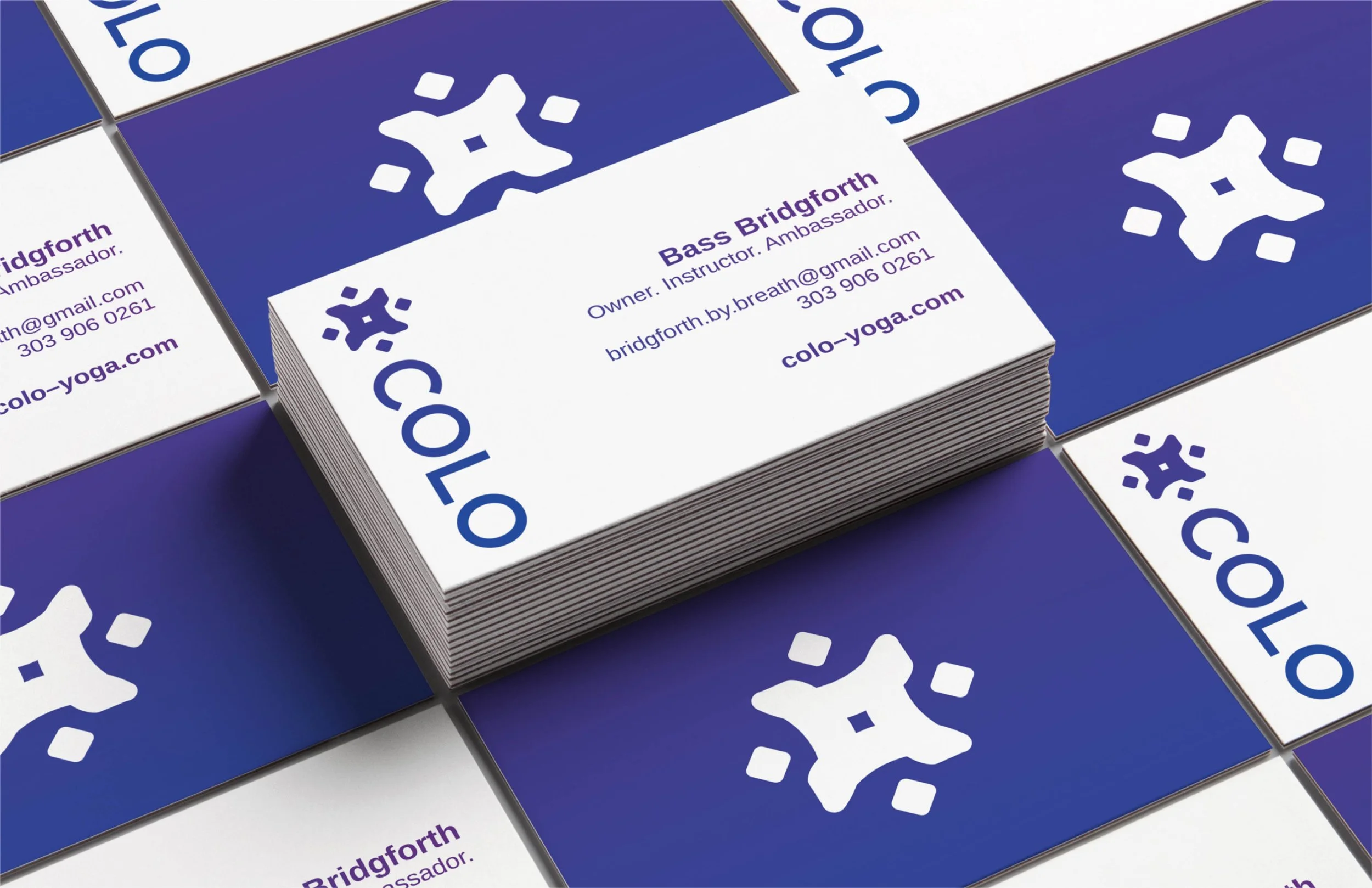
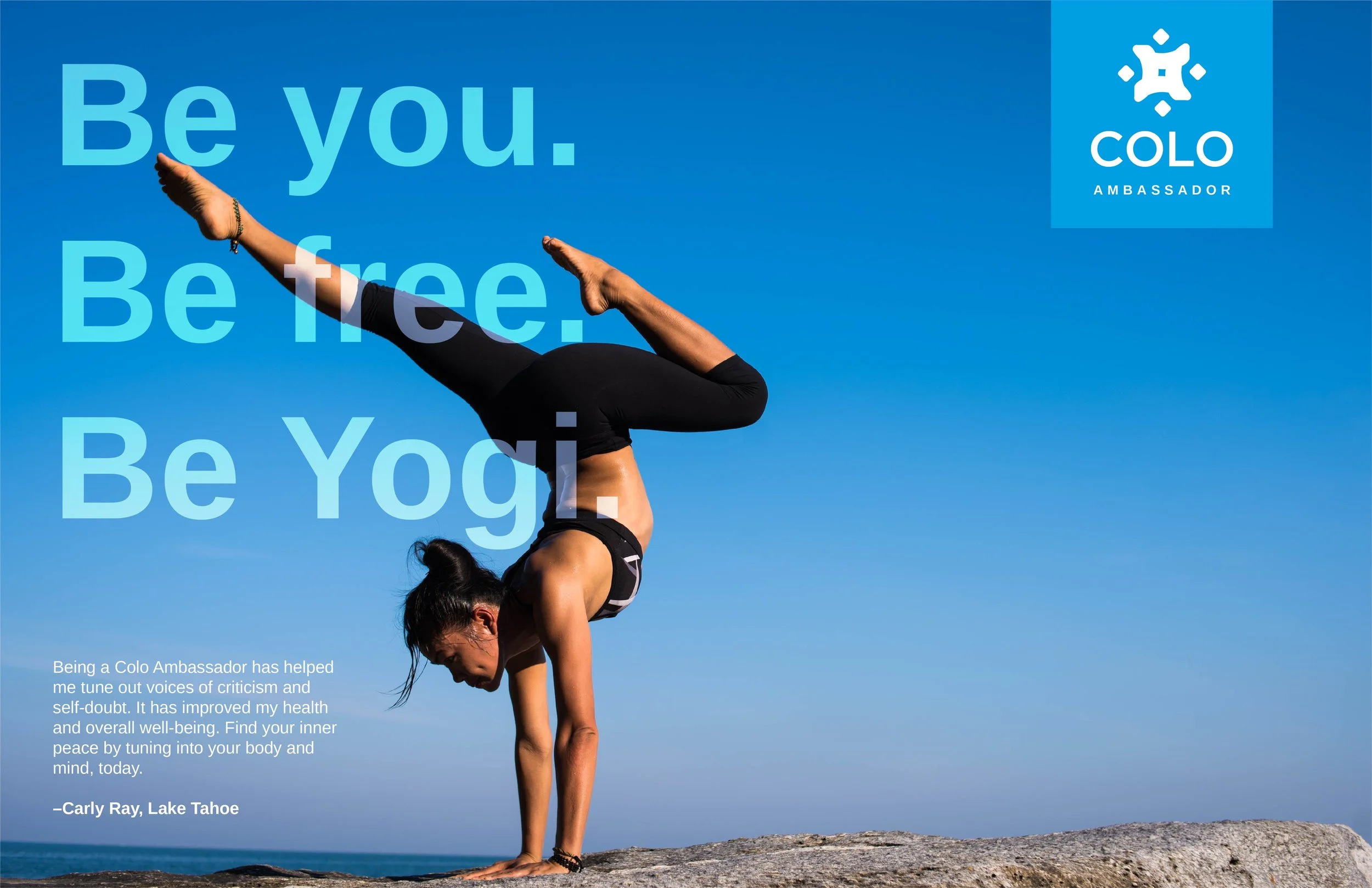
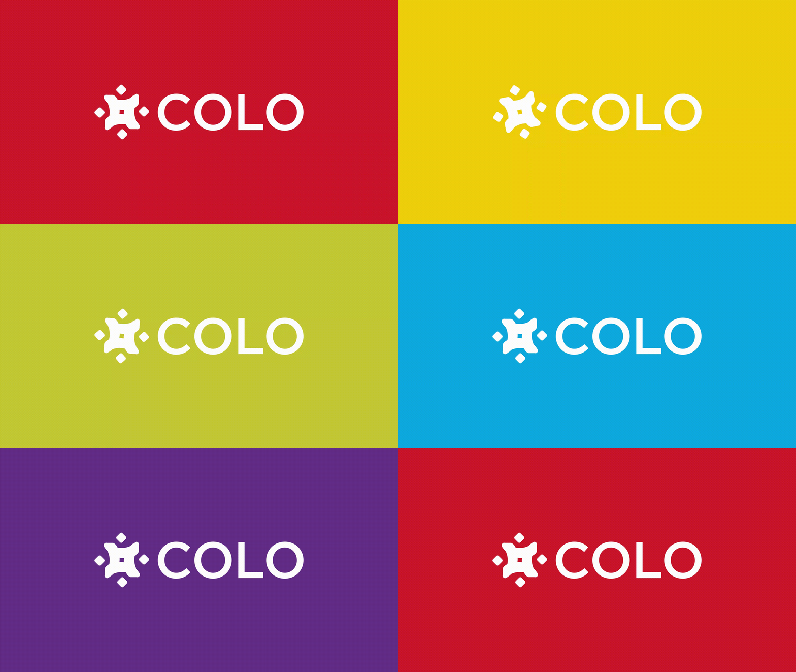
Bartlett Creative started with a brand audit of the national yoga landscape, then built Colo’s positioning around three words: connection, community and consciousness. The icon became the anchor. It was designed to express connection, support, balance and overall wellbeing in a single mark that reads instantly, whether stitched on a mat or shown in an app. The color palette draws on the chakras, pulling from yogic tradition and contemporary healing practices to give the brand a range of color that feels energizing, not clinical. A simple, confident sans serif keeps it grounded across digital, print and product. Brand voice and messaging tied it all together, so Colo sounds as open and encouraging as it looks.
-
Health & Wellness · Yoga
-
Choose love over fear.
-
Brand audit, positioning, logo and icon design, color system, typography, brand voice and messaging
-
Startup · National yoga market
-
Creative Director: Travis Bartlett
Art Director: Travis Bartlett
Lead Designer: Travis Bartlett
Copywriter: Travis Bartlett