Dempsey Challenge
Context
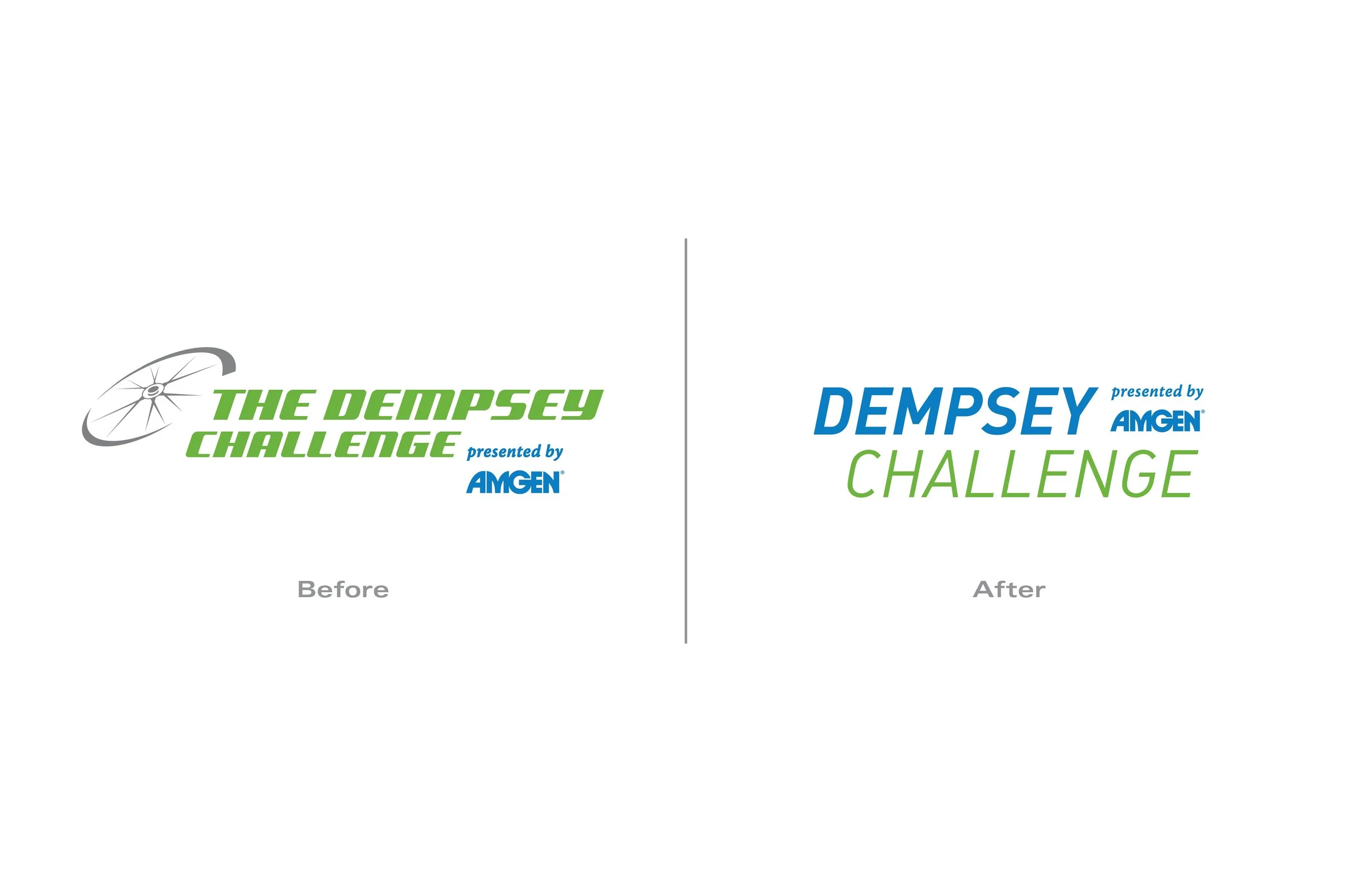
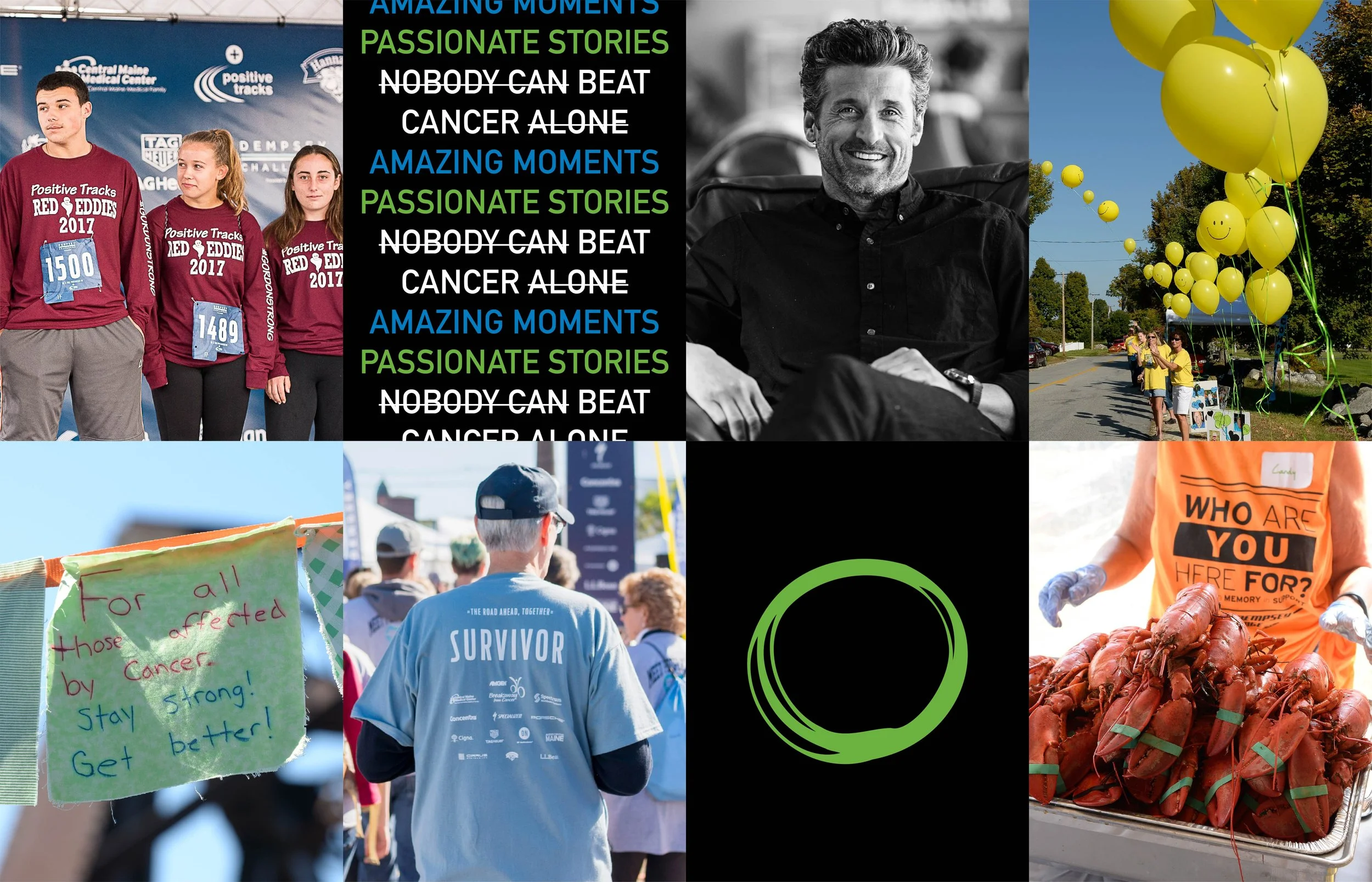
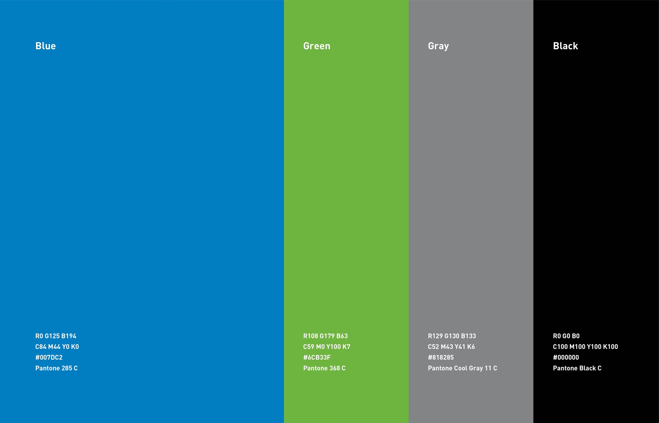
Every September, thousands of people walk, run and ride through Lewiston, Maine for the Dempsey Challenge. It’s the flagship fundraiser for the Dempsey Center, founded by Patrick Dempsey after his mother’s cancer diagnosis. The Challenge has raised more than $20 million, and every dollar funds free support for people impacted by cancer: patients, survivors, caregivers and families. The event had outgrown its look. The old mark, a bike wheel and heavy slanted type, tied the brand to cycling when the Challenge had become something bigger. The organization loved its colors and its history. It needed a brand that felt more approachable, more active and built to last.
Approach
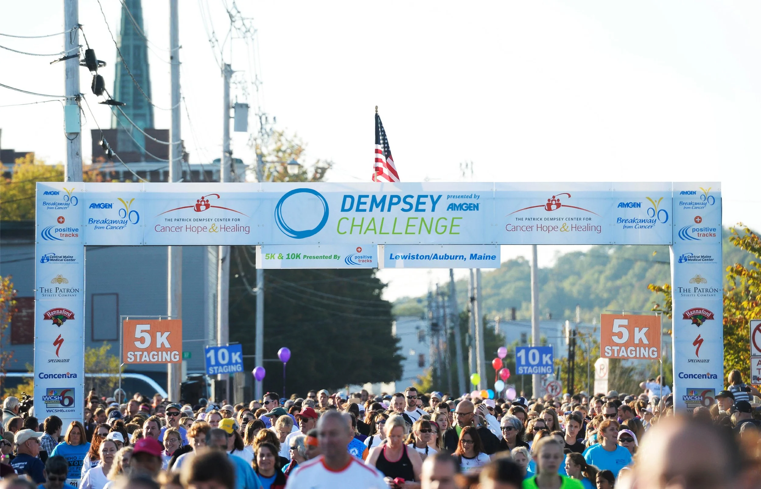
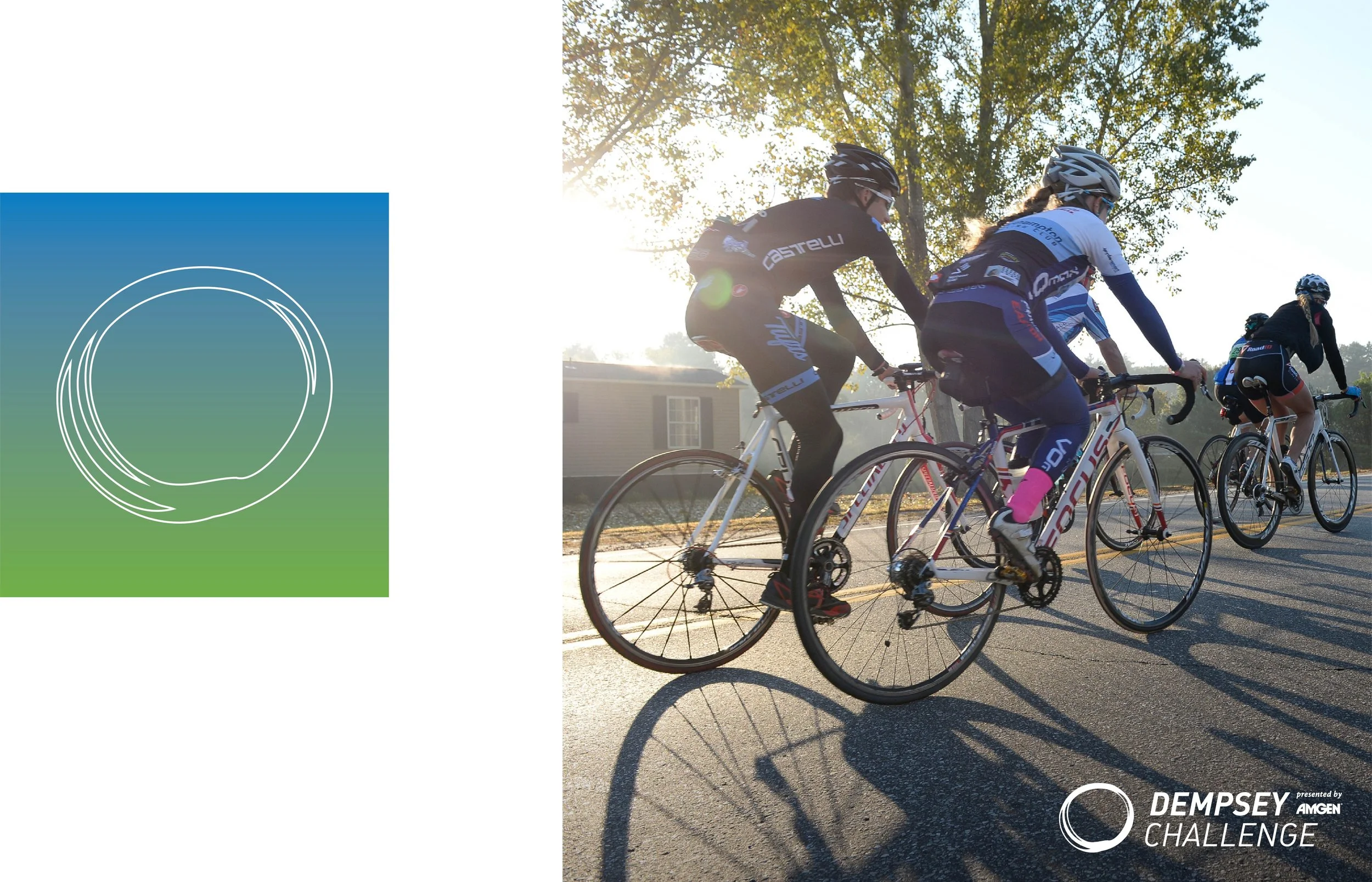
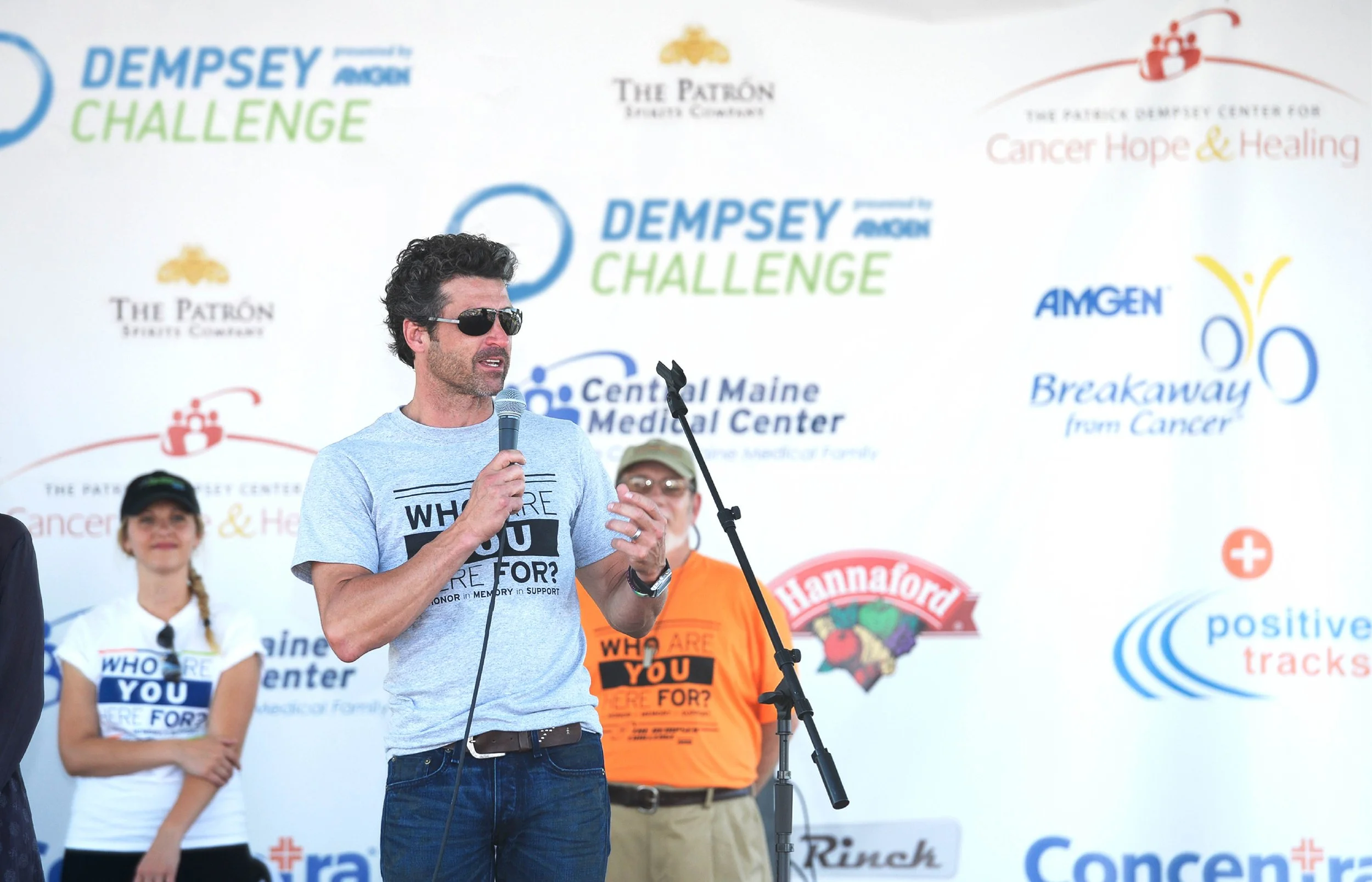
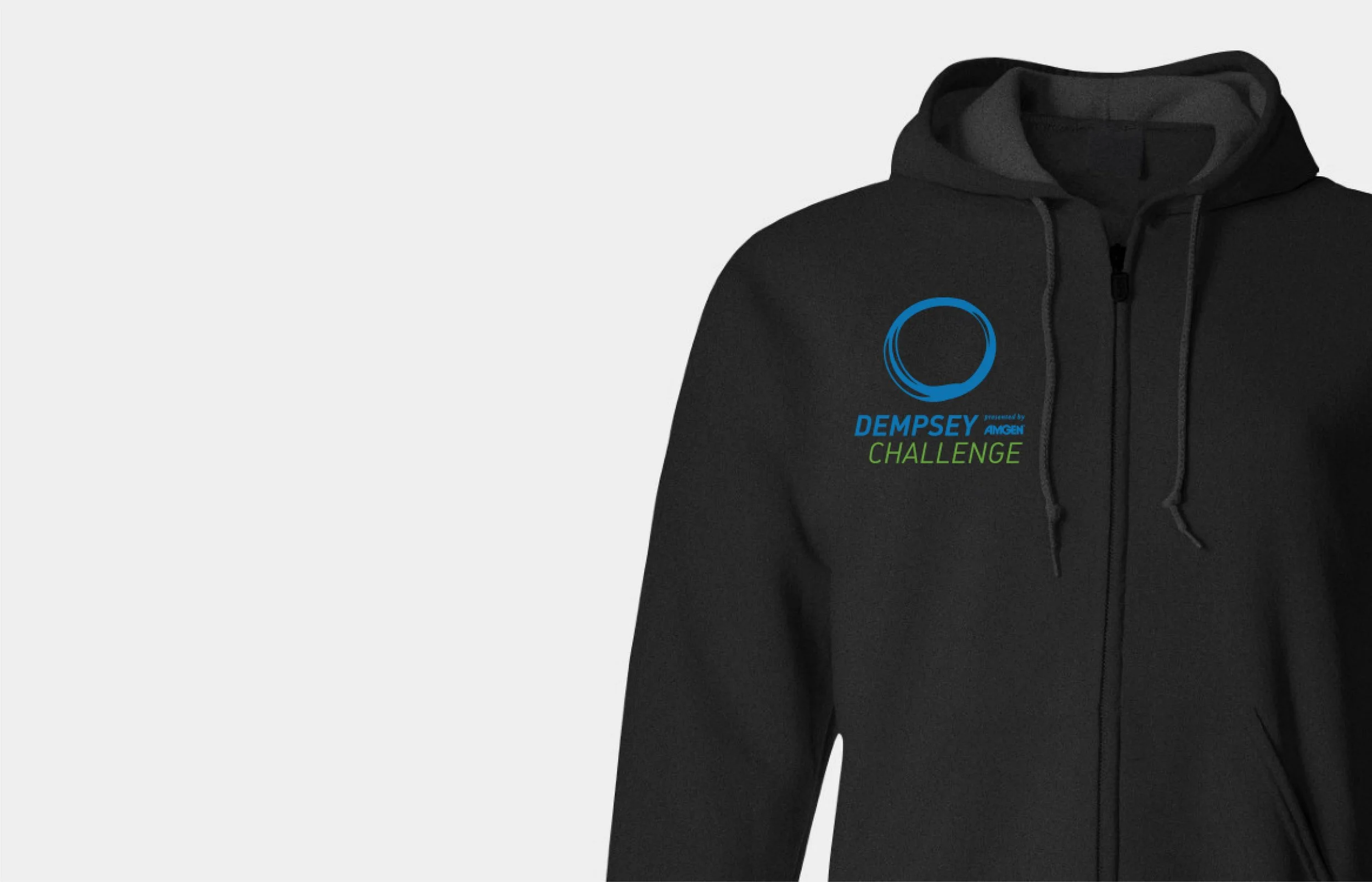
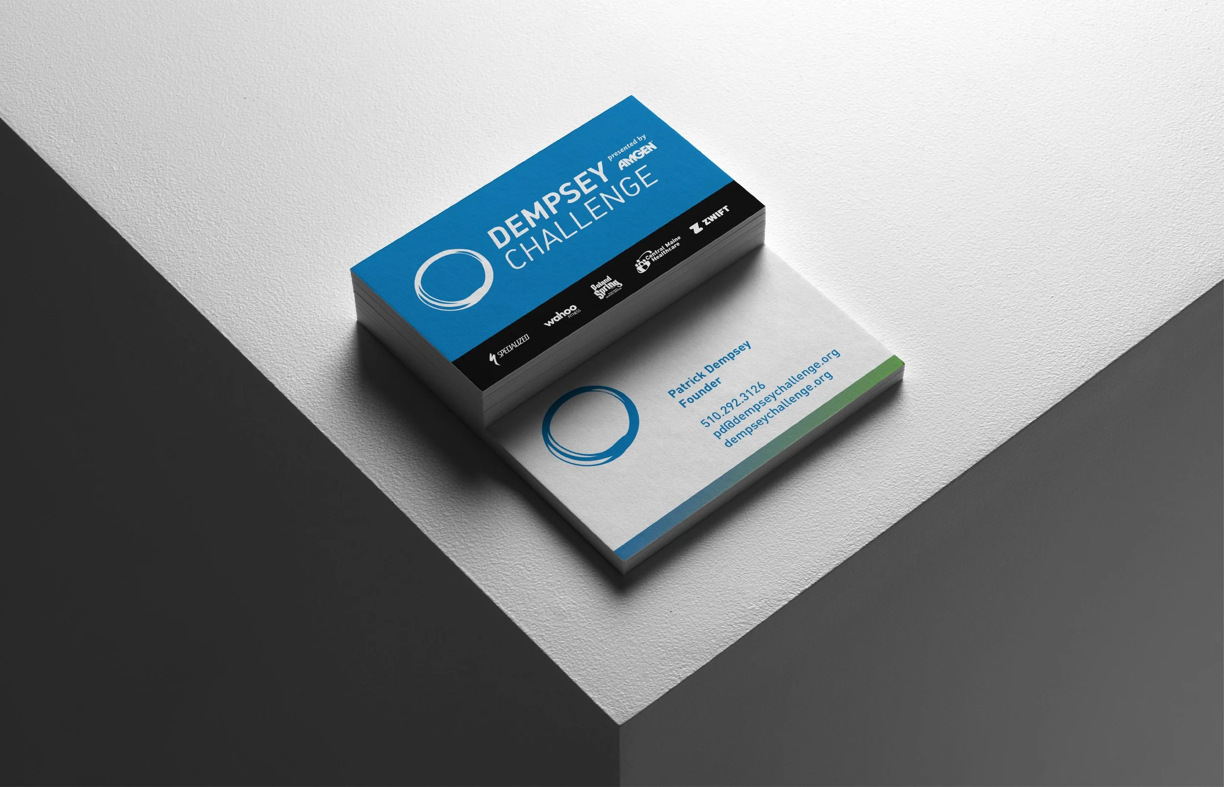
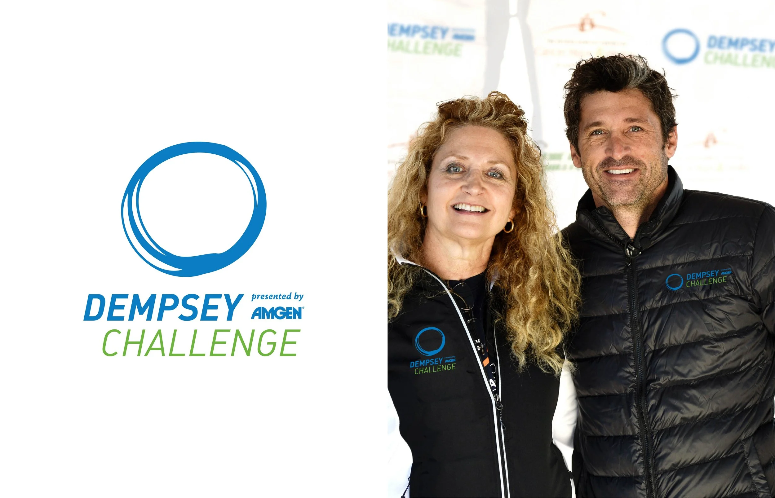
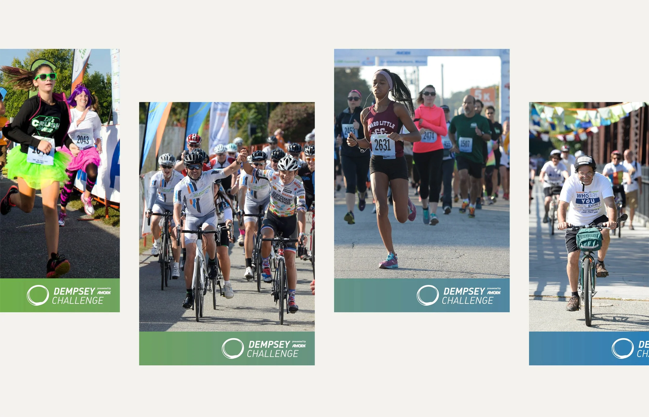
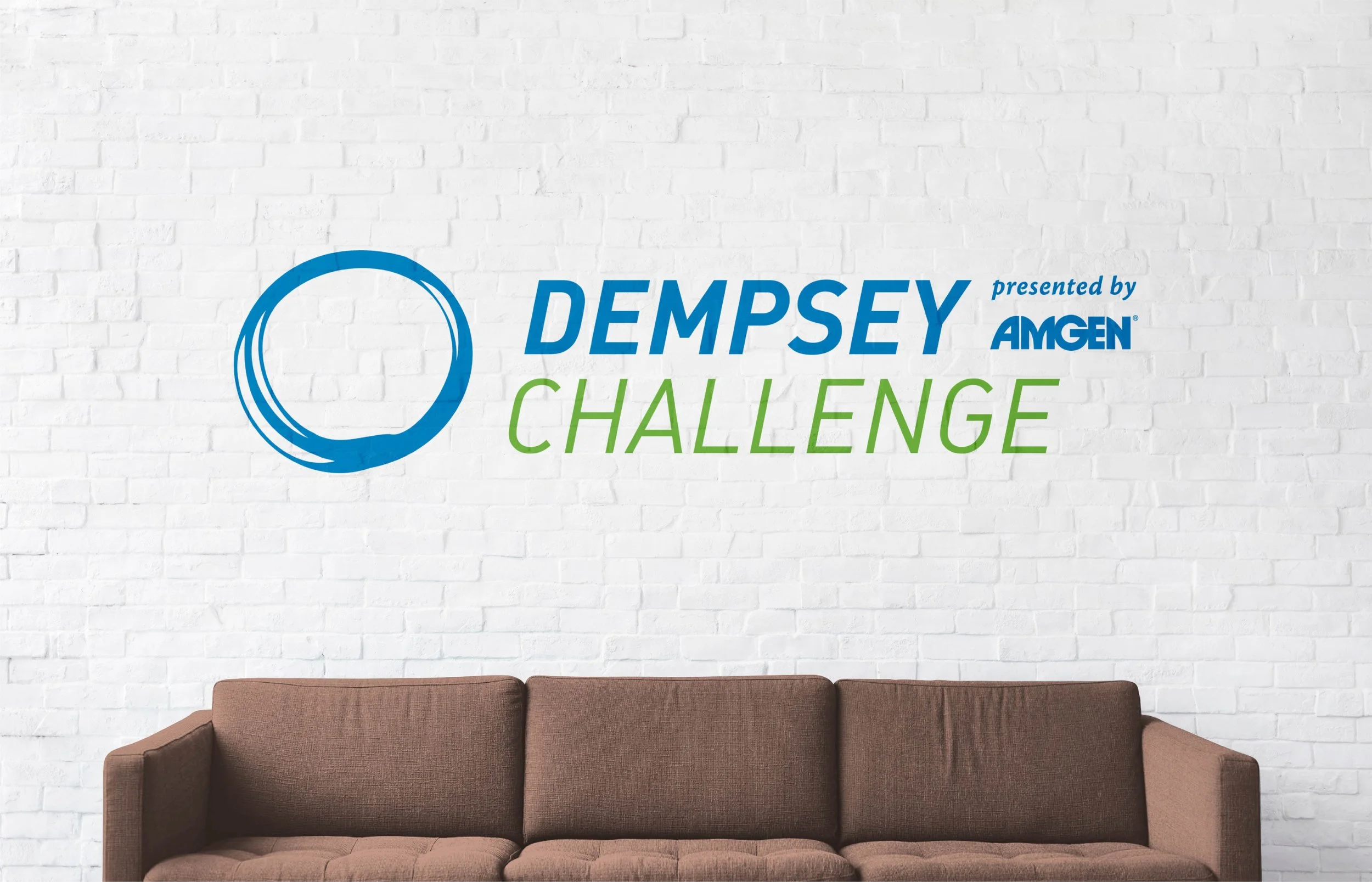
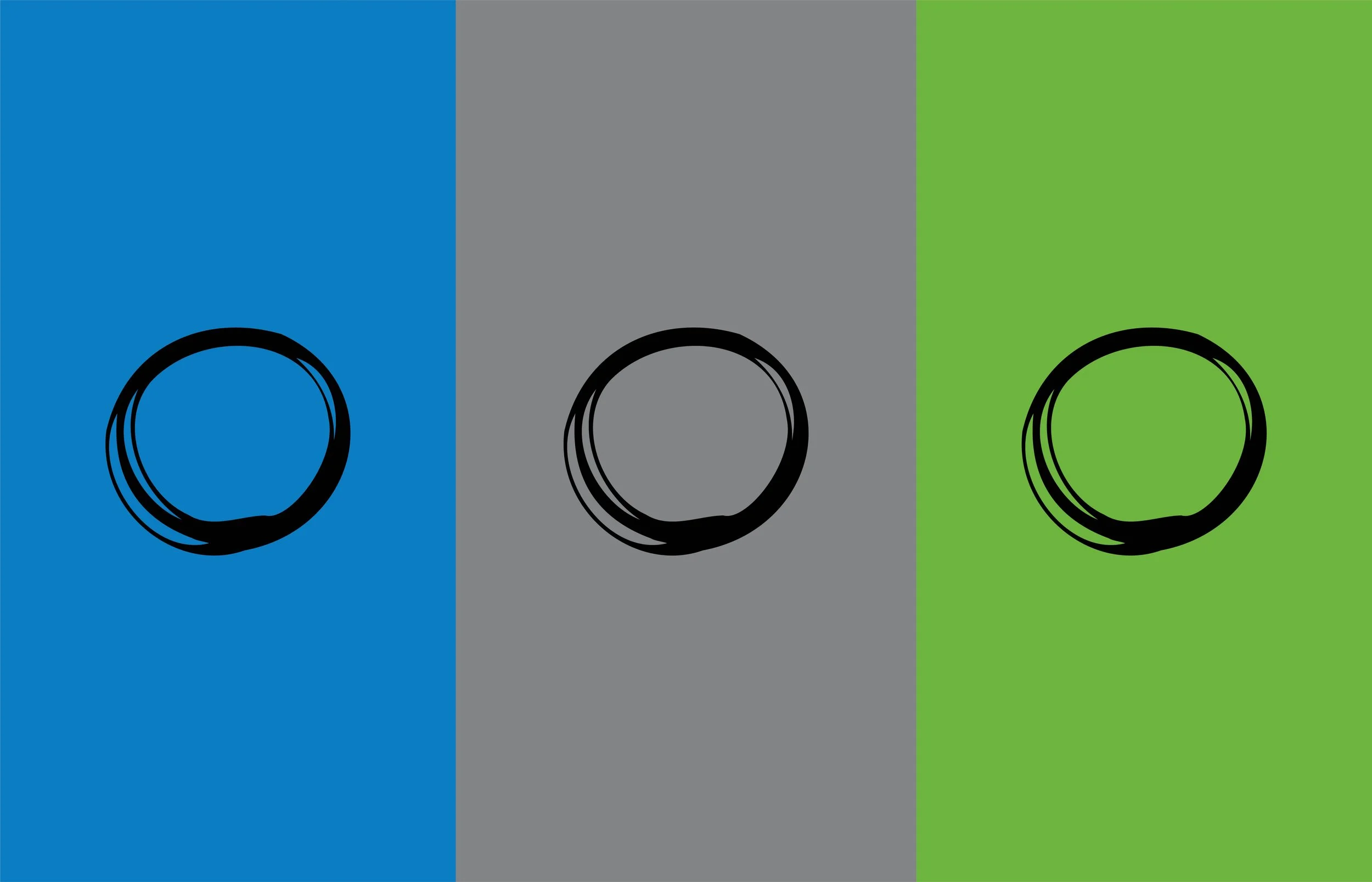
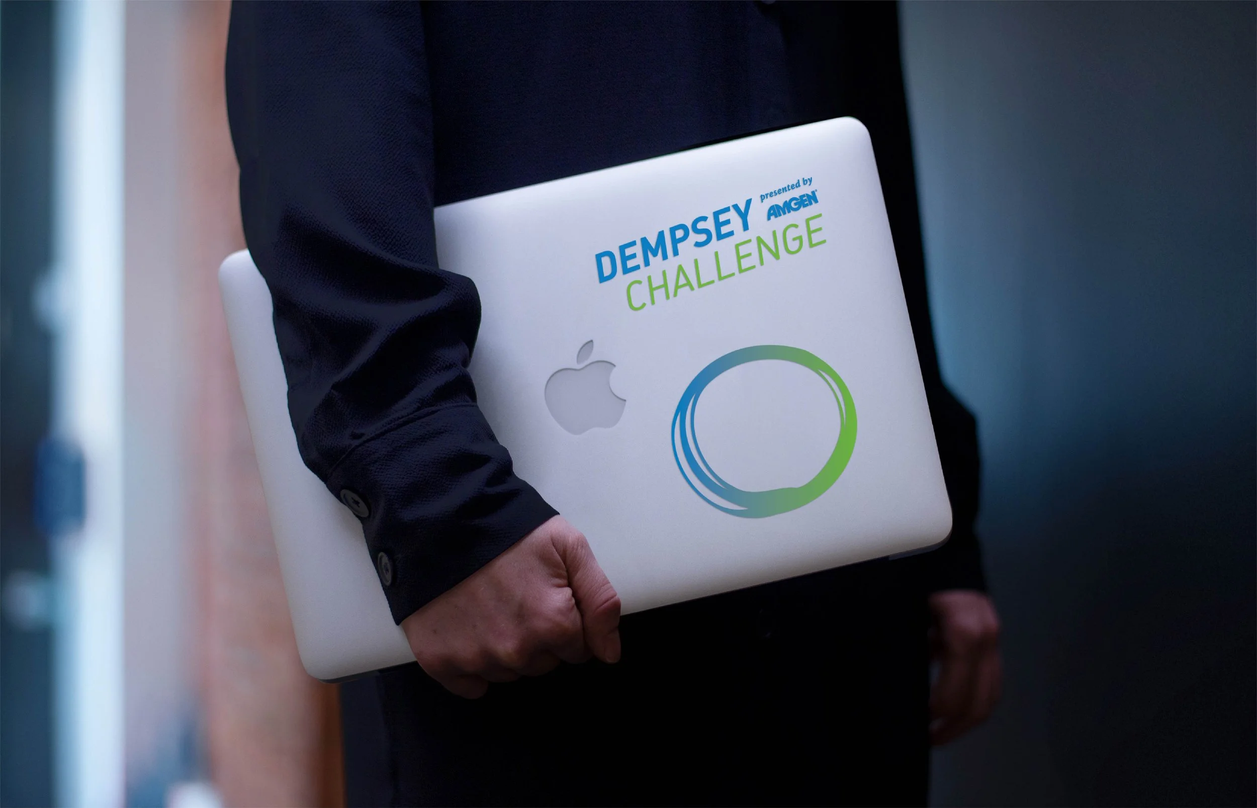
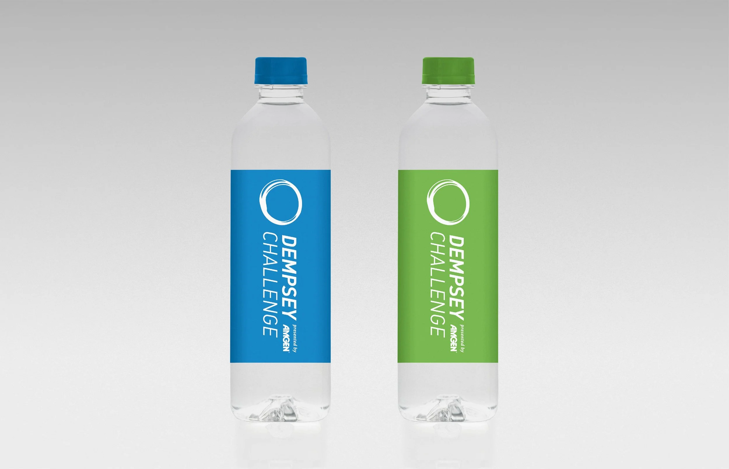
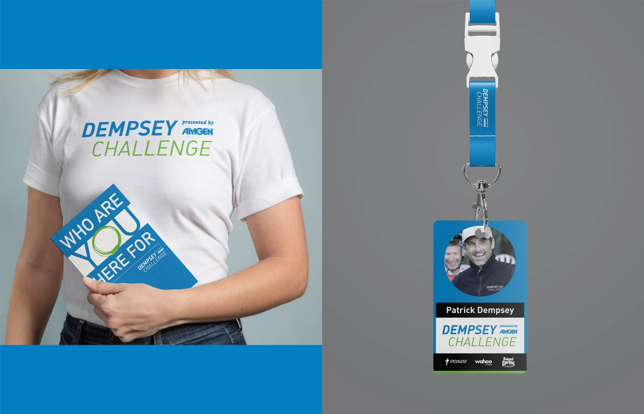
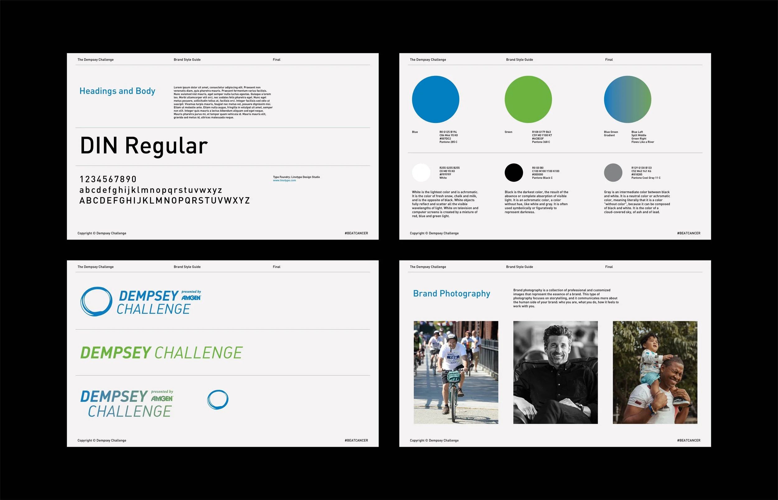
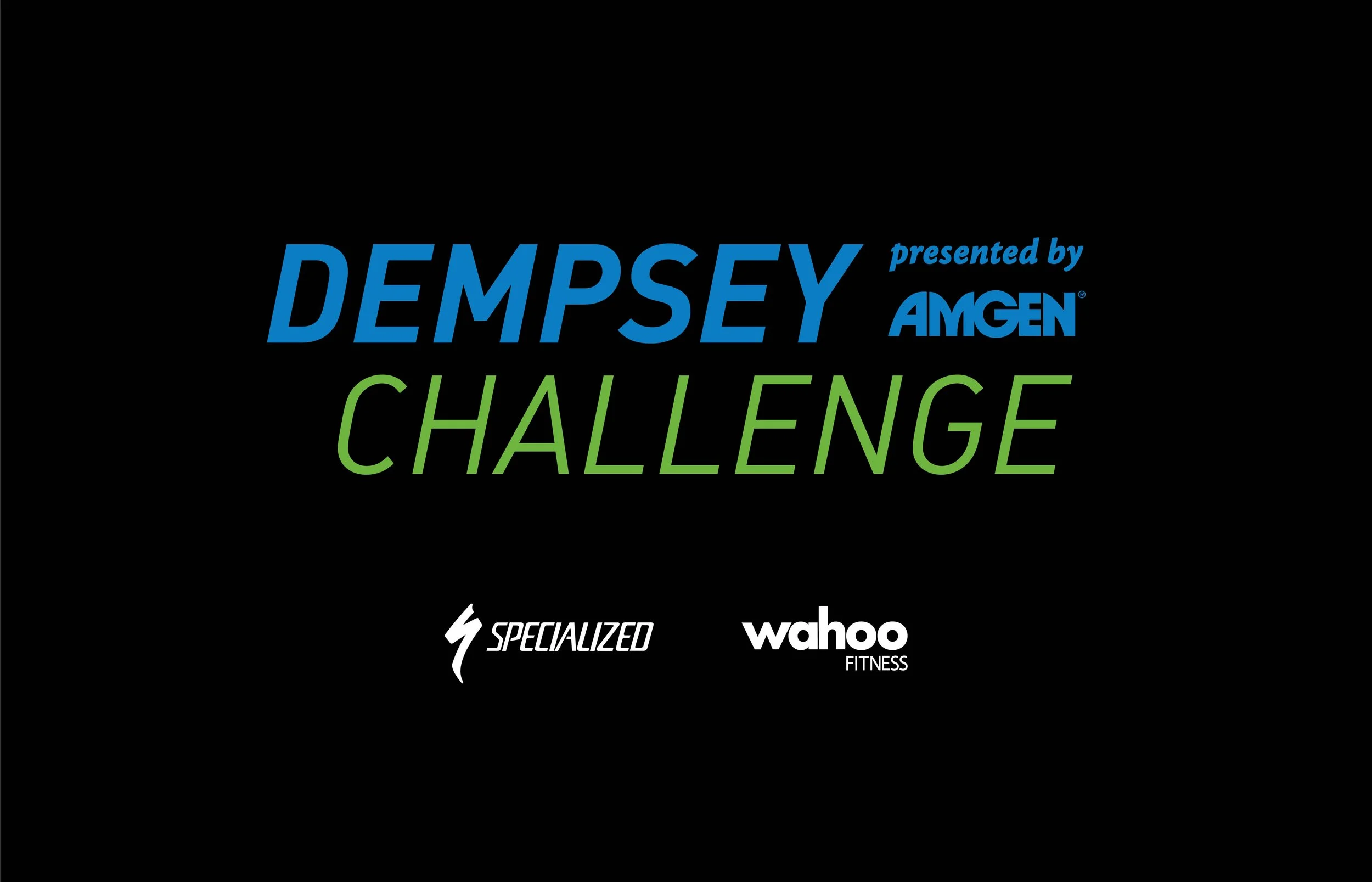
We kept the green and blue the community already knew and rebuilt everything around them. After exploring multiple directions, we landed on a simple hand-drawn circle. It’s loose, human and imperfect on purpose, a symbol of unity and of the idea that nobody faces cancer alone. For the logotype, we chose a type family with enough range to pair a bold italic DEMPSEY with a lighter CHALLENGE, so the wordmark itself feels like it’s in motion. The system had to flex: stacked, single-line, centered, with or without the icon, and always locked up with the Amgen presenting sponsor. It worked on everything from start-line arches and sponsor backdrops to apparel, swag and race day signage. A refresh built for one weekend a year that keeps showing up all year long.
Includes: Logo and icon, logotype, lockup system, sponsor integration, apparel and swag, sponsor backdrops, race day signage, campaign typography
-
Nonprofit · Health · Endurance Events
-
A brand refresh for the Dempsey Challenge, the flagship fundraiser for the Dempsey Center in Lewiston, Maine. The new identity keeps the colors the community knew and replaces a cycling-only mark with a simple hand-drawn circle and an active logotype, built for an event where people walk, run and ride together.
-
Brand refresh · Icon and logotype · Lockup system · Sponsor integration · Apparel and swag · Sponsor backdrops · Race day signage
-
Thousands of participants every September · More than $20 million raised since the event began · In-person and virtual
-
Creative Director: Kirk Erickson, Device Creative
Art Director: Travis Bartlett
Lead Designer: Travis Bartlett