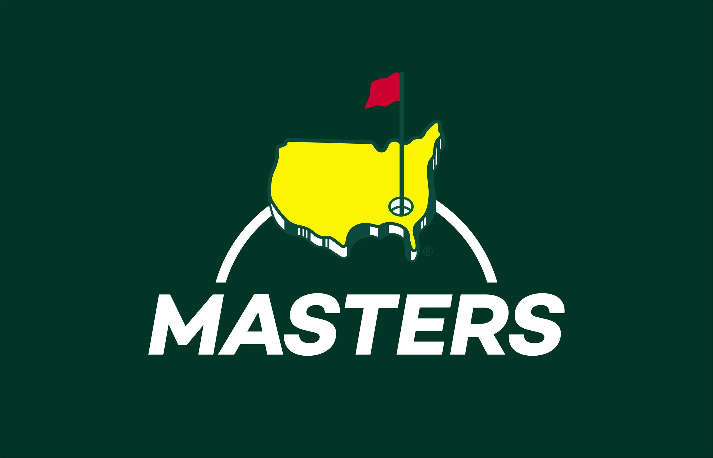
The Masters
Context
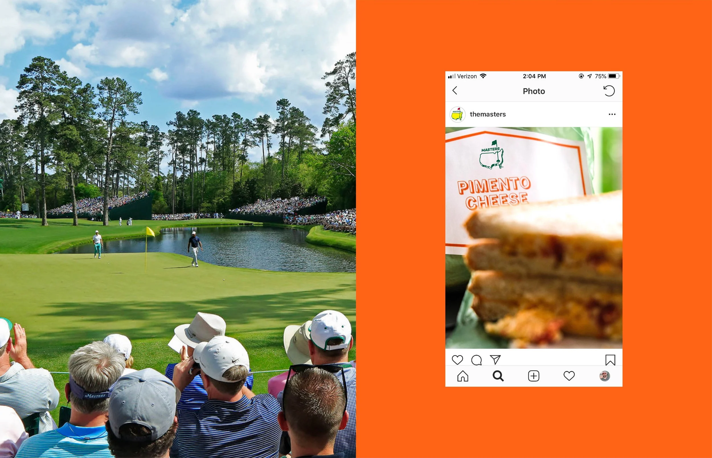
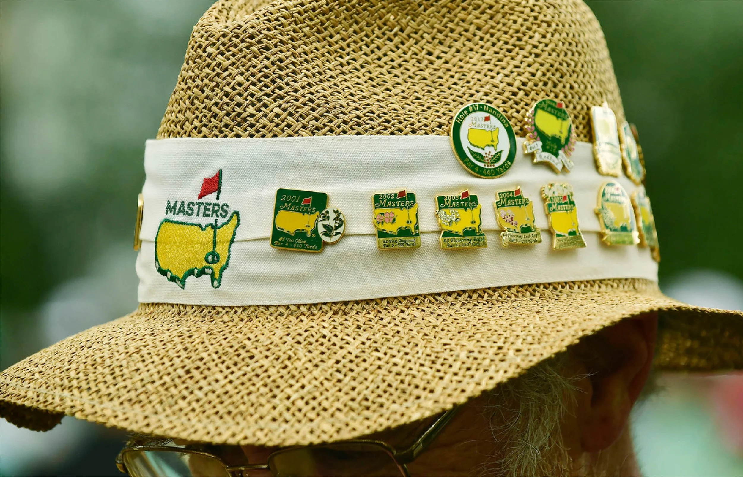
Some brands evolve. The Masters refuses to. Since 1934, Augusta National has guarded every detail of golf’s most storied week, from the green jacket to the pimento cheese, and its identity is no exception. The iconic mark and classic serif logotype have barely moved in decades, and that’s exactly the point. Tradition is the brand. But it raises a question every designer has asked at some point: what would the Masters look like if it played by today’s design rules? This project set out to answer it.
Approach
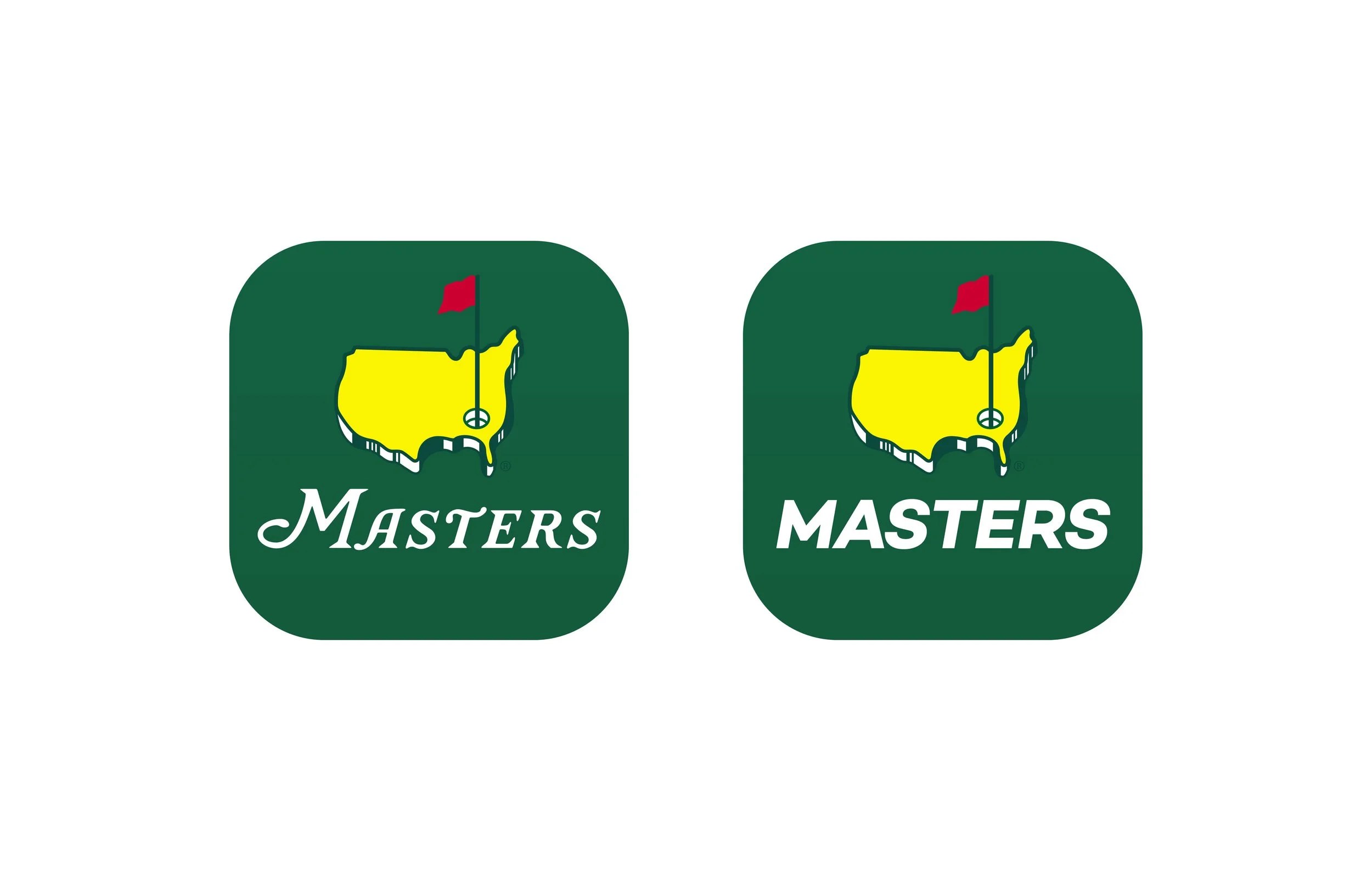
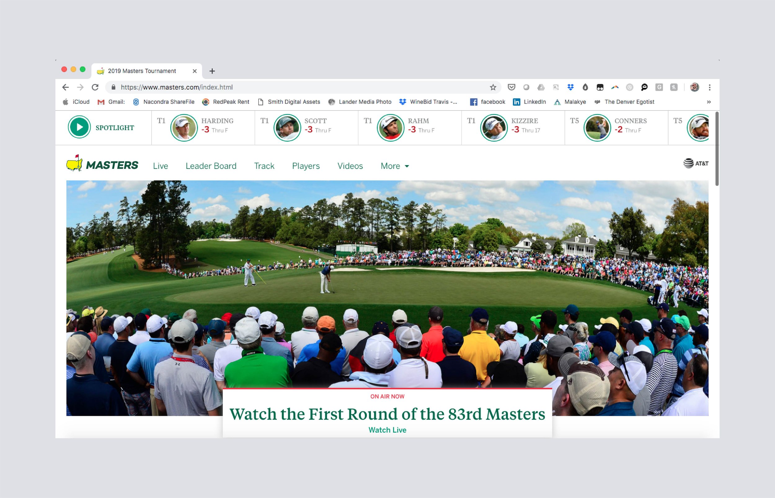
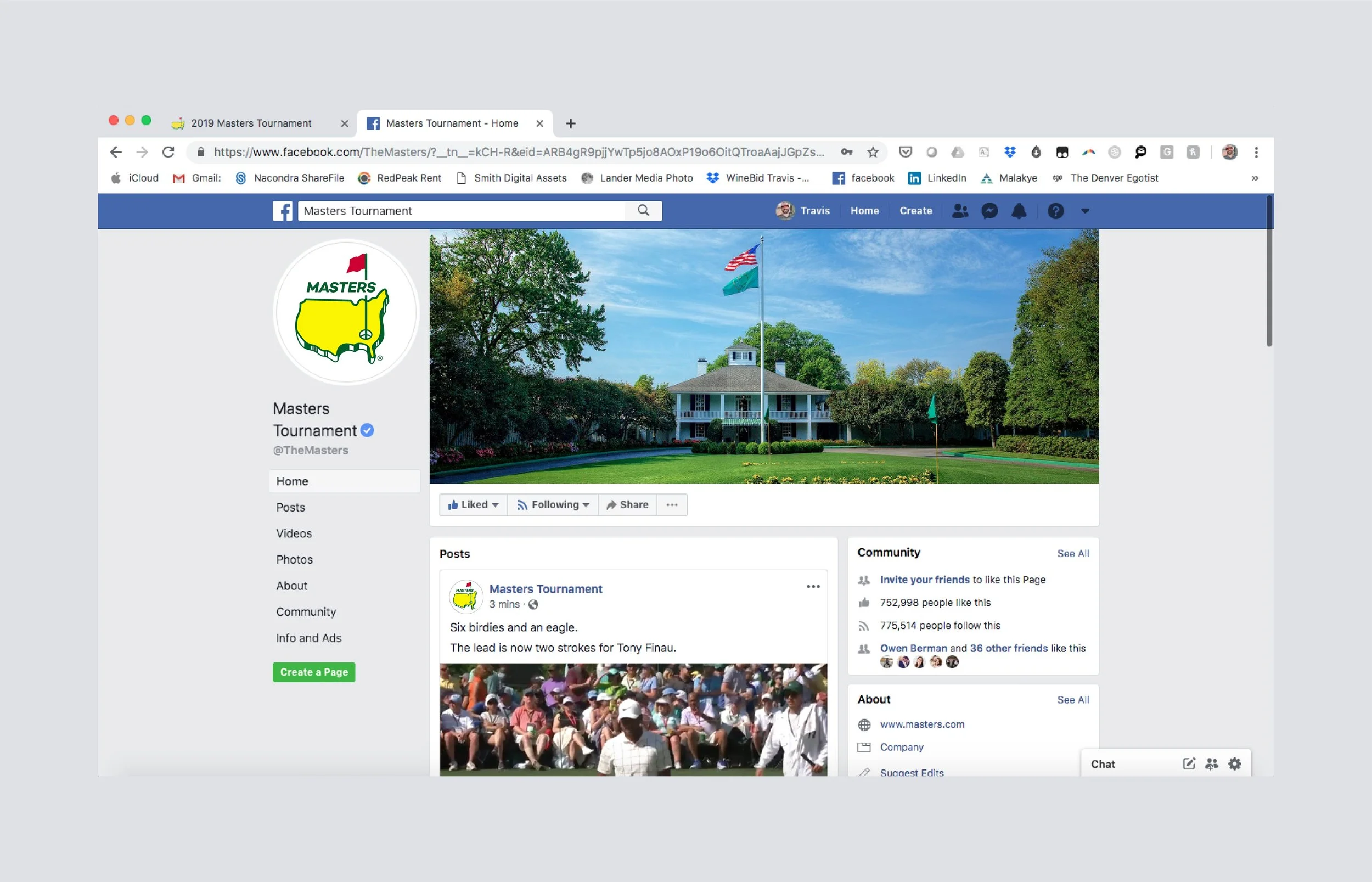
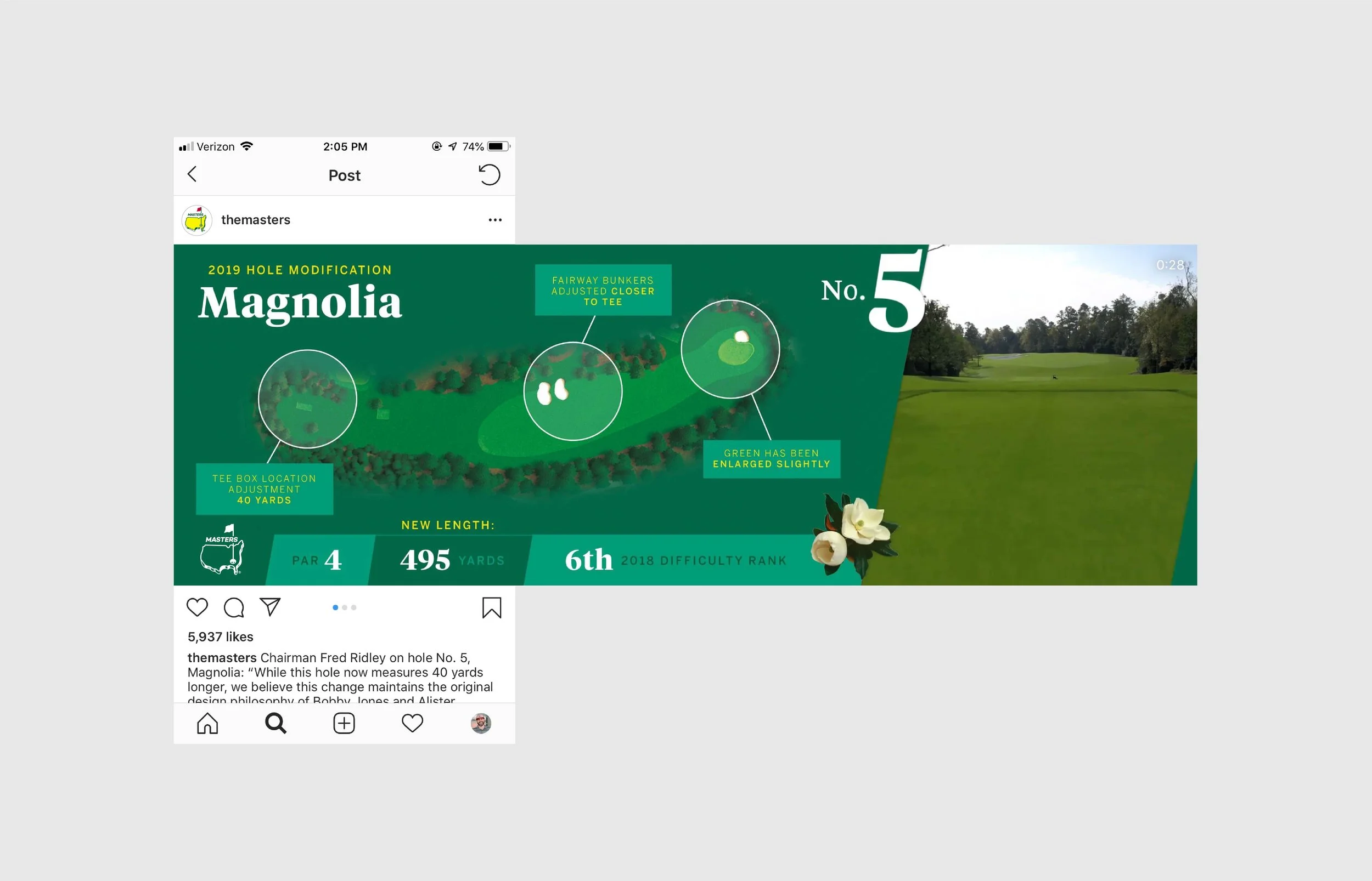
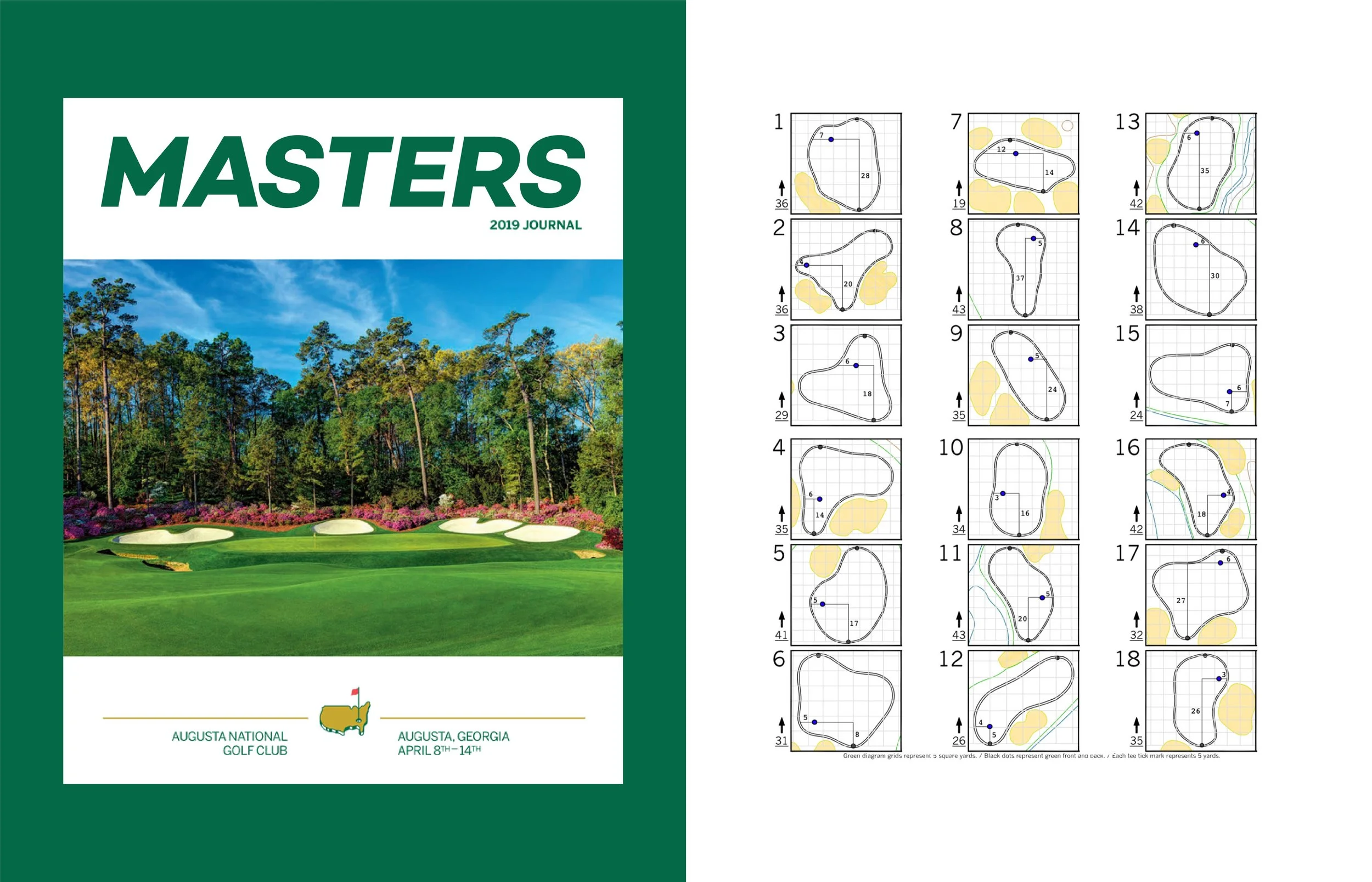
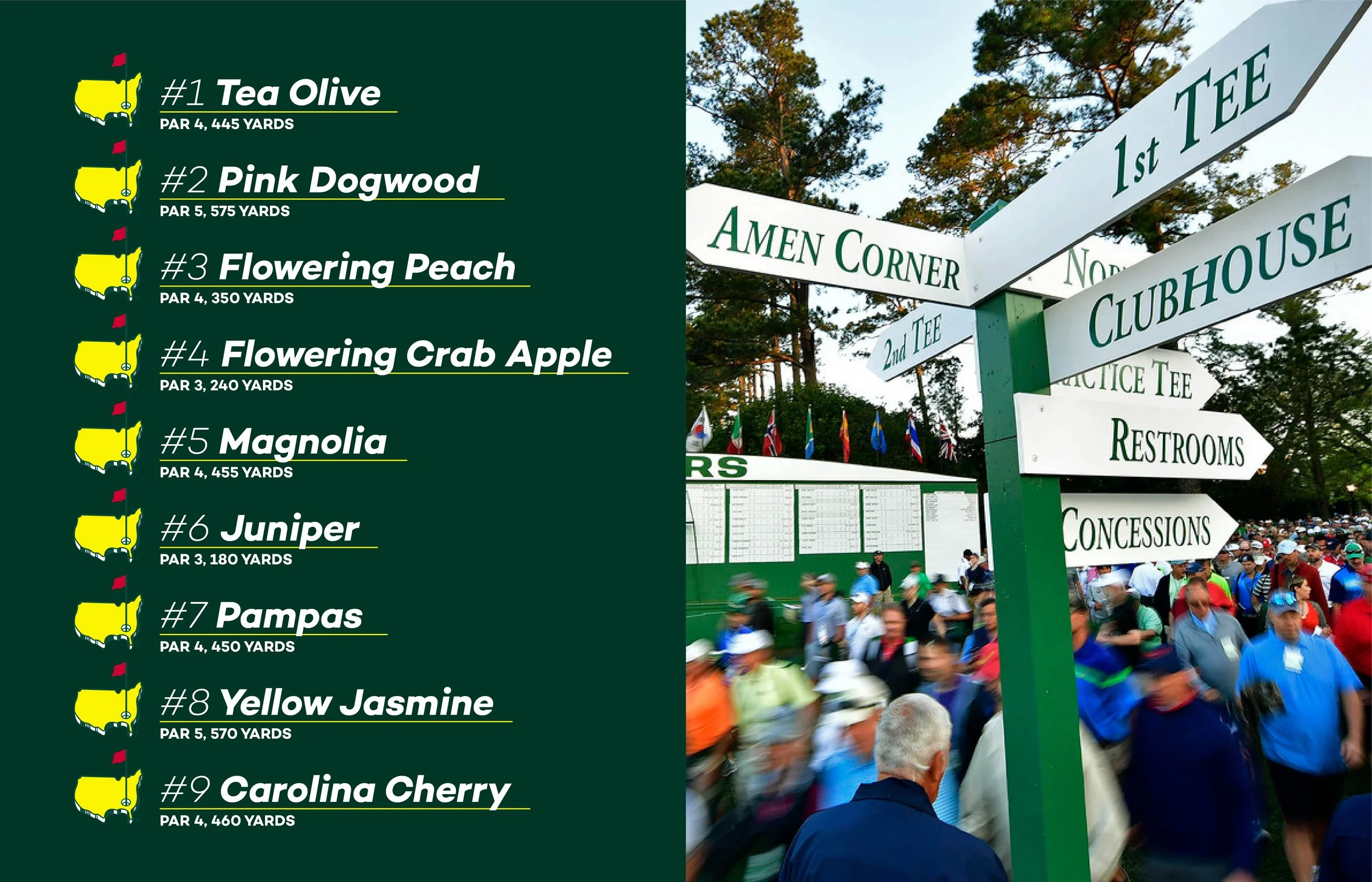
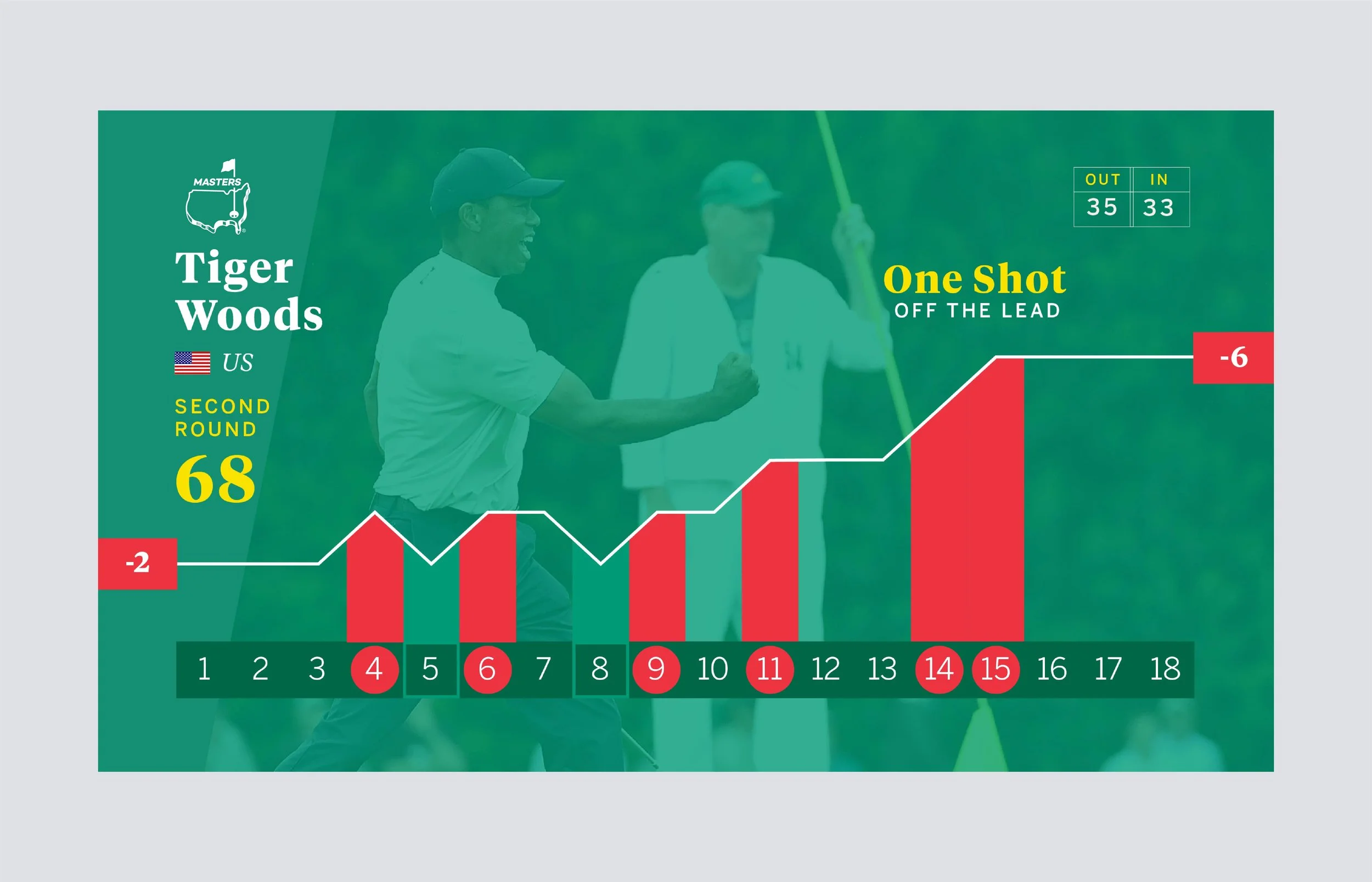
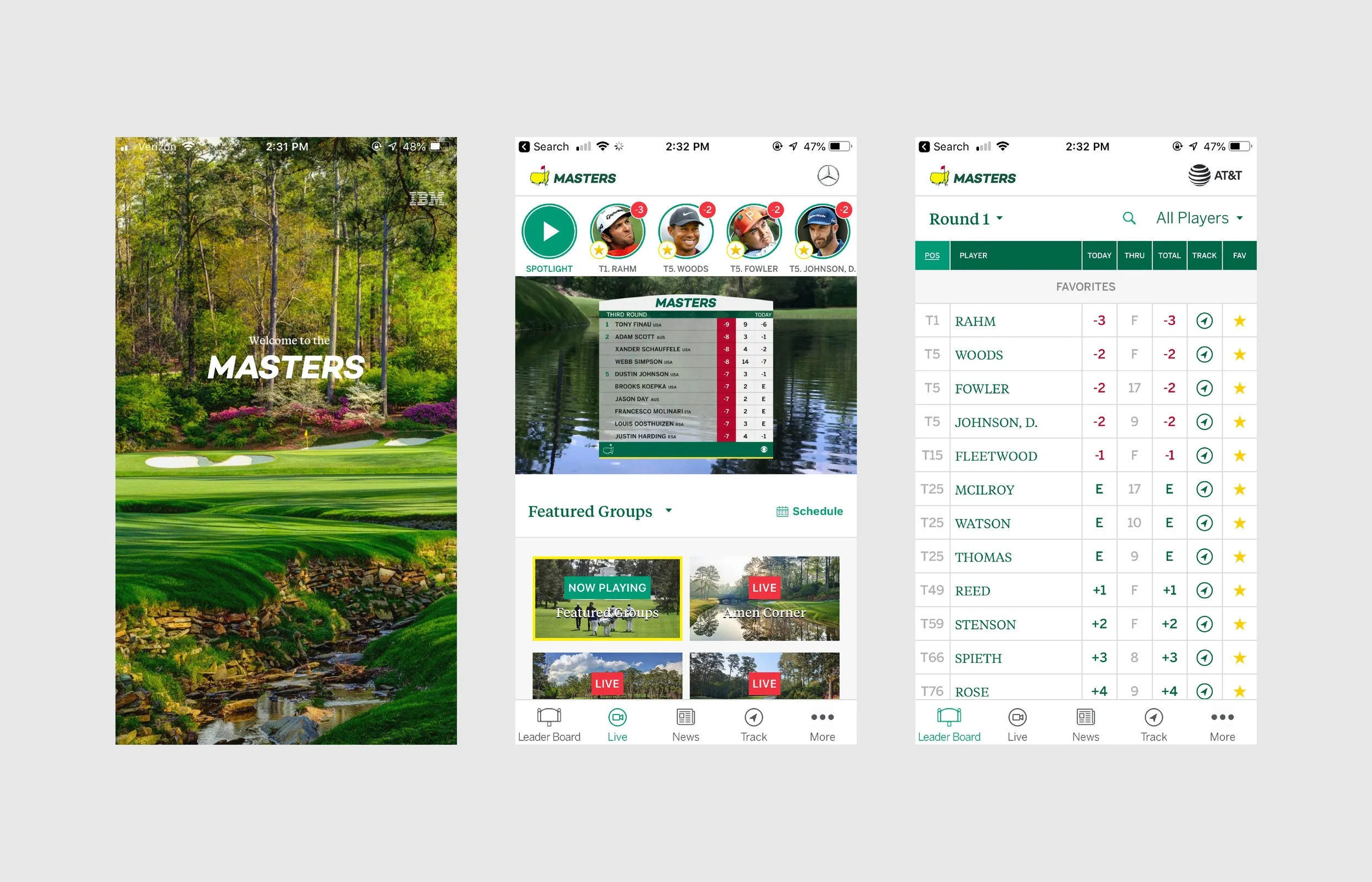
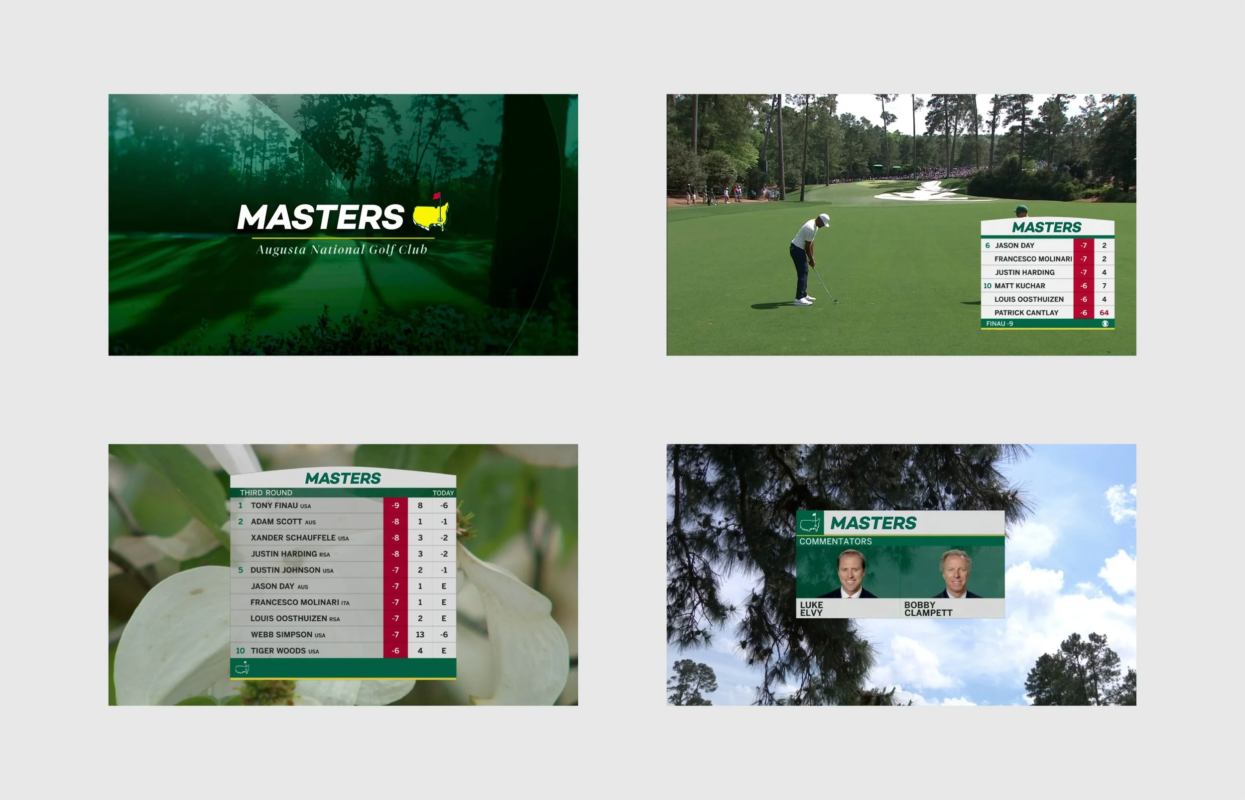
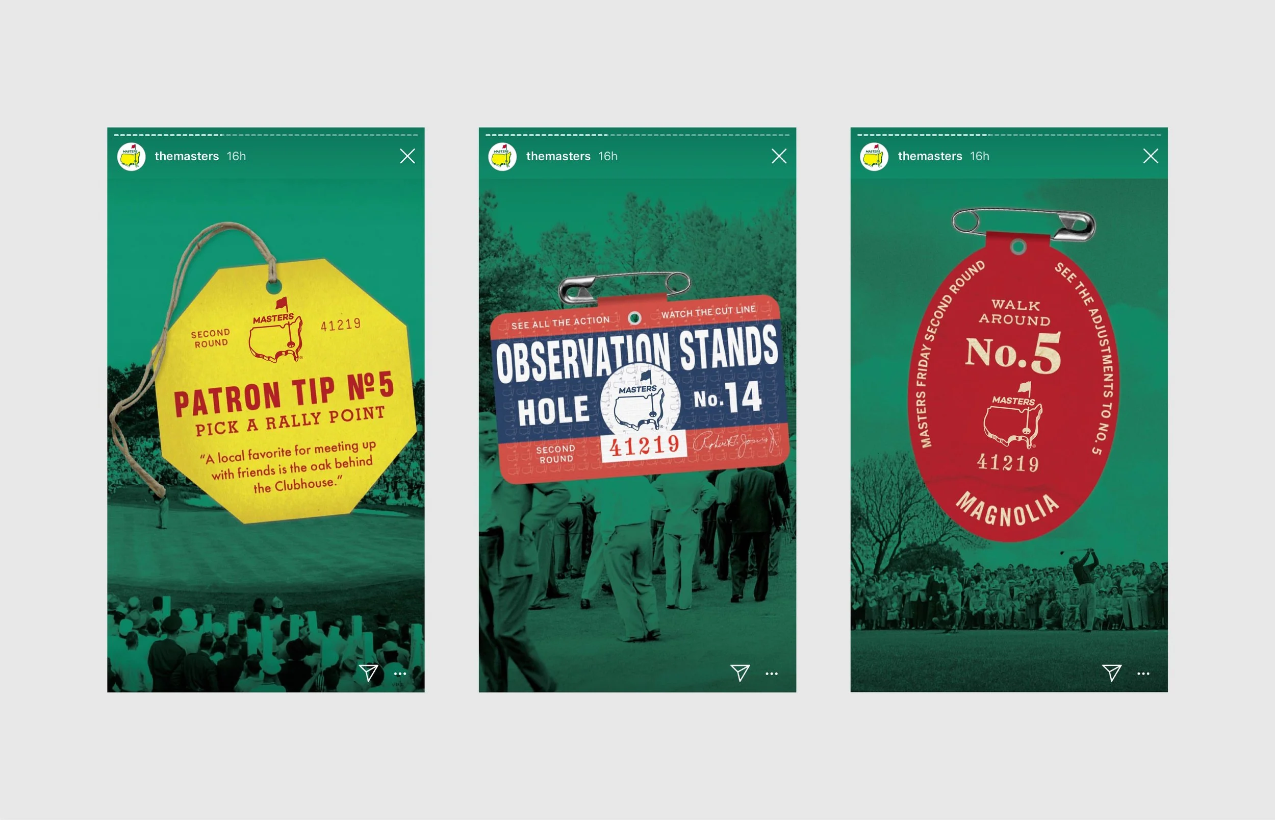
We started with a brand audit, separating what makes the Masters the Masters from what is simply the way it has always been done. The answer shaped every decision. The Masters icon is even more iconic than its logotype, so the mark stayed exactly as is. The logotype is where we pushed. We traded the familiar serif for a clean, modern sans serif built to feel current without losing the quiet confidence of the original. From there, the concepts were tested across across merchandise, signage, scoreboard and digital applications to see whether a modern Masters could still feel like a tradition unlike any other. The result is a respectful provocation: proof that even the most protected brands can be reimagined without being replaced.
***This is a passion project and is in no way connected with the Masters or Augusta National, Inc.
-
Sports · Golf
-
A tradition, reimagined.
-
Brand audit, logo rebrand, typography, creative concepts
-
Golf’s most storied major · 90+ year heritage brand
-
Creative Director: Travis Bartlett
Art Director: Travis Bartlett
Lead Designer: Travis Bartlett