ReconnectCare
Context
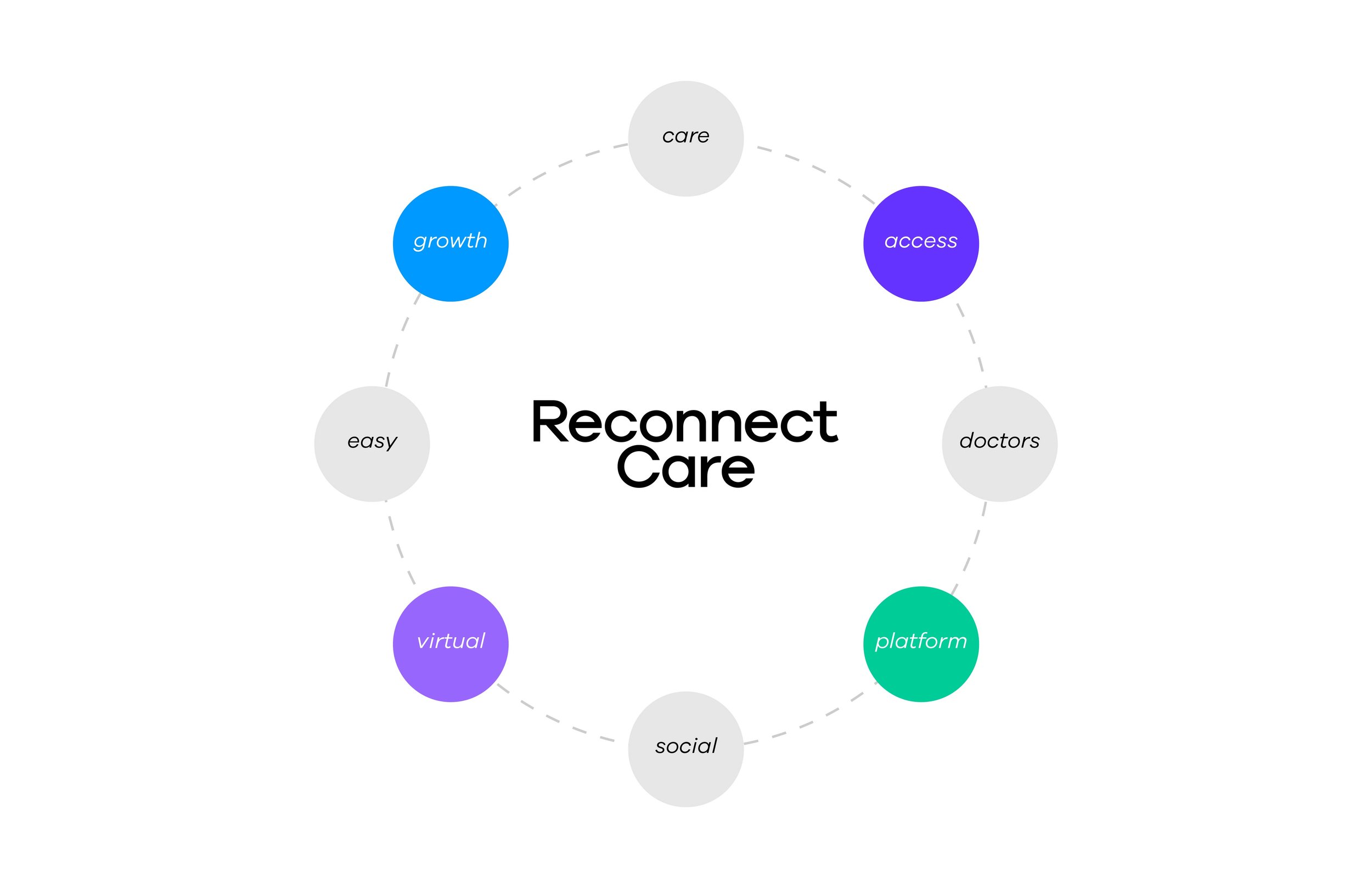
Healthcare is moving online, and patients have more virtual options than ever. That makes it harder for a new platform to earn trust. ReconnectCare is an early-stage virtual health company built on a simple idea: bring doctors and patients together in one place, with easy access to health experts through a web-based platform. But a new company asking people to trust it with their health can’t look like a startup. It needed a brand that felt established, warm and modern from day one, and that could stand out in a crowded virtual care market.
Approach
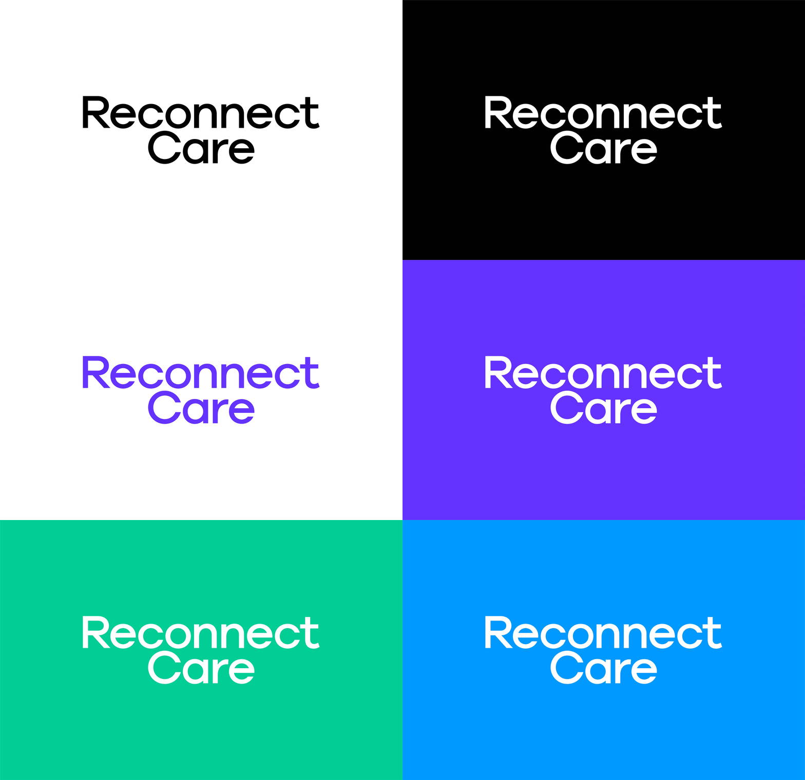
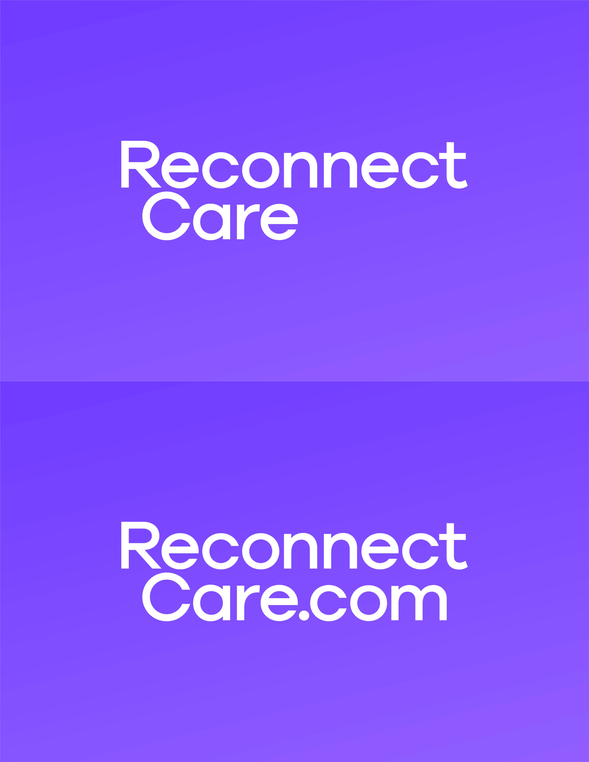
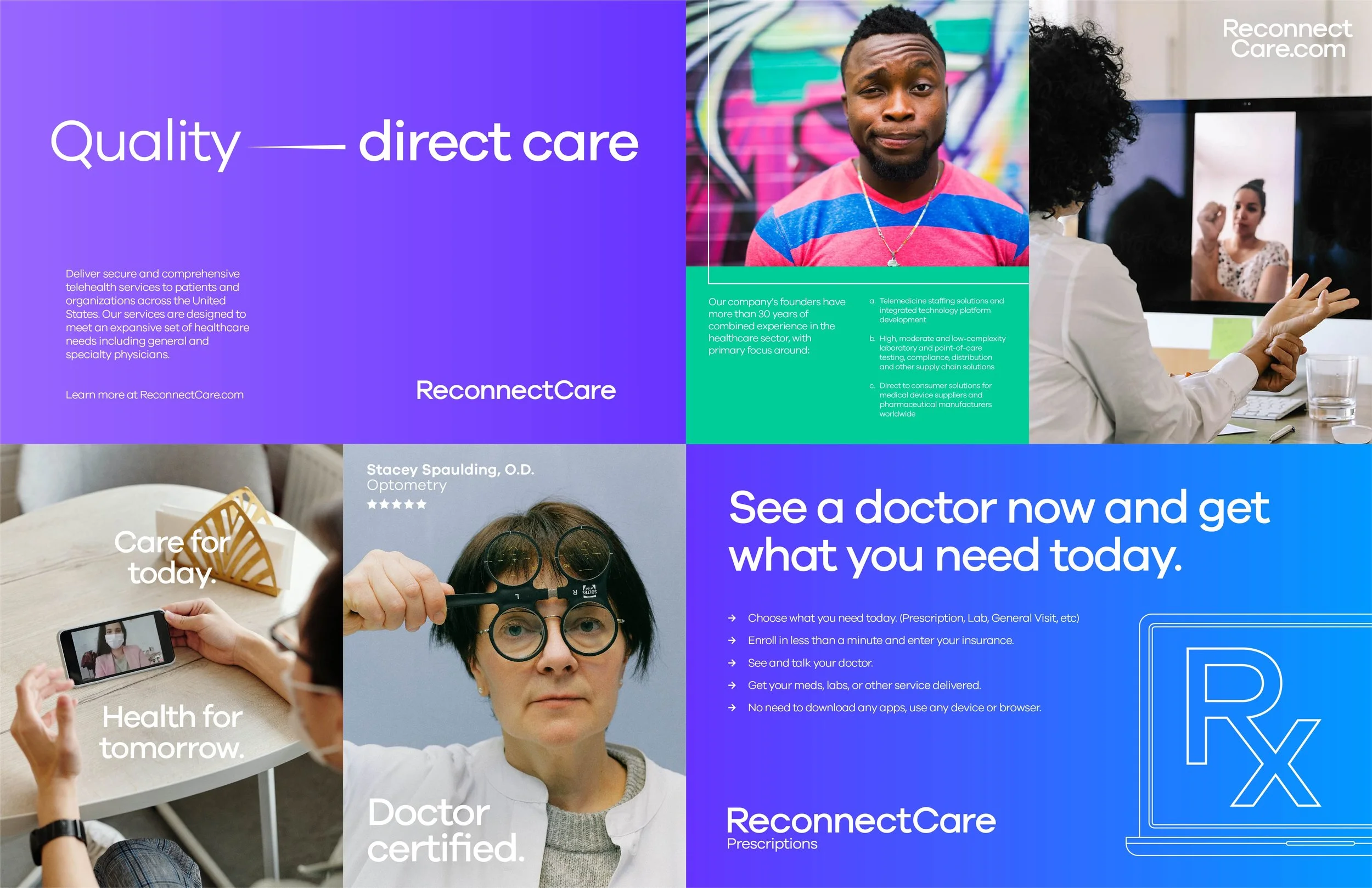
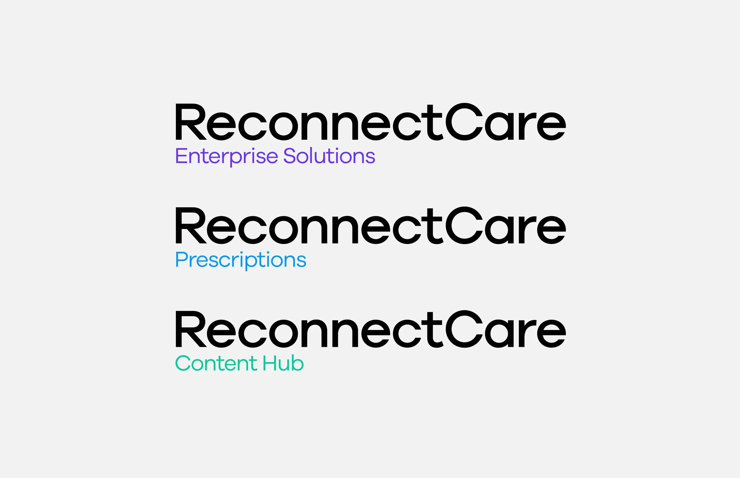
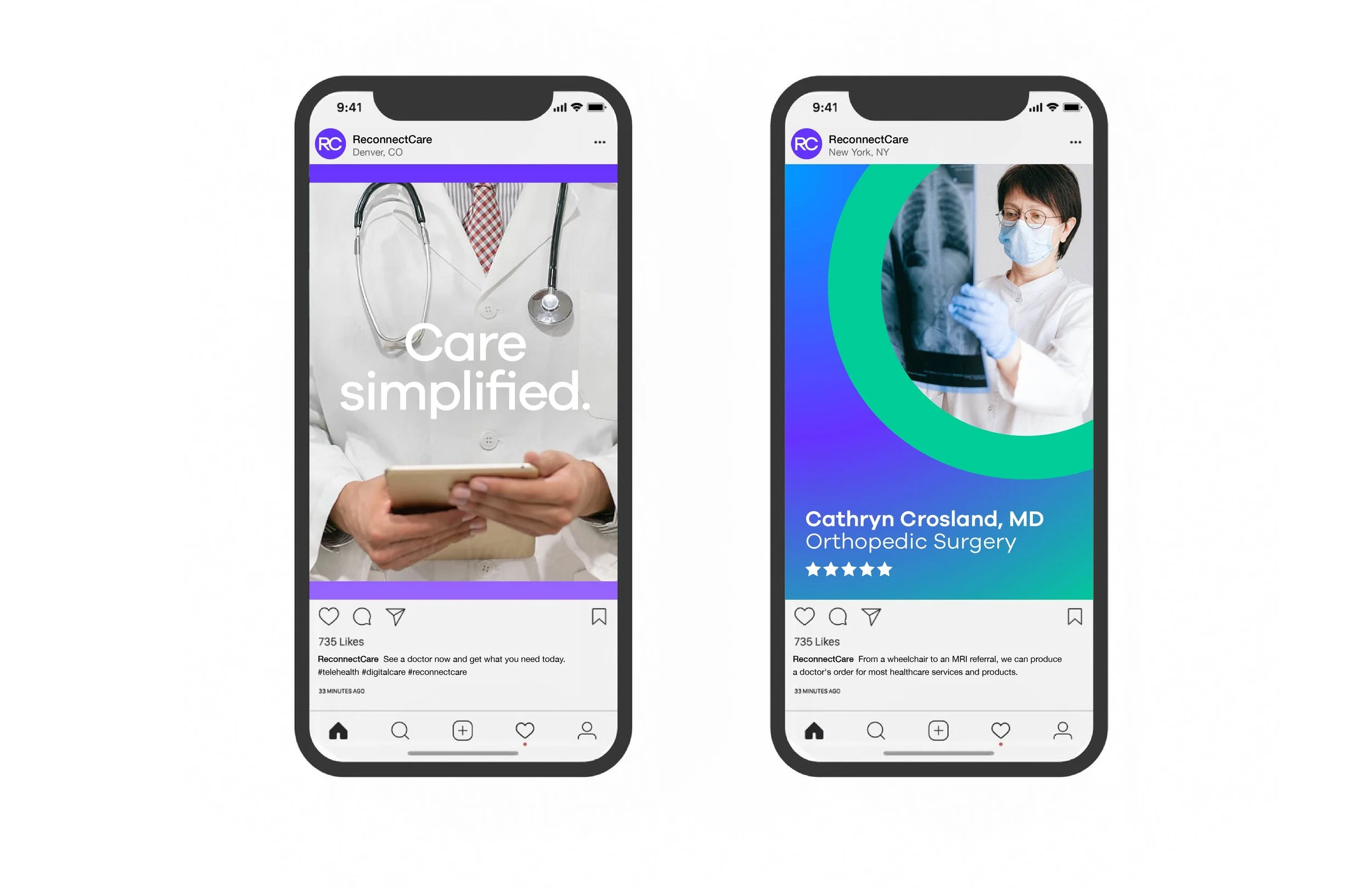
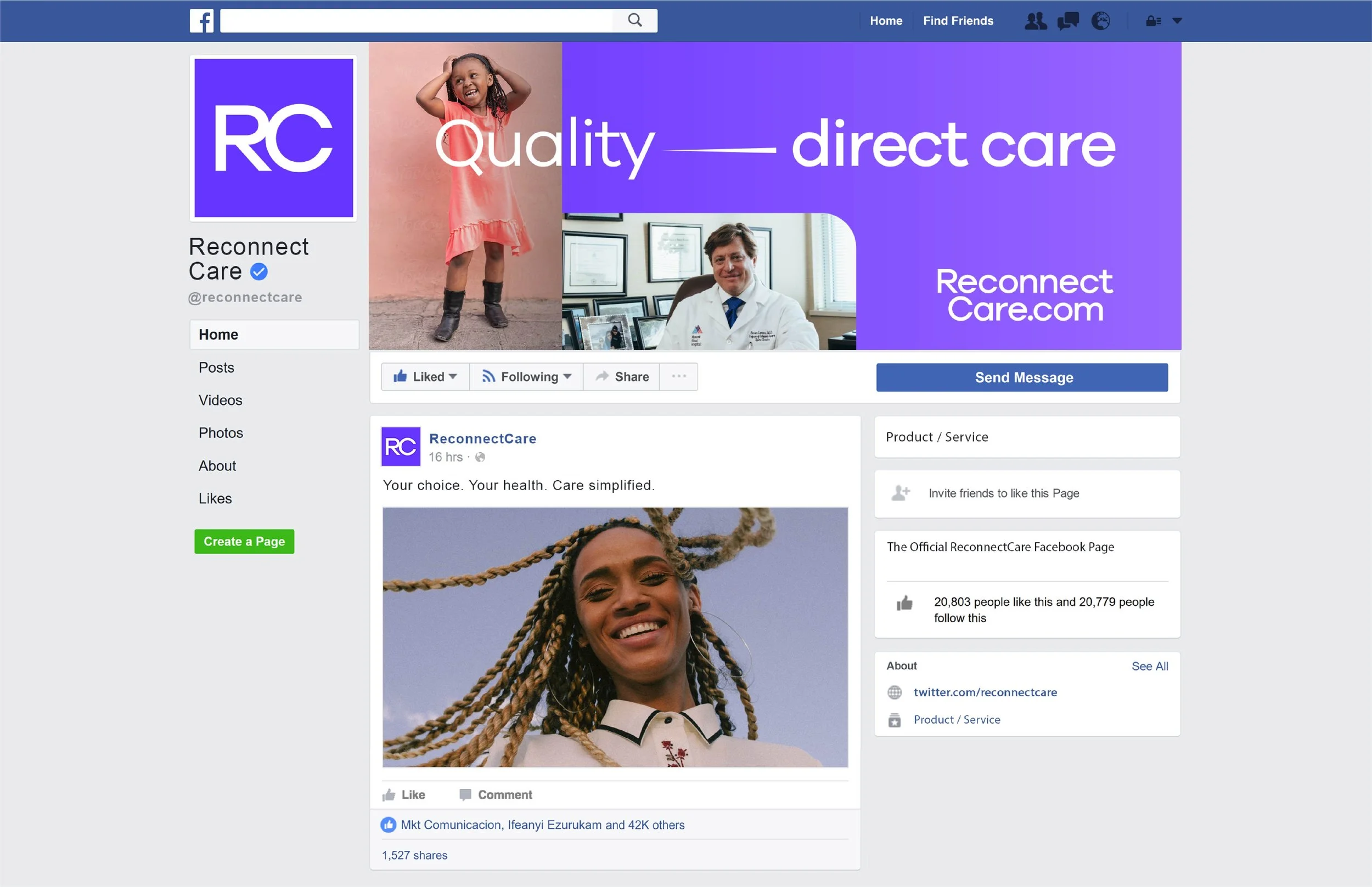
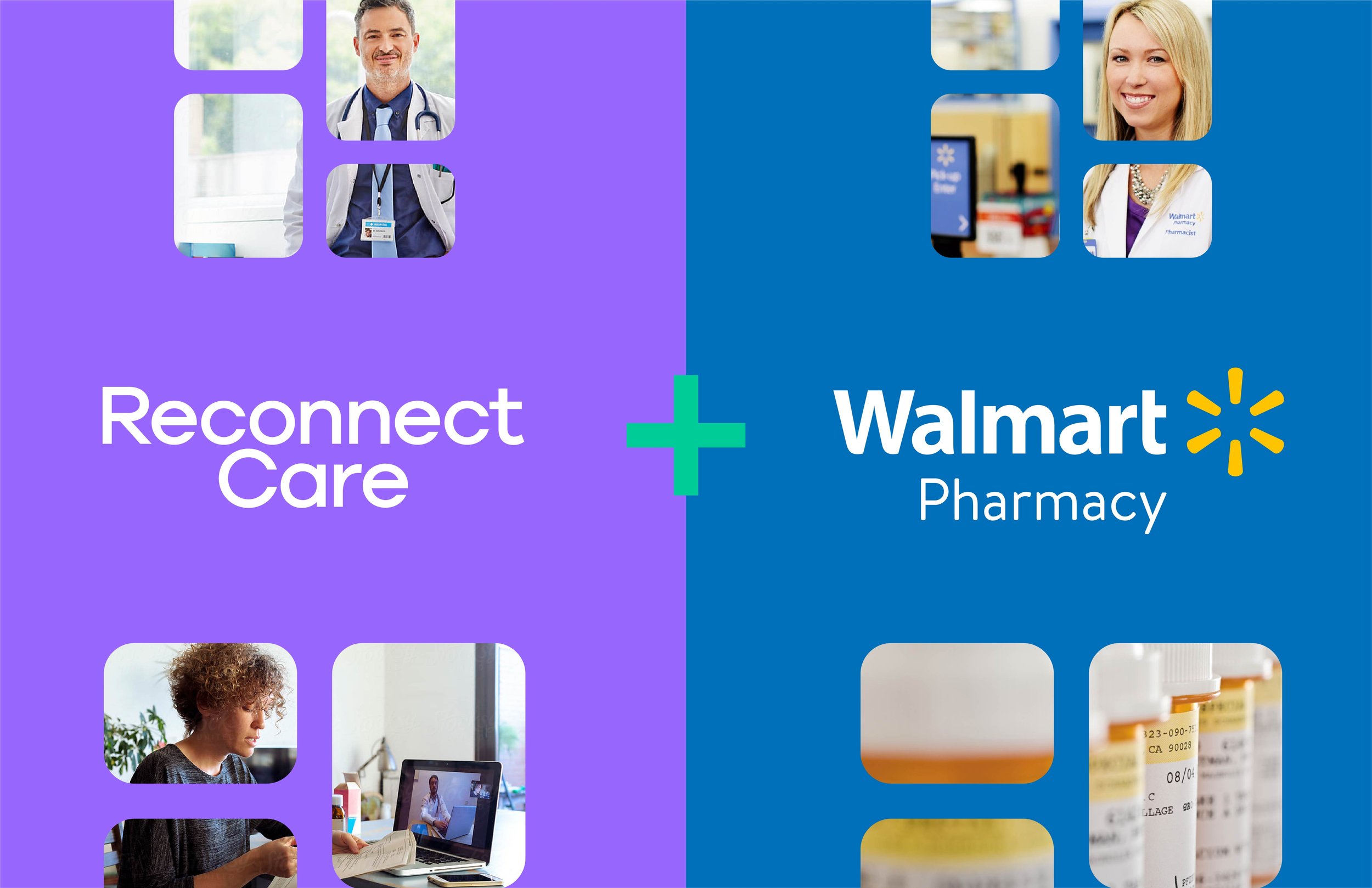
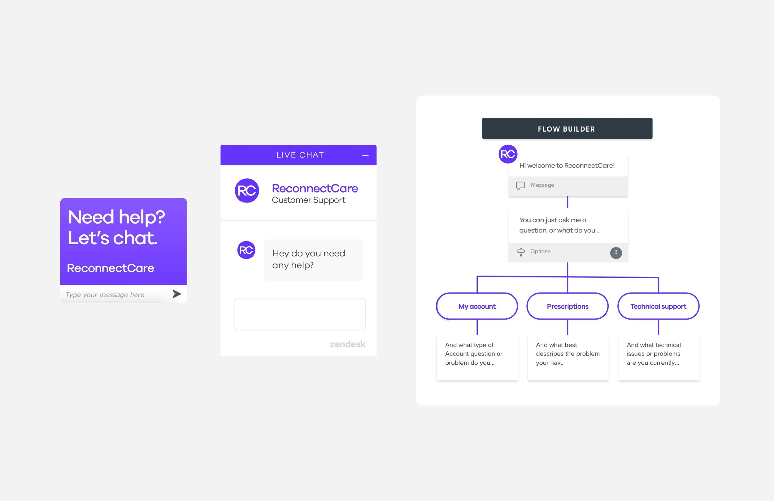
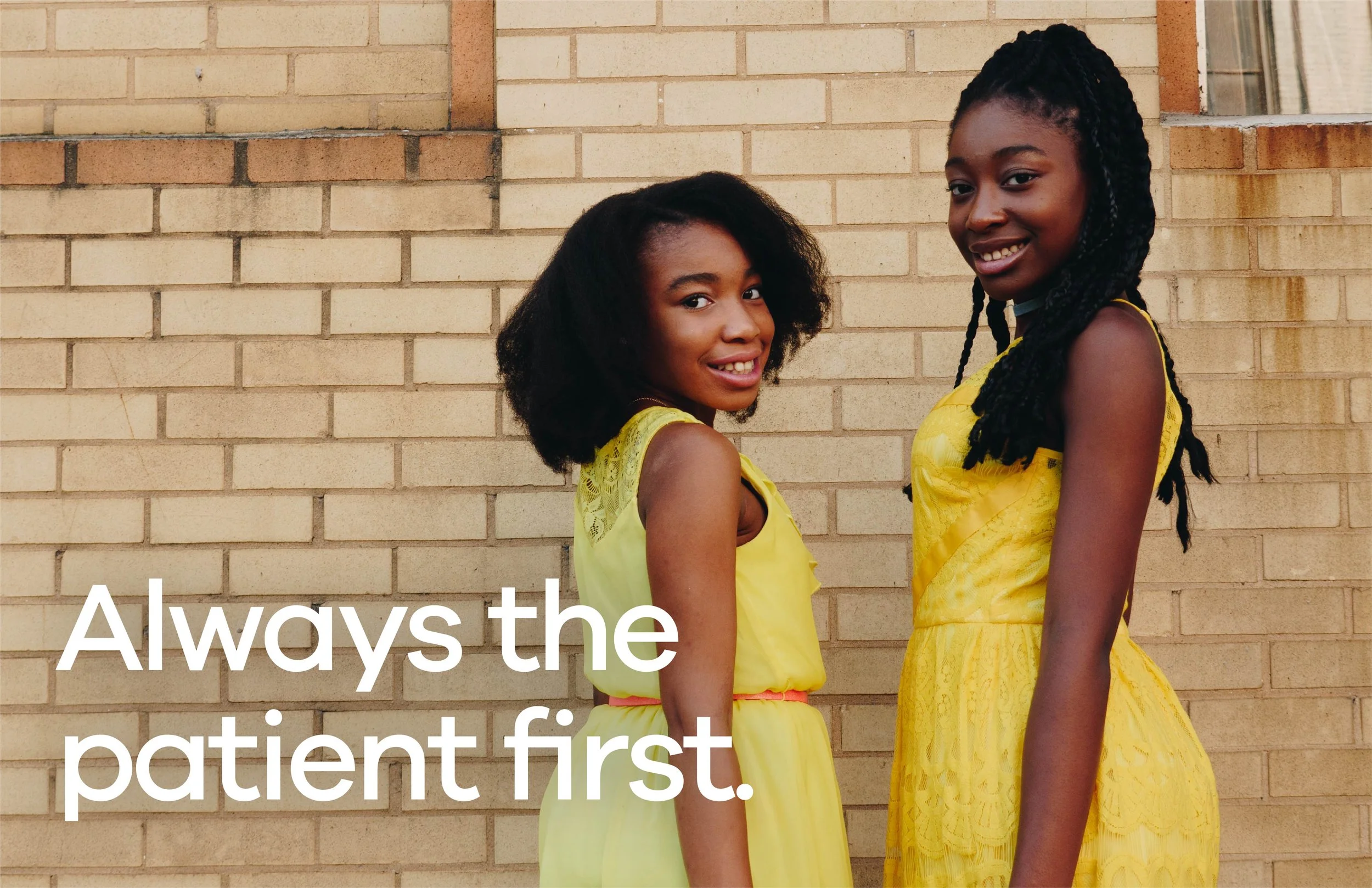
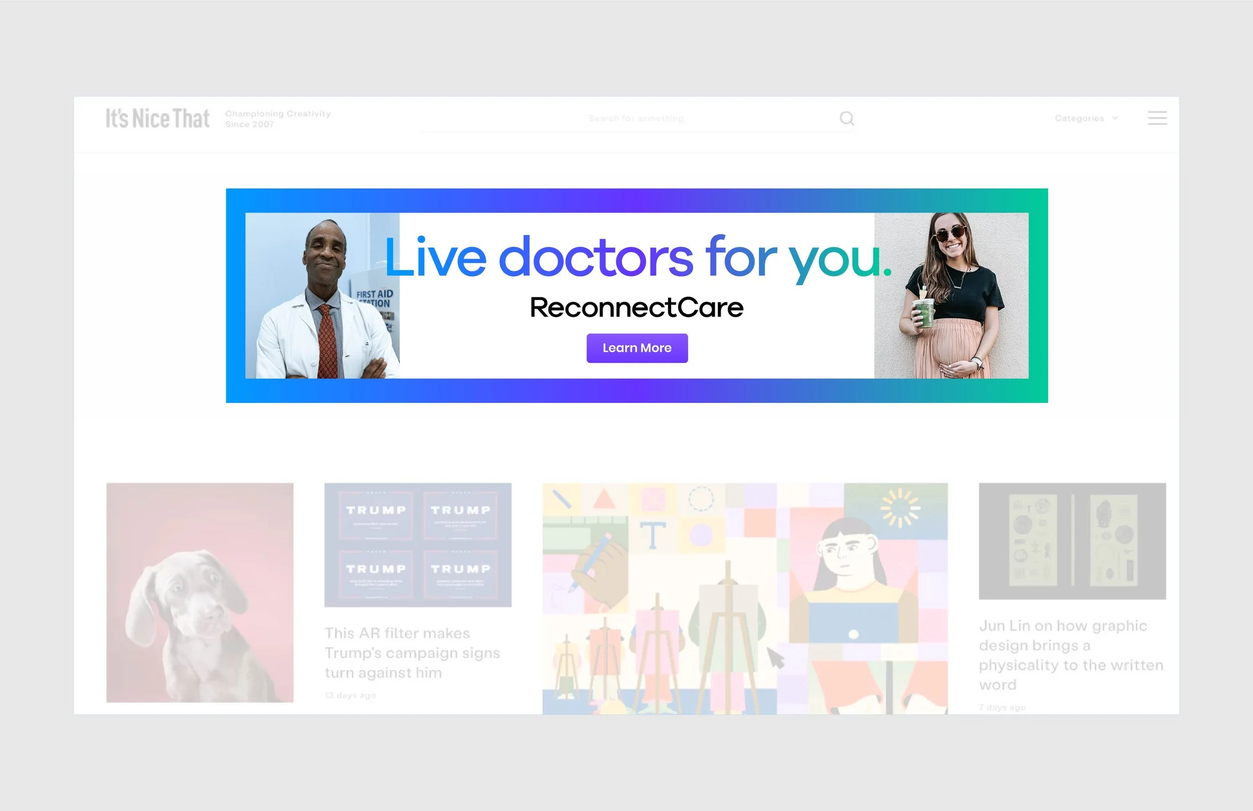
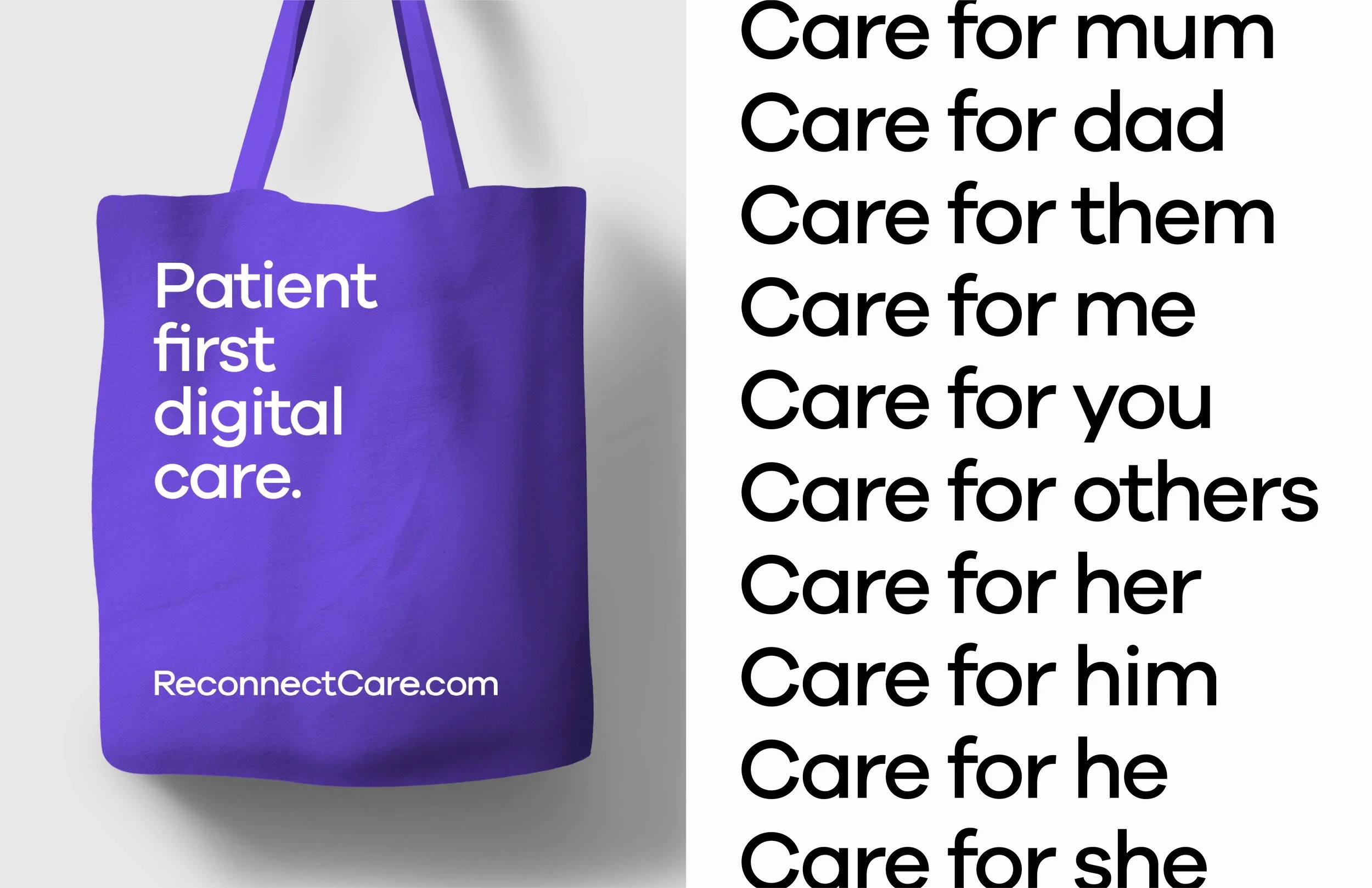
Bartlett Creative started with a brand audit of the virtual care landscape. Most of the category looked the same: clinical blues, generic crosses and cold sans serifs. So we went the other way. The custom logotype is built on Galano Grotesque, with the e and c reworked to give the wordmark more visual weight and a more ownable shape. A progressive, purple-forward palette, backed by green, blue and a set of gradients, gave ReconnectCare a confident look that was still approachable. We extended the typeface into a full brand system for taglines, sub-brands and supporting information, then documented it in brand guidelines. Patient-first messaging and creative concepts carried the identity into campaigns, motion and the platform UI. The result is a brand that looks like care you can trust, not another app.
-
Healthcare · Virtual Health & Telemedicine
-
A mark meant to move.
-
Brand audit, logo design and rebrand, brand identity system, brand guidelines, patient-first messaging, creative concepts, campaign development, motion, UI design
-
Early-stage virtual health startup
-
Creative Director: Travis Bartlett
Art Director: Travis Bartlett
Lead Designer: Travis Bartlett